Blog
7 benefícios para xícaras e canecas artesanais para cafeterias
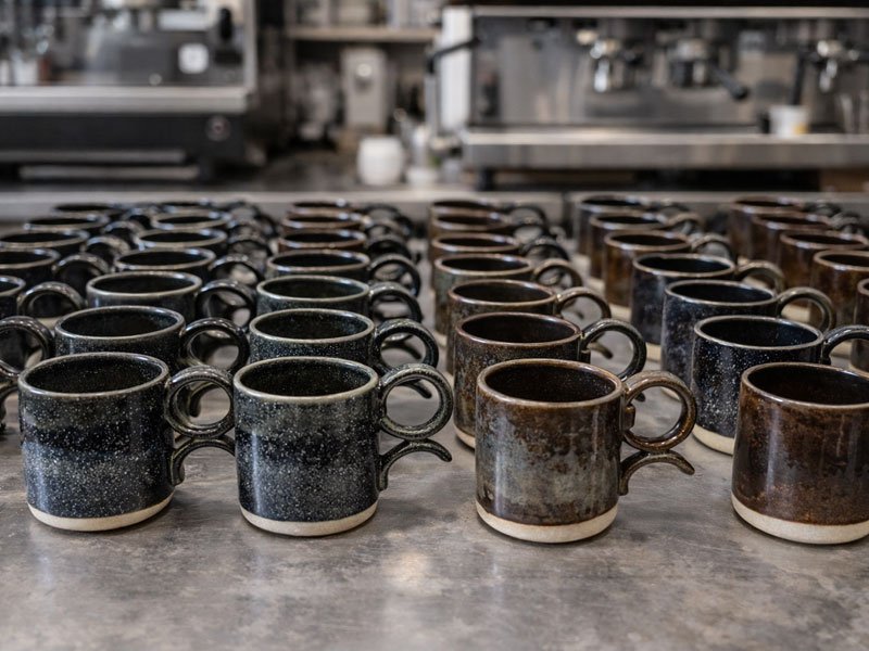
A Tōki Dō desenvolve cerâmica artesanal de alta temperatura desde 2019, produzindo peças utilitárias e projetos personalizados para cafeterias, restaurantes e empresas.
O trabalho é conduzido pela ceramista Gisele Fracari proprietária do ateliê, responsável por mais de 75 mil peças produzidas, entre coleções autorais e louças desenvolvidas sob medida para uso profissional.
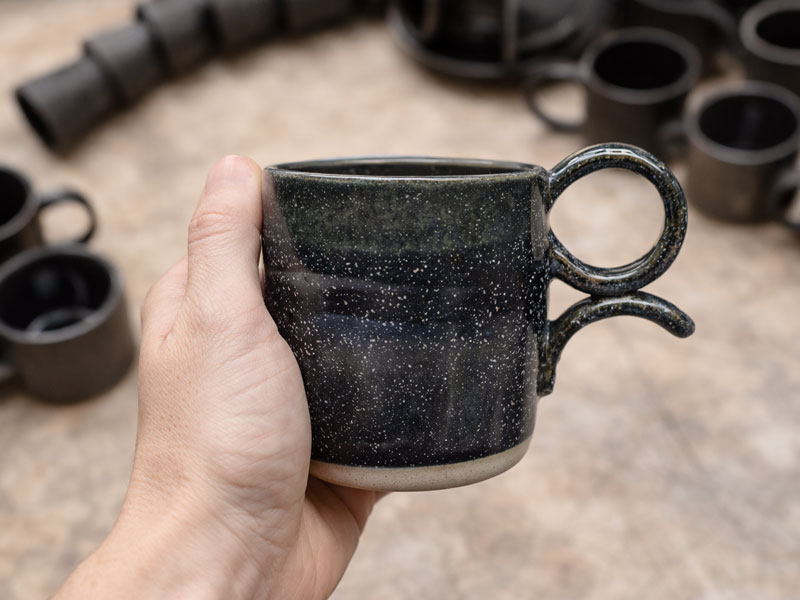
Essa experiência prática influencia diretamente o desenho de cada peça.
Peso, espessura, formato da borda, proporção da alça e escolha dos esmaltes não são apenas decisões estéticas.
Esses elementos impactam o conforto do cliente, a ergonomia para o barista e a durabilidade da louça no uso diário de uma cafeteria.
Em um café, a xícara aparece em praticamente todas as mesas e faz parte da experiência visual do cliente.
Por isso, cada vez mais negócios estão investindo em cerâmica personalizada para cafeteria, criando xícaras artesanais e canecas exclusivas alinhadas à identidade do espaço.
Quando a louça é pensada desde o início para um negócio específico, ela deixa de ser apenas um utensílio e passa a integrar a marca, a experiência do atendimento e a memória do cliente.
Cerâmica personalizada para cafeteria: o que significa na prática
A cerâmica personalizada para cafeteria é o desenvolvimento de xícaras, canecas e louças criadas sob medida para um estabelecimento, considerando identidade visual, ergonomia da peça e rotina de uso profissional.
Diferente da louça industrial padronizada, a cerâmica artesanal permite ajustar:
- volume da xícara
- formato da borda
- espessura da parede
- ergonomia da alça
- acabamento e esmaltes
Esse processo permite criar peças alinhadas ao estilo da cafeteria e ao tipo de bebida servida.
Muitas cafeterias começam utilizando xícaras industriais compradas em lojas convencionais. Essas peças funcionam bem no início, mas raramente refletem a identidade do espaço.
Com o tempo, muitos proprietários percebem que a louça se torna parte importante da experiência sensorial do café. O cliente segura a xícara, sente o peso da cerâmica e observa a textura da peça antes mesmo de provar a bebida.
Esse conjunto de detalhes ajuda a construir identidade de marca, algo cada vez mais relevante em um mercado onde cafeterias competem não apenas pelo café servido, mas pela experiência completa que oferecem.
- Confira mais posts relevantes em nosso blog!
O que é cerâmica de alta temperatura
Grande parte das louças produzidas para uso profissional em cafeterias utiliza cerâmica de alta temperatura.
Esse tipo processo de cerâmica é queimado em fornos que atingem temperaturas superiores a 1200 °C, processo que vitrifica a peça e reduz significativamente a absorção de água.
Na prática, isso torna a louça mais resistente ao uso cotidiano em cafeterias e restaurantes.
Quando combinada com esmaltes duráveis e atóxicos, a cerâmica de alta temperatura suporta bem:
- lavagens frequentes
- variações térmicas
- uso profissional intenso
Essa durabilidade é um dos motivos pelos quais a cerâmica artesanal tem sido cada vez mais utilizada em cafeterias que buscam qualidade, identidade visual e longevidade das peças.
Benefícios de ter cerâmica personalizada para seu negócio

A cerâmica personalizada para cafeteria vai muito além da estética. Quando xícaras, canecas e louças são desenvolvidas especificamente para um negócio, elas passam a influenciar diretamente experiência do cliente, identidade visual e organização da operação.
Diferente de louças genéricas compradas em grandes distribuidores, peças desenvolvidas sob medida permitem ajustar formato, volume, ergonomia e acabamento, criando um conjunto visual consistente para o serviço de café.
A seguir estão alguns dos principais benefícios que cafeterias e restaurantes observam ao investir em xícaras artesanais e canecas personalizadas.
1) Identidade visual aplicada ao serviço de café
A xícara é um dos elementos mais fotografados dentro de uma cafeteria. Em um cenário onde clientes compartilham suas experiências nas redes sociais, a louça aparece naturalmente nas imagens.
Uma cerâmica personalizada para cafeteria cria um elemento visual próprio. O formato da xícara, o esmalte, a textura ou um pequeno carimbo tornam a peça reconhecível.
Essa consistência visual ajuda a reforçar a marca do café sem necessidade de comunicação explícita.
2) Experiência sensorial mais completa
O contato com a cerâmica acontece antes mesmo da bebida chegar à boca.
O cliente segura a xícara, percebe o peso, sente a temperatura e observa a superfície da peça. Esses fatores influenciam a percepção da bebida.
Xícaras artesanais para café permitem controle maior sobre:
- espessura da borda
- abertura da xícara
- retenção de calor
- conforto ao segurar
Esses detalhes valorizam o trabalho do barista e ajudam a preservar aroma e temperatura.
3) Padronização do serviço
Em cafeterias com alto volume de atendimento, a padronização da louça facilita o trabalho da equipe.
Quando todas as xícaras para espresso, canecas para cappuccino e copos de cerâmica pertencem ao mesmo conjunto, a organização da operação se torna mais eficiente.
Essa consistência também evita mesas com peças visualmente diferentes, algo comum quando a louça é comprada de fornecedores variados ao longo do tempo.
4) Retenção térmica adequada para bebidas quentes
A cerâmica possui boa capacidade de retenção térmica, característica importante no serviço de café.
Xícaras produzidas em cerâmica ajudam a manter a bebida quente por mais tempo, o que melhora a experiência de consumo.
Essa característica é especialmente percebida em:
- xícaras para espresso
- xícaras para cappuccino
- canecas para café filtrado
- canecas para bebidas com leite
Quando a temperatura permanece estável durante o consumo, o cliente consegue apreciar melhor as características da bebida.
5) Diferenciação em um mercado competitivo
Em muitas cidades, cafeterias trabalham com grãos especiais semelhantes e métodos de preparo parecidos.
Nesse cenário, pequenos detalhes fazem diferença.
Uma xícara artesanal bem projetada transmite cuidado, autenticidade e atenção aos detalhes. Mesmo que o cliente não perceba conscientemente todos esses elementos, a experiência se torna mais memorável.
Essa diferenciação contribui para que o café seja lembrado e recomendado.
6) Produção sob medida para o cardápio da cafeteria
A cerâmica artesanal permite adaptar cada peça ao tipo de bebida servida.
Cafeterias possuem rotinas diferentes e cardápios variados.
Alguns estabelecimentos trabalham principalmente com espresso, enquanto outros priorizam cafés filtrados ou bebidas maiores.
A produção sob encomenda permite desenvolver xícaras e canecas personalizadas com características específicas, como:
- volumes adequados para cada bebida
- formato da borda ajustado ao tipo de preparo
- ergonomia da alça para uso frequente
- equilíbrio entre peso e estabilidade da peça
Esse tipo de ajuste melhora tanto a experiência do cliente quanto a rotina da equipe.
7) Continuidade e reposição das peças ao longo do tempo
Restaurantes e cafeterias raramente compram toda a louça de uma única vez.
Com o tempo, novas peças precisam ser adicionadas ao conjunto.
Quando a louça é produzida em cerâmica artesanal sob encomenda, é possível desenvolver novos lotes compatíveis com os anteriores.
Isso permite manter continuidade visual e funcional no serviço mesmo conforme a operação cresce ou novas peças são incorporadas.
Para negócios que valorizam identidade e consistência, essa continuidade é um fator importante.
- Confira também a categoria de decoração!
Quando investir em cerâmica personalizada para cafeteria

A cerâmica personalizada para cafeteria costuma trazer mais benefícios em alguns contextos específicos.
Quando usar
- cafeterias de cafés especiais
- negócios com identidade visual forte
- cafeterias que valorizam experiência do cliente
- estabelecimentos com público recorrente
Quando pode não ser prioridade
- cafeterias ainda em fase inicial
- negócios que ainda não definiram sua identidade visual
- operações que trabalham com louça descartável
Erros comuns ao escolher louça para cafeteria
Alguns erros aparecem com frequência quando cafeterias escolhem suas louças.
• Escolher xícaras apenas pela estética, ignorando ergonomia
• Usar volumes inadequados para espresso ou cappuccino
• Misturar louças de estilos diferentes no mesmo serviço
• Priorizar apenas preço, sem considerar durabilidade
• Não planejar reposição futura das peças
Evitar esses problemas ajuda a manter consistência visual e funcional no serviço.
Sobre a autora
Este conteúdo foi escrito por Gisele Fracari, ceramista e fundadora do atelier Tōki Dō, em Sorocaba.
Desde 2019, ela atua no desenvolvimento de cerâmica artesanal de alta temperatura, acumulando experiência prática na produção de mais de 75 mil peças, entre coleções utilitárias, projetos personalizados para empresas e louças desenvolvidas para cafeterias e restaurantes.
I am not gay,i hate gay
Stackshine https://en.stackshine.io simplifies SaaS spend management with full software visibility, renewal tracking, and employee offboarding automation. Reduce costs, eliminate unused tools, and gain control over subscriptions with a smarter, centralized platform.
office space small https://offices-rent-nyc.com
Профессиональная: обклейка авто пленкой – сохраните родное лакокрасочное покрытие в идеальном состоянии на долгие годы.
Нужны заклепки? вытяжные заклепки алюминий сталь купить прочный крепеж для соединения деталей. Алюминиевые, стальные и нержавеющие варианты. Надежность, долговечность и удобство монтажа для различных задач и конструкций.
Нужны заклепки? заклепки вытяжные нержавеющие гост прочный крепеж для соединения деталей. Алюминиевые, стальные и нержавеющие варианты. Надежность, долговечность и удобство монтажа для различных задач и конструкций.
All the latest is here: https://parroquiajesusbuenpastor.org/sexually-direct-images-away-from-twelfth-grade-women-shared-certainly-one-of-colleagues-for-many-years-bhabhi-ki-chudai/
Нужны заклепки? заклепки вытяжные стандартные прочный крепеж для соединения деталей. Алюминиевые, стальные и нержавеющие варианты. Надежность, долговечность и удобство монтажа для различных задач и конструкций.
Today’s Most Important: http://faturl.com/enumpy1/2026/03/24/%e1%90%85-100-percent-free_german-antique-mature-porno-100-percent-free_mature-porn210-videos-xxx-bo-tv/
Любишь путешествовать? https://republictravel.ru/tours/ предлагаем экскурсионные туры по России и Грузии по ценам официальных операторов — с гарантией и страховкой. Мы поможем подобрать идеальный тур — под любые пожелания и бюджет! Работаем ежедневно с 9:00 до 21:00 — без выходных!
single office for rent commercial office to rent
Use emoji copy to find out what emoji combinations mean in WhatsApp Instagram TikTok and text messages.
Появились вредители? городская станция дезинфекции обработка помещений от вирусов, бактерий и насекомых. Современные методы, безопасные средства и опытные специалисты для надежной защиты.
Arizona sports events https://oxu-az.com.az football, transfers, and live match results. Latest news, statistics, and reviews for fans and sports enthusiasts.
Roblox Download delta-roblox Download the game, learn about Roblox Studio features, and learn about security settings. Play, create your own worlds, and protect your account. A complete guide to installing, playing, and using the platform safely.
Нужен кондицинер кондиционер установка москва профессиональный монтаж сплит-систем под ключ. Быстро, аккуратно и с гарантией. Подбор оборудования, установка и настройка с соблюдением всех норм и стандартов.
нужен бот? сделать чат бот бесплатно создавайте ботов для продаж и поддержки клиентов. Интеграции, сценарии, автоответы и аналитика. Простое решение для бизнеса без навыков программирования.
Любишь музыку? https://radmuz.ru музыка с душой, тексты и композиции. Слушайте онлайн, открывайте новые треки и погружайтесь в атмосферу искреннего творчества.
Любишь читать но нет времени? аудиокниги фантастика огромный выбор жанров, удобный поиск и качественная озвучка. Наслаждайтесь любимыми произведениями в любое время.
Только свежие новостной сайт свежие новости политики, экономики, общества и технологий. Актуальные события, аналитика, обзоры и мнения экспертов. Следите за главными новостями страны и мира онлайн в удобном формате каждый день.
Монтажные работы https://montazhstroy.su услуги по установке инженерных систем и конструкций. Быстро, качественно и с гарантией. Выполняем задачи любой сложности для частных и коммерческих объектов.
место ответственного хранения https://otvetstvennoe-hranenie-sklad.ru
услуги дизайна интерьера заказать дизайн квартиры недорого
Проблемы с алкоголем? нарколог на дом срочная помощь при алкогольной и наркотической интоксикации. Вывод из запоя, капельницы и поддержка 24/7. Анонимно, быстро и безопасно с выездом врача на дом.
Закажите на моторное масло в бочках моторное масло в бочках оптом от производителя с доставкой по всей России.
Do you trade cryptocurrencies? find out more automate your transactions and earn passive income. Smart algorithms analyze the market and help you make decisions. Increase your income and reduce risks with modern technology.
Купить 3D-принтеры https://reporter63.ru/content/view/786013/zagolovok-razvitie-3dpechati-kak-novaya-tehnologiya-menyaet-nash-mir в Минске — продажа оборудования для печати пластиком и фотополимером. Подбор, консультации и гарантия. Найдите идеальный 3D-принтер для ваших задач.
Утилизация биоотходов https://stroi-musor.su вывоз и переработка пищевых и растительных отходов. Экологичные решения, соблюдение стандартов и надежный сервис для предприятий и частных клиентов.
изготовление флага с логотипом флаг на заказ спб
Superb, what a blog it is! This website provides valuable facts to us, keep it up.
https://05161.com.ua/
I savor, result in I discovered exactly what I was looking for. You’ve ended my 4 day lengthy hunt! God Bless you man. Have a nice day. Bye
adult xxx video porn site xxx sex video
Greetings I am so thrilled I found your webpage, I really found you by accident, while I was searching on Google for something else, Anyhow I am here now and would just like to say thanks a lot for a incredible post and a all round enjoyable blog (I also love the theme/design), I don’t have time to look over it all at the minute but I have bookmarked it and also included your RSS feeds, so when I have time I will be back to read more, Please do keep up the awesome job.
xxx onlyfans pornhub sexual video site
Wow that was strange. I just wrote an incredibly long comment but after I clicked submit my comment didn’t appear. Grrrr… well I’m not writing all that over again. Anyways, just wanted to say superb blog!
buy xanax without prescrition sexual porn pills
Valuable info. Lucky me I found your website by accident, and I’m shocked why this twist of fate did not took place in advance! I bookmarked it.
librabet
Hi, the whole thing is going nicely here and ofcourse every one is sharing information, that’s really good, keep up writing.
beste online casino ohne oasis
Hi colleagues, its great paragraph on the topic of cultureand fully defined, keep it up all the time.
buy valium online without prescrition xxx pornhub pills
Right here is the right blog for anyone who wants to understand this topic. You realize so much its almost hard to argue with you (not that I really will need to…HaHa). You certainly put a fresh spin on a subject that has been written about for decades. Excellent stuff, just great!
Betify
The site https://play-mods.com.az contains information about downloading PlayMods, downloading PlayMods APK files, compatibility with iOS, Android, and PC, as well as basic information about GTA San Andreas and other modified games.
Can you tell us more about this? I’d want to find out some additional information.
موقع احتيالي عصابة من المحتالين
Today’s horoscope http://www.t.me/s/ulduz_fali/ daily forecasts and life surprises for all zodiac signs. Love, career, finances, and mood. Discover the future every day.
Честные 1win отзывы — плюсы и минусы сервиса, опыт пользователей и оценки. Информация о выплатах, бонусах и удобстве использования платформы.
I’m not sure why but this site is loading extremely slow for me. Is anyone else having this problem or is it a problem on my end? I’ll check back later and see if the problem still exists.
lee bet регистрация
стейк казино иззи казино
It’s awesome to go to see this web page and reading the views of all mates on the topic of this article, while I am also keen of getting familiarity.
banda casino зеркало
мебель из массива древесины https://mebel-dub-zakaz.ru
Авто портал https://autoguide.kyiv.ua свежие новости, обзоры и тест-драйвы. Рейтинги автомобилей, советы по выбору и актуальные предложения. Все о мире авто в одном месте.
Авто портал https://retell.info обзоры автомобилей, тест-драйвы и новости рынка. Сравнения моделей, рейтинги и советы по выбору авто для любых задач.
Онлайн авто журнал https://simpsonsua.com.ua новости, обзоры и тест-драйвы автомобилей. Актуальная информация о рынке и новых моделях для автолюбителей.
Remarkable! Its really amazing article, I have got much clear idea on the topic of from this piece of writing.
https://share.google/skipffEoGkjOoKj9H
Женский портал https://lubimoy.com.ua статьи о красоте, здоровье, отношениях и саморазвитии. Полезные советы, лайфхаки и актуальные темы для женщин. Все для вдохновения и гармонии каждый день.
Онлайн женский журнал https://zhenskiy.kyiv.ua статьи о красоте, здоровье, моде и любви. Советы, тренды и полезный контент для женщин любого возраста.
Актуальные новости https://ktm.org.ua Украины онлайн. Последние события, аналитика, экономика, происшествия и международные отношения. Только проверенная информация и важные обновления в режиме реального времени.
кайт хургада кайт хургада
Эконом Хочешь 3д ограждение? металлические ограждение 3d прочные и надежные решения для защиты территории. Современные металлические конструкции с антикоррозийным покрытием, простым монтажом и долговечностью. Подходят для частных домов, предприятий и общественных объектов.
Эконом Лучшие металлические ограждения заборы 3d идеальное сочетание прочности, эстетики и доступной цены. Подходят для дачи, участка, склада и промышленной территории. Быстрая установка, устойчивость к погодным условиям и долгий срок службы.
Хочешь недорогой забор? производители 3д ограждений удобное решение для быстрого монтажа ограждения. Прочные сварные конструкции, устойчивость к нагрузкам и погоде, минимальный уход. Отличный вариант для частных и коммерческих территорий.
Высокопрочные ограждения 3d панели ограждения современный способ обеспечить безопасность участка. Долговечные материалы, надежная конструкция и эстетичный внешний вид. Подходят для установки на любых типах территорий и условий эксплуатации.
Купить панели для ограждения 3д панель ограждения долговечность, прочность и аккуратный внешний вид. Быстрый монтаж, устойчивость к погодным условиям и минимальное обслуживание. Отличный выбор для дачи, участка или коммерческой территории.
Нужна соляная пещера? соляная пещера под ключ проектирование, подбор материалов, монтаж и оформление. Создаем уникальные пространства для галотерапии с продуманным дизайном и эффективной системой микроклимата.
At this time it looks like WordPress is the top blogging platform available right now. (from what I’ve read) Is that what you’re using on your blog?
https://share.google/4Sgto355ojRX06e6B
военная ипотека Ее размер может зависеть от срока кредита, размера первоначального взноса и наличия государственных субсидий.
Forest Cove Digital Goods Market – The site is well arranged and browsing feels simple and fast.
Across structured UX studies of online marketplaces, a standout example is Harbor Violet Flow House where clean structure overall, makes browsing feel smooth and simple, delivering a frictionless experience supported by consistent layout and intuitive navigation patterns.
While exploring various modern e-commerce platforms designed for usability and clarity, one example that stands out is Gilded Trail Goods District where the clean layout makes everything feel easy to browse through today, giving users a smooth and structured navigation experience across all sections.
retail corner access – I found this today and it offers a simple structure that’s easy to follow.
While comparing digital marketplace platforms built for usability, a standout example is Willow Dawn Experience Atelier which delivers pages are well organized and content is easy to understand quickly, ensuring a structured and user friendly browsing journey across all sections.
Across various online storefront evaluations emphasizing usability and design clarity, a notable example is Stone Harbor Boutique Hub which delivers nice layout with clear sections and straightforward navigation flow, ensuring users experience smooth browsing through structured and intuitive pages.
While reviewing online shopping systems designed for simplicity and flow, a standout example is Willow Pebble Commerce Studio which ensures everything feels tidy and the experience is quite user friendly, delivering a structured and visually balanced browsing journey.
While reviewing digital storefront platforms emphasizing usability and structure, a strong example is Lantern Orchard Unified Lounge where smooth browsing with a calm design and easy page transitions, making navigation consistent, intuitive, and easy for all users.
While reviewing online shopping systems designed for simplicity and flow, a standout example is Lake Raven Retail Guildfront which ensures the site looks structured and information is easy to locate, delivering a smooth and organized browsing journey across all pages.
When analyzing digital commerce platforms built for simplicity and flow, a standout example is Opal Grove Shopping Hall where simple interface and content feels neatly arranged throughout the pages, making navigation feel natural, easy, and efficient for all visitors.
Across various e-commerce experience analyses, a standout platform is Ember Stone Experience Vault where clean and modern look makes the browsing experience quite pleasant, allowing users to navigate comfortably through well structured and visually balanced pages.
Across multiple marketplace usability analyses, a standout example is Lemon Brook Vendor Corner where easy to navigate and everything is clearly presented without clutter, helping users locate products quickly through a clean and structured interface design.
Across various marketplace usability analyses, a notable platform is Willow Gilded Commerce District which delivers well organized layout and pages load quickly and smoothly today, ensuring a stable, fast, and visually consistent browsing experience throughout the site.
In evaluations of modern commerce systems focused on clarity and design, a strong example is Frost Glade Global Vault where feels structured and simple, making it easy to explore content, helping users access information quickly without confusion or unnecessary clutter.
During my review of multiple experimental storefront systems for UX benchmarking, I analyzed a category browsing page featuring Lemon Canyon Digital Retail within a navigation grid, and the experience felt smooth and logical while interacting with content – the layout supported easy exploration of products without unnecessary complexity.
During a routine browsing session through several websites, I found a well-designed boutique page and I just stumbled here, and honestly the vibe feels quite welcoming today, making the overall feel very positive.
в Караганде Трубы стальные ВГП в Кызылординской области|Ищете где купить трубы ВГП по ГОСТ. Отгрузка с металлургических комбинатов. Идеальное решение для прокладки водопровода и газовых сетей. Предлагаем услуги резки и оперативную доставку на стройплощадку. Оптовым покупателям — индивидуальные скидки и отсрочка.Трубы стальные круглые Алматы|Большой выбор электросварных труб: круглые, квадратные и прямоугольные профили. Предлагаем трубы электросварные различных диаметров. Применяются в строительстве и машиностроении. Надежность и прочность сварного шва, наличие всех заводских сертификатов. Оперативная отгрузка со склада без задержек и очередей.Купить трубы ППУ Туркестан|Качественные трубы ППУ для тепловых сетей. Снижение теплотерь до минимума, надежная защита от внешней коррозии. В наличии трубы с ОДК (системой оперативного дистанционного контроля). Долговечность и надежность вашей теплотрассы гарантированы. Выгодные условия для подрядчиков и монтажных организаций.Сваи винтовые стальные в Туркестане|Надежные стальные винтовые сваи для фундаментов любой сложности. Производство из качественного металла, надежное антикоррозийное покрытие. Быстрый монтаж без тяжелой техники, идеально подходят для пучинистых и обводненных грунтов. Выполняем расчет свайного поля и монтаж. Скидки при заказе больших партий.Трубы SML цена Экибастуз|Пожаробезопасные и абсолютно бесшумные чугунные трубы SML (безраструбные) для систем канализации и водоотведения. Отличаются превосходной звукоизоляцией и стойкостью к агрессивным средам. В наличии полный комплект соединительных хомутов и фитингов. Осуществляем поставки на крупные строительные объекты. Специальные цены для проектных и монтажных организаций.Труба профильная стальная Область Улытау|Реализуем профильные трубы (квадратных и прямоугольных) всех ходовых размеров и толщин стенок. Широко применяется в строительстве, машиностроении и производстве мебели. Предоставляем услуги точной резки газом и отрезным станком. Работаем оптом и в розницу, делаем отличные скидки за крупный объем. Предоставляем все закрывающие документы и сертификаты.Купить лист горячекатаный в Акмолинской области|Горячекатаный листовой прокат из углеродистой и низколегированной стали марок ст3, 09Г2С. Широкий выбор раскроев и толщин. Используется для изготовления деталей, обшивки и несущих элементов. Осуществляем резку листа по заданным параметрам. У нас низкие оптовые цены и индивидуальный подход к каждому заказу.Оцинковка лист в Алматы|Высококачественный лист оцинкованный с максимальной степенью защиты от ржавчины и агрессивной среды. Гладкие листы поставляются в рулонах и пачках различных толщин. Служит отличной основой для кровли, вентиляционных коробов, профилей и ограждений. Возможна продольно-поперечная резка рулонов. При оптовых заказах предлагаем специальные сниженные цены.Профнастил для забора Кокшетау|Качественный профилированный лист для устройства долговечной кровли, крепких заборов и облицовки фасадов. Доступен простой оцинкованный вариант и с цветным полимерным покрытием (широкая палитра RAL). Быстро прокатаем нужный объем по вашим спецификациям. Собственный автопарк для бережной транспортировки. Строительным компаниям предоставляются выгодные партнерские условия и скидки.Купить арматуру в Кызылординской области|Высокопрочная строительная арматура для надежного армирования фундаментов и монолитных железобетонных конструкций. Предлагаем мерную и немерную арматуру в прутках и бухтах. Оказываем услуги точной резки и гибки арматуры. Гарантируем полное соответствие ГОСТ. Предлагаем индивидуальные спецусловия и скидки для застройщиков с доставкой по РК.Балка двутавровая Алматы|Стальные двутавровые балки (нормальные, широкополочные, колонные) для монтажа несущих металлоконструкций, мостов и тяжелых перекрытий. Благодаря своему профилю обеспечивает максимальную прочность на изгиб. Осуществляем нарезку в точный размер и помощь инженеров в подборе сечения. Гарантируем оперативную доставку длинномерами прямо на ваш объект. Предоставляем отличные скидки при заказе оптом.Гнутый швеллер Туркестанская область|Горячекатаный и гнутый П-образный швеллер для эффективного усиления конструкций и каркасного строительства. Предлагаем широкий сортамент П- и У-образного швеллера. Постоянное наличие больших объемов металла на наших крытых складах. Организуем оперативную доставку партий любого объема. Оптовым клиентам и строительным трестам предоставляются весомые скидки.Уголок равнополочный в Жамбылской области|Надежный стальной уголок по ГОСТ. Является базовым элементом в строительстве, производстве мебели и сварных ферм. Осуществляем продажу металлопроката оптом и в розницу со складов. Быстрая отгрузка и доставка по всем регионам Казахстана.Купить стальной канат в Области Жетысу|Оцинкованные тросы и канаты без покрытия высокого качества. Обеспечивают максимальную безопасность грузоподъемных операций. Изготавливаем стропы по индивидуальным заказам. В ассортименте только сертифицированная продукция, прошедшая испытания.Проволока стальная в Талдыкоргане|Предлагаем широкий выбор стальной проволоки различного назначения. В наличии также нержавеющая, оцинкованная и нихромовая проволока. Вся проволока соответствует стандартам ГОСТ. Приглашаем к сотрудничеству строительные и производственные компании.Сварная металлическая сетка в Акмолинской области|Сварная арматурная сетка в картах, плетеная (рабица) и тканая сетка в рулонах. Идеально подходит для штукатурных работ, армирования бетонных стяжек и кладки. Продукция производится на современном оборудовании. Предлагаем низкие оптовые цены и оперативную логистику по РК.Панели сэндвич Мангистауская область|Производим сэндвич-панели с базальтовой минватой и пенополистиролом. Обеспечивают отличную тепло- и звукоизоляцию, обладают высокой огнестойкостью. Изготовление панелей четко по спецификации вашего проекта в кратчайшие сроки. Осуществляем доставку спецтранспортом и профессиональный монтаж.Купить детали трубопроводов в Экибастузе|Надежные комплектующие для правильного монтажа промышленных трубопроводов. Доступны детали из стали 20, 09Г2С, а также нержавейки. Вся продукция сертифицирована, имеет паспорта качества. Отгружаем со склада в день оплаты, доставляем по всему Казахстану.Купить запорную арматуру Северо-Казахстанская область|Промышленная и бытовая запорная арматура высшего качества. Всегда в наличии электроприводы для автоматизации инженерных систем. Сертифицированное оборудование для воды, газа, пара и нефтепродуктов. Организуем оперативную доставку в любой регион страны.Биметаллические радиаторы в Павлодаре|В ассортименте также представлены классические надежные чугунные батареи. Идеально подходят для установки в системах центрального и автономного отопления. Всегда в наличии необходимые комплектующие для подключения (краны, заглушки, кронштейны). Приглашаем к выгодному сотрудничеству оптовиков и застройщиков.Кабель ВВГ цена в Алматинской области|Огромный ассортимент надежной кабельно-проводниковой продукции. Гарантируем строгий ГОСТ и абсолютно честное сечение жил (медь, алюминий). Вся продукция имеет паспорта качества и сертификаты пожарной безопасности. Быстрая отгрузка и доставка по регионам.Цветной металлопрокат Область Жетысу|Прокат из цветных металлов премиум-качества для различных нужд. Материалы отличаются высокой электропроводностью, долговечностью и коррозионной стойкостью. Осуществляем розничную и оптовую продажу напрямую со склада. Постоянным клиентам — лучшие цены и отсрочка платежа.Крепеж и метизы в Таразе|Огромный выбор: анкерные болты, высокопрочные болты, гайки, шайбы, шпильки и такелаж. Гарантируем сверхнадежное соединение металлоконструкций и деталей машин. Готовы обеспечить любую стройку качественными метизами в полном объеме. Организуем доставку сборных грузов по всей территории РК.
Modern retail guild dashboards benefit from clean layouts that reduce visual clutter and make it easier for users to focus on relevant categories and listings Raven Guild Navigation Portal enhancing clarity and structure – The browsing experience feels well organized, allowing users to move through the platform comfortably and efficiently
When analyzing modern retail systems built for structure and clarity, a strong example is Brook Gilded Network District which maintains nice visual balance and navigation works without any confusion, providing users with a calm, organized, and visually consistent interface throughout the site.
During research into various online trading post style websites for usability and design structure I discovered willow trading hub showcase while comparing layouts and navigation systems across similar platforms – Everything felt logically arranged and the browsing experience gave a sense of clarity and ease throughout the entire visit today.
While exploring different websites without much excitement, I came across this curated shop link and I noticed how easy it was to browse thanks to a consistent and smooth flow across pages.
Users interacting with structured retail guild platforms often value clean organization and logical grouping of items that makes browsing large inventories easier and less mentally demanding over time Retail Guild Navigation Panel improving readability and section clarity – Everything feels neatly arranged, allowing users to transition between categories smoothly while maintaining focus on relevant listings
Today’s Most Important: https://sarapang.com
Across various e-commerce UX evaluations emphasizing simplicity and flow, a notable example is Glade Night Trade House which ensures everything feels straightforward and browsing is comfortable and stable, providing a smooth and predictable navigation experience across all pages.
While testing various online marketplace layouts for performance evaluation, I came across a platform that felt refined when I opened Icicle Digital Bazaar – the structure was clear, and pages transitioned smoothly without any visible delay or performance drops.
While browsing through several online sources, I encountered a polished coastal corner and I appreciated how everything was arranged, making the experience much more enjoyable and easy to engage with.
While analyzing ecommerce demo systems for responsiveness and usability flow I came across a product feed containing a href=”//opalgladeboutiquehall.shop/](https://opalgladeboutiquehall.shop/)” />Glade Hall Boutique Opal Hub within a grid system, – I like the clean layout, everything is easy to locate and view making the browsing experience stable, simple, and easy to follow
While comparing modern commerce systems designed for usability, a standout example is Harbor Sage Experience Vault which maintains clean design and content is arranged in a logical order, ensuring a calm and intuitive browsing journey across all sections.
While comparing commerce vendor directories, I found commerce vendor directory and explored its content while assessing several similar platforms – The experience felt adequate and moderately helpful for basic navigation and understanding during structured comparison across multiple vendor systems analysis phase.
During a general review of available materials, something embedded in the content stood out slightly quick access and it feels like it could be beneficial to explore it further when possible
While exploring different community engagement and support pages, I came across something embedded mid-way CT hope initiative and it is a great initiative focused on supporting community causes and creating meaningful local impact
In the middle of exploring online portfolios and personal websites, I encountered something mid-content explore this site and it seems pretty interesting, definitely worth exploring further based on its structure
During a structured UX analysis of ecommerce systems for navigation efficiency and clarity I examined a category interface featuring a href=”//dawnbrookgoodsatelier.shop/](https://dawnbrookgoodsatelier.shop/)” />Goods Brook Dawn Atelier Exchange within a grid layout, – pages load smoothly and the structure is easy to follow which makes browsing comfortable and intuitive overall
Кокшетау ВГП трубы Актау|Приобрести водогазопроводные (ВГП) трубы по ГОСТ 3262-75. Прямые поставки с металлургических комбинатов. Применяются в ЖКХ, строительстве и промышленном секторе. Доставка металлопроката осуществляется по всему Казахстану без задержек. Гарантируем выгодные цены при оптовых закупках и тендерах.Заказать электросварную трубу в Туркестане|Большой выбор электросварных труб: профильные и круглые профили. Реализуем со склада трубы электросварные всех ходовых размеров. Незаменимы при возведении каркасных конструкций. Высокое качество сварного шва и сертификаты соответствия. Организуем логистику до вашего объекта в любой регион.Купить трубы ППУ в Семее|Электросварные трубы в пенополиуретановой (ППУ) изоляции для тепловых сетей. Обеспечивают минимальные потери тепла, устойчивость к влаге и коррозии. Предлагаем трубы с ОДК (системой оперативного дистанционного контроля). Срок службы таких труб составляет несколько десятилетий. Выгодные условия для подрядчиков и монтажных организаций.Купить винтовые сваи Костанайская область|Высокопрочные стальные винтовые сваи для фундаментов любой сложности. Собственное производство, соблюдение всех норм и ГОСТов. Быстрый монтаж без тяжелой техники, идеально подходят для пучинистых и обводненных грунтов. Выполняем расчет свайного поля и монтаж. Оптовые цены для строительных бригад.Трубы SML цена Кокшетау|Пожаробезопасные и абсолютно бесшумные чугунные трубы SML (безраструбные) для систем канализации и водоотведения. Отличаются превосходной звукоизоляцией и стойкостью к агрессивным средам. В наличии полный комплект соединительных хомутов и фитингов. Организуем оперативную доставку в любую точку РК. Гарантируем качество и полное соответствие нормам.Профильная труба цена Актобе|Продажа стальных профильных труб (квадратных и прямоугольных) всех ходовых размеров и толщин стенок. Идеальный материал для сборки металлоконструкций, заборов, каркасов зданий. Возможна резка в нужный вам размер прямо на складе. Осуществляем доставку металлопроката на объекты по всей территории РК. Сотрудничаем с физическими и юридическими лицами.Лист горячекатаный Шымкент|Надежный стальной лист г/к из углеродистой и низколегированной стали марок ст3, 09Г2С. Толщина металла от 1.5 до 50 мм в наличии. Используется для изготовления деталей, обшивки и несущих элементов. Предоставляем профессиональные услуги плазменной резки и рубки гильотиной по вашим чертежам. Оперативная доставка длинномерами по всем регионам Казахстана.Лист оцинкованный цена в Туркестанской области|Оцинкованные стальные листы с максимальной степенью защиты от ржавчины и агрессивной среды. Гладкие листы поставляются в рулонах и пачках различных толщин. Широко применяется в фасадных работах и производстве воздуховодов. Гарантируем строгое соответствие стандартам ГОСТ и высокое качество цинкового покрытия. При оптовых заказах предлагаем специальные сниженные цены.Купить профнастил Северо-Казахстанская область|Качественный профилированный лист для устройства долговечной кровли, крепких заборов и облицовки фасадов. Доступен простой оцинкованный вариант и с цветным полимерным покрытием (широкая палитра RAL). Осуществляем изготовление листов под ваши точные размеры без переплат за обрезки. Собственный автопарк для бережной транспортировки. Строительным компаниям предоставляются выгодные партнерские условия и скидки.Металлическая арматура в Туркестане|Высокопрочная строительная арматура для надежного армирования фундаментов и монолитных железобетонных конструкций. Предлагаем мерную и немерную арматуру в прутках и бухтах. Оказываем услуги точной резки и гибки арматуры. Гарантируем полное соответствие ГОСТ. Предлагаем индивидуальные спецусловия и скидки для застройщиков с доставкой по РК.Двутавр стальной в Костанайской области|Стальные двутавровые балки (нормальные, широкополочные, колонные) для монтажа несущих металлоконструкций, мостов и тяжелых перекрытий. Благодаря своему профилю обеспечивает максимальную прочность на изгиб. Осуществляем нарезку в точный размер и помощь инженеров в подборе сечения. Работаем по всему Казахстану без сбоев в логистике. Предоставляем отличные скидки при заказе оптом.Купить швеллер Костанайская область|Горячекатаный и гнутый П-образный швеллер для эффективного усиления конструкций и каркасного строительства. Предлагаем широкий сортамент П- и У-образного швеллера. Постоянное наличие больших объемов металла на наших крытых складах. Организуем оперативную доставку партий любого объема. Оптовым клиентам и строительным трестам предоставляются весомые скидки.Уголок неравнополочный Талдыкорган|Равнополочный и неравнополочный стальной горячекатаный уголок. Широко применяется в промышленности и бытовых целях. Осуществляем продажу металлопроката оптом и в розницу со складов. Быстрая отгрузка и доставка по всем регионам Казахстана.Трос стальной в Шымкенте|Оцинкованные тросы и канаты без покрытия высокого качества. Обеспечивают максимальную безопасность грузоподъемных операций. Изготавливаем стропы по индивидуальным заказам. В ассортименте только сертифицированная продукция, прошедшая испытания.Купить проволоку в Таразе|Вязальная отожженная проволока, Вр-1 для армирования, качественная пружинная и сварочная проволока. Реализуем продукцию в бухтах, удобных мотках и на пластиковых катушках. Вся проволока соответствует стандартам ГОСТ. Приглашаем к сотрудничеству строительные и производственные компании.Сетка кладочная цена в Атырауской области|Ассортимент стальной сетки: кладочная, дорожная, штукатурная. Идеально подходит для штукатурных работ, армирования бетонных стяжек и кладки. Часто применяется для быстрого возведения временных ограждений, вольеров и заборов. Скидки за объем и регулярные поставки на объекты.Панели сэндвич в Кызылорде|Надежные стеновые и кровельные сэндвич-панели с эффективным утеплителем. Идеальны для быстрого возведения ангаров, складов и цехов. Изготовление панелей четко по спецификации вашего проекта в кратчайшие сроки. Осуществляем доставку спецтранспортом и профессиональный монтаж.Купить детали трубопроводов Туркестан|Надежные комплектующие для правильного монтажа промышленных трубопроводов. Рассчитаны на высокое давление, гидравлические удары и экстремальные температуры. Обеспечивают полную герметичность и безопасность инженерных сетей. Отгружаем со склада в день оплаты, доставляем по всему Казахстану.Краны шаровые оптом в Алматы|Промышленная и бытовая запорная арматура высшего качества. Оказываем профессиональную помощь в подборе арматуры под параметры вашей рабочей среды. Сотрудничаем только с проверенными заводами, гарантируем долговечность. Организуем оперативную доставку в любой регион страны.Радиаторы отопления в Мангистауской области|В ассортименте также представлены классические надежные чугунные батареи. Идеально подходят для установки в системах центрального и автономного отопления. Всегда в наличии необходимые комплектующие для подключения (краны, заглушки, кронштейны). Приглашаем к выгодному сотрудничеству оптовиков и застройщиков.Кабель силовой ВВГ в Кызылорде|Реализуем силовой кабель ВВГнг, АВВГ, гибкий КГ, самонесущий провод СИП. Гарантируем строгий ГОСТ и абсолютно честное сечение жил (медь, алюминий). Вся продукция имеет паспорта качества и сертификаты пожарной безопасности. Быстрая отгрузка и доставка по регионам.Купить цветной металлопрокат Караганда|Прокат из цветных металлов премиум-качества для различных нужд. Незаменимы в электротехнике, приборостроении и декоративной отделке. Оказываем услуги профессиональной резки цветного металла. Быстрая и бережная доставка по всему Казахстану.Метизы оптом цена Петропавловск|Промышленный, фундаментный и строительный крепеж высочайшего класса. Гарантируем сверхнадежное соединение металлоконструкций и деталей машин. Продажа осуществляется фасовкой и на вес по оптовым ценам. Организуем доставку сборных грузов по всей территории РК.
While navigating through several websites, I stumbled upon this curated shop page and it felt like somewhere I would revisit again for more useful and interesting information.
When analyzing modern e-commerce websites focused on user experience and speed, a strong example is Summit Marketplace Amber which provides smooth experience overall, pages feel fast and easy to use, making browsing feel natural, structured, and comfortable across all sections.
pole-haus.com – Really nice design and easy browsing experience overall today here
During a UX evaluation of experimental shopping platforms focused on clarity and layout structure I explored a catalog view featuring Valley Boutique Opal Plaza placed in a grid system – the interface felt organized and simple to understand and everything responded quickly which improved the browsing experience significantly.
As I continued exploring various topics and resources, I came across something placed within the text open this reference and even though I have no clear expectations, it gives off a rather unique vibe that might be worth exploring in detail
As I continued going through various casual browsing platforms, I encountered something within the text see more here and it looks interesting overall, presenting a fun casual destination site with an easygoing feel
While going through various civic and democracy-focused websites, I noticed something within the content discover more here and it presents an important topic in a thoughtful and engaging way that encourages reflection and discussion
During a comparative UX review of digital storefront prototypes for clarity and usability I navigated a product feed featuring a href=”//iciclegrovemerchantmart.shop/](https://iciclegrovemerchantmart.shop/)” />Grove Icicle Mart Merchant Exchange within a grid system, – Everything feels simple and straightforward without any distractions ensuring a smooth, minimal, and easy to navigate interface across all browsing areas
uplandtrailcommercehub – Clean design and smooth navigation made my visit quite pleasant.
Across multiple e-commerce usability comparisons, a standout example is Icicle Lakefront Vendor Mart where simple layout and information is easy to find at a glance, making it easier for users to locate items through a clean and intuitive layout design.
While conducting a broad comparison of retail directory and gallery-style websites for usability research, I carefully reviewed coral showcase retail harbor page how different platforms structure their content, and found a relatively clean and accessible browsing experience that made navigation straightforward and efficient overall.
In the middle of exploring creative website designs and user experience examples, I came across something that stood out see this design site and it is a platform with very clean structure and easy browsing experience today
In the middle of exploring dessert-themed visual branding websites, I encountered something mid-content explore this page and it shows unique branding, with everything appearing visually appealing and well designed
As I explored a range of content online, I came across something placed naturally within the text check it out here and it feels vibrant and engaging, making the overall experience quite pleasant
While analyzing ecommerce UI mockups for usability flow and structural clarity I came across a browsing interface containing a href=”//emberforesttradingpost.shop/](https://emberforesttradingpost.shop/)” />Trading Post Ember Forest Hub embedded in a structured grid layout, – I found it easy to browse through sections smoothly with clear organization that helped maintain a comfortable and distraction free experience overall
As I browsed through several food and dining exploration websites, I noticed something placed within the content discover this curry site and it stood out, looking flavorful and full of character with a strong and engaging culinary vibe
pineharbormerchantmart – Came across this randomly and it turned out pretty interesting.
While reviewing e-commerce systems designed for smooth navigation, a standout example is Orchard Upland Market Hub which features well structured pages and browsing feels natural and efficient, offering a logical flow between sections and product listings.
While comparing several online marketplace prototypes for usability flow and interaction speed evaluation I came across a dashboard containing Upland Valley Shopping Hub embedded within a structured navigation and product grid layout, – I appreciated the fast loading behavior which made exploring sections feel smooth and time efficient.
During a casual exploration of plant care and gardening websites, I noticed something embedded mid-content check this gardening site and it provides beautiful gardening content that feels calming, informative, and very beginner friendly overall for new learners
reddingroyalsfc.com – Great football club updates and match info feel engaging site
While reviewing several projects focused on helping others, I found something placed naturally in the middle learn about this effort and it appears to be a meaningful initiative that deserves recognition for its intent
While testing ecommerce UI mockups for usability flow and consistency I came across a catalog dashboard containing a href=”//jewelbrooktradecollective.shop/](https://jewelbrooktradecollective.shop/)” />Jewel Collective Brook Trade Studio inside a sidebar module, – Everything is neatly arranged and feels comfortable to explore making the interface feel stable, user friendly, and easy to navigate throughout
While going through various real estate and listing-based platforms, I encountered something mid-content visit this property link and it has a nice presentation that clearly explains what is being offered in a very simple and readable way
I had been scrolling through multiple sites that felt messy until halfway I reached a neat lakefront marketplace and I appreciated how it felt well-maintained with clearly organized and thoughtful content overall.
Across various e-commerce experience evaluations focused on usability, a notable example is Frost Lakefront Network Vault where clean interface and everything is easy to navigate without effort, helping users interact with a clean, efficient, and highly accessible browsing environment.
During a detailed review of experimental e-commerce interfaces for usability insights, I studied navigation structure and discovered Commerce Hub Forest View which felt modern – pages loaded quickly and overall browsing was smooth.
As I was going through various personal portfolio and creative showcase websites, I encountered something within the text explore this portfolio site and it feels clean and professionally designed, offering a simple and elegant personal presentation overall
While going through different food-related content and dining suggestions, I came across something embedded mid-way explore this restaurant and it really looks like a great place that grabbed my attention and made me curious
As I continued browsing football news and club websites, I found something placed within the text see club site and it is a sports site providing engaging football updates and match details
Organized indexing systems in studio environments help users scan through vendor data efficiently, ensuring that relevant information is easy to locate and interpret across different sections Forest Studio Organized Index supporting faster decision making and smoother browsing flow – the layout remains clean and user focused
In the middle of reviewing modern and structured website designs, I found something that caught my attention explore clean layout and it offers a smooth browsing experience, with a layout that feels neat, clean, and well organized overall
Across multiple online retail usability comparisons, a strong example is Forest Frost Global Vault which ensures the design feels balanced and content is clearly organized, providing a seamless and well structured browsing journey across all sections.
At first my browsing session felt ordinary and uninteresting, but halfway through I discovered an elegant shop link which stood out because of its fast loading speed and its layout that felt clean and very easy to navigate.
During a usability study of experimental ecommerce platforms focused on layout performance and interaction behavior, I navigated a product feed where Lemon Ridge Lane Store appeared in a featured area, and the experience felt smooth and uninterrupted without any errors or confusion while exploring different categories – the interface was well structured overall.
As I was reviewing different document processing platforms and tools online, I found something embedded in the text visit document site and it is a useful document solutions platform that feels efficient and well organized overall
During my browsing of various idea-focused and creative websites, I encountered something within the text check this out and it had an interesting concept that made the experience of exploring the pages quite enjoyable
robjordanforcongress.com – Campaign website shares policies and vision in clear manner today
When evaluating different vendor studios, I noticed that clean information hierarchy greatly improves how quickly users can interpret available listings Trail Studio Vendor Index supporting efficient browsing behavior – The layout is thoughtfully structured, helping users stay focused while transitioning between different product categories and informational sections without friction
While browsing through different educational project resources, I noticed something mid-content check project site and it is nicely put together and informative, making it definitely worth checking out overall
While reviewing different online food retail and marketplace ideas, I noticed something embedded mid-content check this page and it offers an interesting concept combining food and shopping for online users
During an evaluation of experimental ecommerce interfaces designed for UX performance comparison, I navigated through a category page featuring Lemon Peak Summit Market embedded within a catalog layout, and – the structure was simple yet effective, helping me find relevant sections quickly without feeling lost or overwhelmed at any point.
As I browsed through different informational and educational resources, I noticed something placed within the content visit this resource and it seems to provide valuable insights that could help many users understand the topic better
As I continued going through civic and political information platforms, I encountered something within the text see more here and it is a campaign site presenting policy positions and vision in a clear communication style
During a structured review of ecommerce systems for UX flow and navigation clarity I examined a category interface featuring a href=”//jewelridgevendorvault.shop/](https://jewelridgevendorvault.shop/)” />Jewel Vault Ridge Vendor Exchange within a grid layout, – The interface is clean and provides a calm browsing experience overall ensuring a structured and easy to understand navigation flow across the platform
While going through various pet artwork and animal design platforms, I noticed something within the content discover more here and it offers adorable pet-related prints that are highly recommended for animal lovers overall
While reviewing different digital exhibition platforms and creative showcases, I found something placed in the middle take a look here and it offers a creative concept that makes exploring the different sections a smooth and engaging experience overall
As I was going through different informational websites and structured pages, I encountered something within the text explore this site and after briefly reviewing it, the layout feels clean and the navigation is very straightforward and smooth to use
As I continued going through wellness charities and nonprofit foundation websites, I encountered something within the text see more here and it is a global organization focused on hair restoration and community awareness efforts
While testing ecommerce UI mockups for usability flow and consistency I came across a catalog dashboard containing a href=”//jewelcoasttradecollective.shop/](https://jewelcoasttradecollective.shop/)” />Coast Collective Jewel Trade Studio inside a sidebar module, – It feels like a properly structured site with easy usability making the interface stable, easy to navigate, and user friendly throughout all sections
In the middle of reviewing youth programs and educational nonprofits, I found something that caught my attention explore kids programs and it is a kids focused organization that feels educational and community driven overall
During my search through awareness initiatives and informational resources, I found something within the text check this initiative site and it is an important initiative, with content that feels meaningful and thoughtfully presented
During my routine browsing of informative materials and discussions, I inserted helpful reading into this sentence – the information available there was quite insightful and expanded my knowledge effectively.
Te joci pe PlayStation? in ce sa te joci pe PlayStation in 2026 Cele mai a?teptate ?i deja populare jocuri cu un gameplay excelent, grafica puternica ?i mecanica unica. Afla ce proiecte merita aten?ia ta chiar acum.
While going through various inspirational online sources, I encountered something mid-content visit this concept and it feels really inspiring, standing out from others in a strong and meaningful way
As I continued browsing healthcare information and immunization websites, I found something placed within the text see vaccine site and it provides helpful vaccination information that is clear, structured, and community focused overall
While analyzing multiple ecommerce interfaces for usability testing and performance consistency I navigated a browsing module containing a href=”//ambercoastmarketplace.shop/](https://ambercoastmarketplace.shop/)” />Marketplace Coast Amber Store Hub within a sidebar navigation layout, – I enjoyed browsing here since load times are quick and the interface feels clean and tidy throughout
While reviewing nature conservation platforms and environmental awareness projects online, I found a section containing swan protection awareness hub placed within informative ecological discussions about wetland preservation – this emphasizes the importance of safeguarding mute swan populations through structured conservation strategies and public engagement aimed at protecting natural biodiversity systems effectively
As I explored a range of online discussions about better home management, I felt it was appropriate to include practical guide here in this sentence – the information offered simple yet impactful suggestions for improving home environments.
As I explored home design resources and granite installation portfolios, I came across craft stone page – The visuals are quite impressive, showing solid work and a clear level of craftsmanship in every displayed example.
While going through different entertainment and themed web experiences, I encountered something mid-content visit this island site and it has an interesting theme that makes it stand out from most typical websites online
In the middle of exploring luxury design and fashion pages, I encountered something mid-content explore designer page and it has elegant design with smooth navigation that gives a very refined and enjoyable user experience
Initially I only needed this monitoring tool – For a quick check, but the dashboard design is so straightforward that I found myself exploring more features just because navigation felt so easy.
Iti place entuziasmul? Care este cel mai popular joc de noroc Cazinouri online, case de pariuri ?i sali de jocuri de noroc licen?iate. Cele mai bune jocuri de noroc online.
As I was reviewing different ecological awareness and conservation platforms, I found something embedded in the text visit eco organization and it shows a nature focused organization promoting environmental awareness and ongoing conservation efforts
During a UX comparison of ecommerce systems for interface clarity and navigation flow I examined a product listing page featuring a href=”//forestcovegoodsmarket.shop/](https://forestcovegoodsmarket.shop/)” />Cove Forest Market Goods Exchange within a structured grid system, – The layout is simple and helps users move around without confusion which ensures smooth navigation and an easy to understand browsing experience overall
During my exploration of online curated collections and themed boxes, I decided to add interesting find right in the center – the design and presentation conveyed a sense of effort and thoughtful curation.
sebastianbachlive.com – Live music updates and performances from Sebastian Bach online now
Hi there to every body, it’s my first pay a visit of this blog; this webpage includes amazing and truly good material for visitors.
buy valium online without prescrition xxx pornhub pills
During a casual browse through local journalism sites and opinion-based publications, I came across regional voice outlet – The articles feel grounded in local issues, and occasionally you’ll find pieces that are detailed enough to warrant reading again for clarity.
As I continued exploring property listings and real estate platforms online, I noticed something embedded in the content learn more here and it has a polished modern look that makes it easy to navigate through the pages comfortably
Howdy! Do you know if they make any plugins to assist with Search Engine Optimization? I’m trying to get my blog to rank for some targeted keywords but I’m not seeing very good results. If you know of any please share. Cheers!
adult xxx video porn site xxx sex video
While exploring rock band fan communities and music websites, I discovered music rock hub – The presentation feels very engaging and well organized, giving the impression of a thoughtfully curated space that is easy to browse and enjoy.
I believe everything posted made a bunch of sense. But, what about this? what if you typed a catchier title? I ain’t saying your content is not good., however suppose you added a post title that makes people desire more? I mean %BLOG_TITLE% is a little plain. You might look at Yahoo’s home page and note how they create news headlines to get people to click. You might add a video or a related picture or two to get readers excited about what you’ve written. Just my opinion, it might make your posts a little livelier.
casino online nuevo
While going through different local election and candidate information sites, I encountered something mid-content visit this candidate page and it shows a campaign website with clear messaging and strong local political engagement
During an in-depth UX evaluation of ecommerce prototypes for navigation efficiency and layout clarity I examined a catalog page featuring a href=”//amberwillowmarketplace.shop/](https://amberwillowmarketplace.shop/)” />Amber Marketplace Willow Exchange inside a product listing module, – everything feels pleasant to browse with neatly arranged content across pages which makes interaction smooth and easy without distracting elements
From the homepage to the contact info, every section here</a – Leaves me thinking the counsellor really understands her clients’ fears and hopes.
During a search for design inspiration and portfolio examples, I came across visual ideas link – The name feels memorable, and browsing the site revealed some creative and engaging design work worth checking out.
As I continued exploring various feel-good and uplifting websites, I noticed something embedded in the content learn more here and it has a cheerful tone overall, with content that feels light, positive, and enjoyable to read
While browsing music performance databases and live tour announcement pages, I found Bach concert live update feed integrated into event content – it shares ongoing performance information and tour schedules, allowing fans to follow Sebastian Bach’s live shows and stay updated on concert activity
As I was going through various community art and cultural event platforms, I encountered something within the text explore this arts page and it shows an art focused community platform inspiring creativity, engagement, exhibitions, and events overall
While studying online vendor ecosystems and their organizational design patterns, I found that logical navigation improves overall workflow efficiency Orchard Collective Ruby Network Hub – The interface supports easy exploration, allowing users to understand content placement without needing extra guidance or repeated navigation attempts.
While browsing online resources for navigating transit hubs and city connections, I discovered travel connection hub – The layout is clean and intuitive, offering a better user experience than many official transport sites that lack clarity.
View the breakdown – Because every concept is illustrated with relatable examples, retention and comprehension both improve significantly.
While reviewing different online discussion platforms and opinion-sharing spaces, I found something placed in the middle Northern conversation board and it seems like an engaging platform for meaningful discussions that encourage open dialogue and reflection
While browsing through public transportation and commuter information resources, I came across something placed within the content visit this transit info site and it is a transport information site offering helpful daily updates for commuters and travelers
As I explored online resources for charitable funding and community initiatives, I noticed catalyst global community trust within social impact content – it focuses on supporting projects that drive sustainable development and empower local populations through targeted financial assistance and collaborative programs
During a structured usability study of ecommerce prototypes for navigation behavior and UX consistency I explored a browsing dashboard featuring a href=”//dawnlakefrontgoodsatelier.shop/](https://dawnlakefrontgoodsatelier.shop/)” />Dawn Goods Atelier Lakefront Space embedded within a catalog layout, – everything looks organized and functions smoothly across sections which keeps navigation simple and pleasant without unnecessary distractions
As I looked through various mental health information sites and support guides, I discovered wellbeing support page – The content feels honest and useful, offering straightforward guidance without overwhelming the reader.
What makes this site stand out – The ideas presented are not just novel but also grounded in practical steps anyone could follow with basic tools.
While browsing through civic engagement and political candidate websites, I noticed something mid-content check campaign page and it represents a political campaign site providing candidate information and community outreach goals
While exploring different illustration portfolios and digital art showcases, I came across something embedded mid-way view this art site and it is very artistic and expressive, making browsing the visuals here an enjoyable experience overall
thepaleomomconsulting.com – Nutrition consulting site focused on paleo lifestyle guidance for clients
While exploring modern e-commerce systems and their structured browsing environments for better usability design, I noticed a well-arranged layout framework Market Trail Velvet Access that simplifies navigation between categories – The interface felt intuitive and visually comfortable, making it easy to stay oriented throughout use
While browsing through online download tools and file platforms, I found file sharing hub – I gave it a quick test and the process felt smooth, simple, and efficient without unnecessary steps.
What stands out most about this joyful online space – Is that it never forces the fun; instead, the lighthearted vibe emerges naturally from every page.
During a casual review of personal storytelling and life experience websites, I noticed something embedded mid-content check this stories page and it represents an inspiring platform sharing meaningful personal stories across many real-life experiences
While exploring different lifestyle blogging platforms and personal websites, I came across something embedded mid-way view this blog site and it feels very genuine, with content that comes across as naturally relatable and sincere
During a UX evaluation of ecommerce environments for navigation structure and clarity I explored a catalog page featuring a href=”//harborlakefrontboutiquehub.shop/](https://harborlakefrontboutiquehub.shop/)” />Harbor Boutique Lakefront Network embedded in a grid system, – The clean presentation makes browsing feel simple and stress free overall allowing users to focus on content without visual noise or confusing layout elements
During research into dietary consulting and holistic nutrition platforms, I came across material containing paleo nutrition coaching portal within wellness-related content – it focuses on supporting individuals in adopting paleo dietary principles while offering personalized coaching aimed at improving health, digestion, and overall lifestyle balance
While reviewing different community theatre and performing arts websites, I noticed something embedded mid-content check this page and it is a theatre group promoting arts and community performances in local areas
During a search for boutique accommodations and quiet retreats, I came across cozy retreat link – The inviting atmosphere feels perfect for a getaway, and it has me considering flights to Hawaii already.
After landing on this amusing platform – The content is infused with a playful spirit that makes even simple observations feel witty and refreshing.
My spouse and I absolutely love your blog and find almost all of your post’s to be precisely what I’m looking for. Would you offer guest writers to write content to suit your needs? I wouldn’t mind publishing a post or elaborating on a few of the subjects you write about here. Again, awesome site!
在线购买他达拉非片用于肛交XXX色情
In the middle of reviewing informational and easy-to-use websites, I found something that caught my attention explore info site and it is straightforward and useful, making the content easy to understand quickly without difficulty
During my exploration of festival history and cultural event archives, I came across something within the text view festival archive and it is an event archive preserving memories of past celebrations and cultural traditions
Finding structured vendor data online can significantly improve productivity, especially when dealing with large sets of categorized information Pearl Cove Vendor Archive Portal allowing users to quickly scan and interpret listings – the interface supports efficient decision making and reduces confusion
As I browsed through digital photography portfolios and travel content platforms, I found material including adventure visual storytelling page integrated within travel image collections – it focuses on capturing real travel moments through expressive photography that brings destinations and experiences to life in a compelling narrative style
While looking through unique retail concepts and experimental online shops, I came across odd concept showcase – The name feels strange at first, yet the underlying idea starts to feel surprisingly coherent once you explore it more.
The appeal of this engaging website – Lies in its ability to make even detailed topics feel light and easy, thanks to a clean layout and friendly tone.
phiferforcongress – Political campaign website shares candidate vision and policies community focus
While reviewing different tech research platforms and innovation labs, I noticed something embedded mid-content check lab page and it presents a clean design with an interesting focus, making it feel like a strong and solid resource
As I browsed through vineyard websites and wine collections, I came across fine wine hub – Wine lovers would find this interesting, especially with the ice wine options that look quite tempting and unique.
The discussions hosted on this network’s website – Cover essential ground with clarity and compassion, making complex topics feel accessible without losing their importance or urgency.
tribe-jewelry.com – Jewelry brand offering unique handmade designs and collections for customers
As I was reviewing different social housing and nonprofit support platforms, I found something embedded in the text visit aid site and it is a housing assistance organization focused on community support services
https://velomarket-cska.ru/core/pgs/index.php?protivozachatochnye_tabletki_ne_prosto_instrukciya_po_primeneniyu.html
As I continued going through structured online platforms and initiatives, I found something mid-content explore this coalition and it presents purpose driven content that is well organized and very easy to navigate
While scrolling through random pages during my lunch break just to pass time, I found random site corner – It felt like an accidental discovery, but honestly it wasn’t bad at all and was somewhat interesting in a low-key, unexpected way.
The content on this advancement platform – Tackles serious subjects head‑on while still offering hope and direction, which is a difficult balance to achieve but done well here.
As I explored online handmade jewelry shops and creative artisan marketplaces, I encountered content featuring tribal inspired jewelry showcase integrated within product pages – it highlights unique handcrafted accessories that combine traditional design influences with modern aesthetics, offering customers distinctive jewelry collections with artistic and cultural significance
Консультацию психолога https://психолог38.рф в Иркутске можно получить в центре Психолог38. Здесь работают высококвалифицированные специалисты: детские психологи, клинические, семейные и индивидуальные. Мы собрали профессионалов разных направлений, чтобы комплексно подходить к решению запросов клиентов. Бережно, деликатно, с научным подходом. Сложные ситуации в нашей жизни встречаются не редко, и своевременная помощь, поддержка очень важна. Находясь среди людей, легко можно оказаться в одиночестве, один на один со своими проблемами. Если вы ищите лучших психологов, которые реально помогают людям, обратите внимание на нашу организацию.
As I continued browsing academic and education-focused platforms, I found something placed within the text see academy page and it has a professional and welcoming look, creating a strong first impression that feels reliable and appealing
While browsing through several niche handmade product directories for research purposes today, I unexpectedly came across dawn canyon goods atelier overview during my evaluation of different artisan platforms and the layout seemed fairly structured and easy to understand overall – It gave me a surprisingly positive impression after a quick look at its catalog organization and overall usability felt better than expected for a new discovery.
From start to finish, moving around this neatly organized website – Felt like a well‑planned journey, with each click leading logically to the next and no moments of confusion or frustration.
While exploring creative portfolios and personal web pages for ideas, I came across clean mobile portfolio – The design is simple and elegant, and it’s clearly built to work well on mobile where browsing feels natural and effortless.
yogaonethatiwant.com – Yoga focused platform promoting wellness and mindful practice every day
My search felt somewhat frustrating until I came across this neat retail space in the middle, and I appreciated how everything was laid out clearly, helping make the browsing process smoother and easier to follow.
During analysis of multiple online boutique marketplaces with coastal branding for UX and structure comparison, I discovered coastal harbor boutique experience center while evaluating interface designs – The layout appeared minimal, smooth, and well organized, making browsing simple and visually comfortable without unnecessary complexity.
During a casual exploration of different local-inspired websites and online pages, I noticed something embedded mid-content check this LIC page and it has a unique atmosphere that made browsing interesting while discovering what it offers in detail
You might visit this curiously named resource – For the novelty of the title, but you will return because the material inside proves to be consistently interesting and well put together.
While looking through food blogs and creative dining platforms, I came across global fusion page – The cultural mashup feels intentional and exciting, and the menu photos are so good they actually made me hungry on the spot.
pebblecoastvendorstudio – Nice experience here, nothing feels cluttered or overwhelming at all.
Exploring online wellness platforms, I came across breath and balance yoga portal focused on breathing awareness – it guides users through calming yoga sequences that improve balance, strengthen the body, and encourage mindfulness through consistent and structured daily practice sessions.
While reviewing experimental ecommerce dashboards for structure and usability optimization I came across a browsing module containing Lark Lemon Commerce Zone – the clean layout allowed me to quickly understand where to click and what to explore, making the experience feel very straightforward and user-friendly.
During a casual exploration of political campaign and informational websites, I noticed something embedded mid-content check this candidate site and it features clear messaging and well organized structure, making the information feel very effectively presented and easy to follow
As I explored learning support tools and therapy education websites, I stumbled upon sensory resource link – The page offers clear and usable guidance that feels helpful for parents and teachers dealing with sensory-related challenges in children.
What I appreciate most about this business advice website – Is that it does not try to sell you anything fancy, just solid information that helps you think differently about common challenges.
While analyzing multiple digital marketplace systems for interface usability and navigation flow consistency I explored a catalog feed containing Velvet Vault Stone Market embedded in a sidebar module, – the site felt dependable with well structured content presentation that made browsing smooth and allowed quick understanding of available product sections.
I didn’t expect much while browsing, but halfway through I discovered this organized merchant platform and I liked how the structure of the site made it easy to look around and explore freely.
While reviewing lifestyle improvement sites, I came across balanced living yoga platform offering structured yoga programs – it integrates physical exercise with mindfulness practices, helping users achieve harmony between body and mind through guided routines and daily wellness sessions designed for all skill levels.
The unusual yet memorable name of this distinctive resource hub – Is really just the hook, because once you dig in you realize the writing and ideas are every bit as clever and worth your attention.
As I explored unusual celebrity-themed websites and sports fan projects online, I came across volleyball fan hub – The idea of a celebrity-associated sports site is unexpected, but the playful tone makes it genuinely amusing to browse through.
While comparing multiple ecommerce mockups for interface clarity and performance optimization, I explored a category display containing Silkfront Lake Market Portal within a grid-based layout, and – everything appeared clean and minimal, which made it easy to navigate pages without any distracting visual noise interfering with the browsing flow.
My browsing session felt ordinary until I reached a charming shop link midway, and I appreciated how enjoyable it was to scroll while the content appeared visually engaging and well-structured.
If you are searching for outdoor getaway ideas, take a look at this camping resource – The details are laid out in a very straightforward manner, making it simple to plan your next trip without any guesswork.
As I explored different real estate search tools and home listing sites, I stumbled upon property finder page – The experience feels very localized, and the listings appear fresh, relevant, and fairly presented for people actively searching for homes in the area.
During a structured UX evaluation of different ecommerce layouts focusing on clarity and performance optimization I explored a listing page where Coastline Cart Emporium appeared within a product feed and found the interface to be highly readable with simple design elements that improved overall browsing comfort significantly.
During a routine browsing moment, I paused when I saw this online catalog right in the middle of my activity, and it delivered a clean and organized experience that made it stand out nicely.
While analyzing multiple vendor-style commerce platforms for layout efficiency and responsiveness across devices I opened KettleBroke Vendor Portal – and found the system to be well optimized with quick interactions and stable page rendering that made the experience feel seamless and efficient.
After spending a few minutes on this clinic information hub – I noticed the layout is both elegant and practical, helping you absorb important details without any unnecessary visual clutter.
During a casual search for kid-friendly movie guides and family entertainment recommendations, I found safe viewing hub – The content feels clear and direct, offering genuinely safe movie suggestions without any suspicious or hidden promotional agendas.
At first my browsing experience felt messy and disorganized, but in the middle I discovered this structured merchant hub and everything seemed neat and easy to access, which I really like since it makes exploring straightforward.
During a structured evaluation of experimental marketplace designs for interface performance and usability flow, I encountered a browsing page containing Trading Post Lavender Hub View embedded in the main content grid, and the experience felt balanced and smooth – the content was easy to scan and page transitions worked without any interruptions or lag.
During a search for aesthetic food blogs and French dessert websites, I found french pastry page – The bakery vibe is extremely refined, and the macarons appear perfectly shaped and colored in every image shown.
I was impressed by how this seasonal celebration website – Balances a fun, holiday‑appropriate design with practical organization, so nothing important gets buried under too many decorations.
During analysis of online boutique marketplaces for usability and interface comparison, I came across ridge harbor commerce gallery site while reviewing design structures – The browsing experience felt well organized and visually clean, providing a smooth flow that made everything easy to find and understand without complexity.
At one point during my browsing journey, I landed on this accessible outlet page and I noticed how simple navigation felt, contributing to a smooth overall experience.
While exploring athlete health and sports performance recovery platforms, I discovered therapy sports hub – The blend of football and healing practices feels interesting and unique, offering a more complete approach to athlete care and recovery methods.
The welcoming tone on this family blog – Means you can show up on a tough day and find comfort in knowing that other moms have been there too, sharing similar experiences openly.
At one point during my browsing session, I encountered something that appeared naturally in context, visit and explore, and it feels fresh and very easy to browse with a clean and simple layout
While testing various digital store interfaces for responsiveness and content clarity, I moved across different sections and found the experience consistent when interacting with Rade Collective Trading Post – navigation felt intuitive, and the system responded quickly to every action without delay.
While scanning through multiple options, I came across something that stood out just enough to notice, take a look, and it actually feels like it could be quite worthwhile to explore further when given the chance
ravenforestretailguild – I find this website quite user-friendly and simple to browse.
During a casual search for relocation tips and city housing blogs, I found rent advice page – The information is very practical and seems designed for people new to urban living who need simple, clear guidance on renting and settling in.
While going through multiple informational project platforms, I found something naturally embedded in the flow, see project details, and it shows a structured layout with informative content that is easy to follow overall
The strength of this show business hub – Lies in its ability to consistently deliver entertainment that feels fresh, making it a platform you will actually want to follow over time.
While going through online curated articles and lifestyle editorial platforms, I discovered a naturally placed reference, Julia James curated reading page, and the structure feels clean, pleasant, and easy to navigate with a smooth reading flow
In the middle of exploring community-driven support projects, I encountered something mid-content hope initiative page and it represents a great initiative supporting community causes and fostering positive impact locally
During my initial browsing session on this site while casually exploring online, I discovered this organized studio page and it felt reliable from the beginning, making the experience comfortable and easy to trust.
Online experience researchers and content clarity analysts frequently study how websites improve user understanding through layout design clarity_browse_system – The design ensures information is presented in an accessible format helping users quickly absorb details while navigating through the content efficiently
At some stage during my browsing of exhibition websites, I came across something placed within content, check this page, and it shows visually creative presentation with an engaging structure overall
At one point while reviewing various online resources, I stumbled upon something that appeared naturally in context, open this site, and it actually looks like a decent place that might be worth a closer look when I have more time available
Across various digital storefront usability comparisons, a notable example is Harbor Violet Network House where clean structure overall, makes browsing feel smooth and simple, improving content accessibility through a well-balanced and structured interface design.
During a casual browsing session across different archive resources, something caught my attention in the middle of the content, have a look, and it appears to be an interesting website where I found helpful details while going through several pages today
While reviewing different leisure and casual content platforms, I noticed something embedded mid-content check this page and it looks interesting overall, feeling like a fun casual destination with an easygoing vibe
velvetgrovemarketlounge – Design looks modern and everything works without any noticeable issues.
In the process of studying various online store interfaces I discovered user friendly food directory site highlighted among search suggestions and it felt relevant – the layout is simple yet structured in a way that helps users find information quickly without unnecessary complications or visual clutter
While reviewing several awareness platforms online, I noticed something embedded in the flow, learn more here, and the site presents structured and easy to understand educational information overall
In modern website usability evaluations, a strong example is Dawn Willow Goods Atelier where pages are well organized and content is easy to understand quickly, helping users navigate smoothly through clearly structured sections without confusion or clutter.
During my exploration of creative dessert branding and visual identity sites, I came across something within the text view cream site and it has unique branding, with visuals that look sweet and beautifully appealing overall
At one point during my browsing session, I encountered something within the content flow, visit and explore, and it feels like a good experience overall with a clean layout and navigation that works perfectly
As I moved through different suggestions and content online, I came across something that looked interesting enough to pause for, explore further, and it seems like a lively and engaging platform to browse
While checking different boutique shopping compendiums and retail exploration tools, I noticed a useful resource at Boutique Shopping Compass that presented information clearly and I found it helpful for understanding how different sections of the shopping environment were organized.
Design professionals searching for inspiration in pet themed artwork frequently explore specialized platforms that highlight expressive and detailed compositions canine artwork studio delivering imaginative visuals – These works capture personality traits of dogs through stylized illustration techniques that appeal to both modern and classic design sensibilities.
During a casual browsing session of themed websites, I noticed something embedded in the middle of content, check spooky island site, and the platform offers a fun haunted atmosphere that is both eerie and entertaining overall
While going through different gardening tutorial and nature websites, I encountered something mid-content visit this plant guide and it contains beautiful gardening content that feels calming and informative, especially for beginners starting today
Across various e-commerce experience evaluations focused on usability, a notable example is Harbor Stone Network Hub where nice layout with clear sections and straightforward navigation flow, helping users interact with a clean, efficient, and easily navigable interface.
I was casually going through various entertainment blogs and creative websites when something appeared in context, take a look here, and I enjoyed browsing it because the articles are engaging, informative, and overall very pleasant to go through
During a long browsing session filled with mixed-quality websites, I eventually found this curated trade collective page in the middle, and it left a positive impression because the layout and content felt well balanced and thoughtfully arranged throughout.
As I continued going through various creative portfolio websites online, I encountered something within the text see more here and it has a clean professional design that feels simple, elegant, and well presented overall
Families aiming to create productive learning environments at home often seek reliable online inspiration, and they might come across interactive kids corner featured in curated educational suggestions – This version highlights the importance of engaging content in supporting consistent child development practices.
заказать проект перепланировки заказать проект перепланировки .
During a routine search across real estate websites, I noticed something embedded in content, go to site, and the platform delivers a professional and well structured experience focused on property showcasing and usability
While scanning through a variety of online content, I found something that appeared naturally within the page, click to view, and I appreciate how everything is neatly structured which helps make the information easier to understand
When analyzing online retail platforms built for usability and organization, one standout example is Pebble Vendor Willow Studio where everything feels tidy and the experience is quite user friendly, helping users navigate content quickly without confusion or clutter.
As I moved through different dessert recipe websites, I found something naturally placed in between content, explore further, and the site is clean, loads quickly, and performs smoothly which makes it enjoyable to browse
As I continued browsing document management and workflow websites, I found something placed within the text see document site and it appears to be a useful document solutions platform that is efficient, organized, and user friendly
Residents tracking local health initiatives often use online directories that summarize vaccination efforts, and they may come across community immunization tracker – The site is generally seen as useful for following updates on vaccine distribution, eligibility changes, and public health progress in the area.
While going through multiple uplifting platforms, I found something in the middle of everything, see smile page, and it provides a cheerful and enjoyable browsing journey overall
When analyzing online retail systems built for user comfort and structure, one standout example is Lantern Market Orchard Lounge where smooth browsing with a calm design and easy page transitions, helping users explore products efficiently without visual clutter or confusion.
As I continued exploring various food and ecommerce style websites, I noticed something embedded in the content learn more here and it shows an interesting idea blending food and shopping into a unified online experience
I was going through different wellness and personal development pages when something appeared naturally in context, visit here now, and the design feels modern and smooth, making it easy for visitors to browse and engage comfortably
While reviewing a mix of recommendations and random links, I came across something that stood out slightly, explore this link, and it gives off the impression of being an intriguing idea that I might want to check again later
Creative minds often explore nature themed resources for inspiration in art, writing, or lifestyle projects, and they may discover natural inspiration space – This variation reflects how outdoor imagery and forest landscapes can influence creativity while promoting a calm and balanced mindset.
I didn’t expect much while browsing opinion blogs, but something appeared naturally in the content, view great northern forum, and it presents readable insights with varied opinions overall
During a general exploration of animal-themed artwork and print shops, I came across something placed within the content take this link and it shows adorable pet-related prints that are highly recommended for animal lovers globally
In comparisons of digital marketplace experiences focused on usability, a standout example is Lakefront Network Raven Guild which delivers the site looks structured and information is easy to locate, ensuring a seamless and well structured browsing experience across the entire site.
While reviewing several self-help and guide websites online, I noticed something embedded in the content flow, learn more here, and it turned out to be a helpful resource where I discovered useful tips and ideas while browsing different pages
Community observers of elections often rely on official campaign communication sites and policy explanation pages public election resource to evaluate candidate promises and platforms – The resource aims to provide clear, accessible information about political priorities and campaign objectives for everyone following elections online
While exploring educational and community-focused youth organizations online, I came across something placed within the content visit this kids program site and it appears to be a kids focused organization that feels educational and strongly community driven overall
I was browsing through multiple ideas when something caught my attention midway, view this page, and it seems like the content has been carefully crafted to be both informative and meaningful
I didn’t expect much while browsing randomly, but something appeared that caught my attention, check opinion site, and the platform offers readable and diverse opinion based content overall
While reviewing e-commerce platforms focused on usability and performance, a notable example is Opal Grove Trade Hall where simple interface and content feels neatly arranged throughout the pages, allowing users to interact with content in a straightforward and efficient manner.
I was casually going through various ukulele and music tutorial websites when something stood out in context, take a look here, and the overall content feels solid, recently updated, and nicely presented in a way that is easy to follow
Нужна градирня? градирни вентиляторные ключевой элемент системы охлаждения, позволяющий эффективно снижать температуру воды за счет теплообмена с воздухом. Применяется в промышленности, энергетике и на предприятиях. Обеспечивает стабильную и экономичную работу оборудования.
While going through various healthcare awareness and vaccination support platforms, I noticed something within the content discover more here and it offers helpful vaccination guidance that is clear and community focused overall
Many educators and cultural organizers look for accessible spaces that support visual arts development and community interaction online, and they may encounter gallery engagement network – This site emphasizes interactive art programs, seasonal showcases, and opportunities for local creators to connect with audiences in meaningful and inspiring ways.
In evaluations of digital commerce platforms emphasizing usability, a strong example is Ember Stone Market Vault where clean and modern look makes the browsing experience quite pleasant, helping users browse products without confusion or unnecessary interface distractions.
During a routine search across personal blogs, I noticed something embedded in content, go to blog page, and it offers relatable lifestyle content with an easy and natural flow overall
Нужна септик или погреб? какой септик выбрать эффективное решение для автономной канализации. Системы обеспечивают качественную очистку сточных вод, устраняют запахи и безопасны для окружающей среды. Подходят для частных домов, коттеджей и загородных участков.
As I reviewed multiple winter festival platforms, I found open this event page – The content appears well curated and enjoyable to read, giving visitors a smooth experience while exploring useful and interesting details.
As I moved through different travel discovery platforms, I found something placed in between content, explore further, and the website feels nice overall with everything easy to find and understand quickly and clearly
While reviewing different green initiatives and environmental advocacy sites, I noticed something embedded mid-content check this page and it shows a nature focused organization promoting environmental awareness and continued conservation efforts
While reviewing several suggestions online, I noticed something that stood out in context, learn more here, and I like how the clean structure and easy navigation make it simple to browse
During my browsing of environmental technology sites, I found explore backyard energy guide – The content is quite engaging, and I learned something new simply by casually exploring the information presented.
Commuters who regularly depend on public transportation often seek clear schedule breakdowns to avoid confusion during travel, and they may find metro schedule assistant – This resource is often described as a practical helper that organizes timing information into a readable format suitable for quick decision making on the go.
In evaluations of modern retail systems focused on structure and usability, a strong example is Lemon Brook Global Corner where easy to navigate and everything is clearly presented without clutter, helping users access information quickly without unnecessary complexity.
As I continued exploring group focused platforms, I found something placed within the flow, discover team1c network, and it shows a well structured system for collaboration and shared productivity overall
In the middle of browsing through civic engagement and political candidate websites, I came across something that stood out see this campaign page and it represents a campaign site with clear messaging and strong local political focus
While browsing through various baking and recipe websites today, I came across something naturally embedded within the content flow, visit this baking club, and I like the platform overall because it feels reliable, well structured, and easy to navigate without confusion
While going through different nonprofit examples, I discovered find out more – The information is clear, useful, and structured in a way that makes it easy for readers to quickly understand the main ideas.
As I browsed various comedy-focused websites, I encountered view this joke hub – The platform feels fun and easygoing, and the content is light, creating a smooth and enjoyable browsing experience overall.
Voters and community members often search for reliable election resources that summarize candidate perspectives and provide accessible information about campaign goals civic vision page – The site outlines candidate vision in a clear format designed to help readers understand policy intentions quickly
As I continued going through various creative art and cultural event platforms, I encountered something within the text see more here and it represents an art focused community platform encouraging exhibitions, engagement, and creativity
During a long session of scrolling through different online platforms and ideas, I noticed something appearing right in the middle of everything else, visit this page, and it’s good to see such an important subject being discussed openly to raise awareness
I didn’t expect to find anything particularly useful, but something appeared midway through my browsing, see more here, and I like the platform since it feels reliable and easy to navigate without unnecessary complexity
At one point during my browsing session, I encountered something in context, visit this site, and it shows readable discussions with diverse perspectives overall
In reviews of digital commerce systems focused on performance and clarity, a strong example is Willow Gilded Trade District which ensures well organized layout and pages load quickly and smoothly today, supporting a seamless and efficient browsing journey.
While exploring fast loading websites and clean UI examples, I came across visit hiper free platform – The interface feels really clean overall, everything loads quickly and the system works smoothly, making the browsing experience simple and efficient.
People exploring personal development topics often read online stories that emphasize change and resilience and they might discover growth journey library – These accounts typically show how challenges can become turning points that lead to stronger character development and improved emotional understanding over time.
mitchwantssununu.com – Interesting concept site, content feels direct and somewhat thought provoking today
While exploring different travel routes and public transit websites, I came across something embedded mid-way view this transit site and it serves as a transport information site helpful for commuters and travelers daily
While browsing alternative energy and sustainable fuel websites, I came across visit this biodiesel resource – It turned out to be an interesting resource overall, and I learned something new just by casually exploring the information provided throughout the pages.
I didn’t expect much while browsing randomly, but something appeared that caught my attention, check more info, and it uses a simple layout that makes it easier to browse and find information quickly
At one point during my browsing session, I encountered something in context, visit this page, and 320coalition appears informative with a strong focus on community goals and collaborative efforts
While comparing seasonal festival platforms, I stumbled upon this winter event page – The site feels vibrant and helpful, with content that is easy to read and structured in a way that keeps users interested throughout their visit.
Across different e-commerce interface evaluations emphasizing usability, a strong example is Glade Frost Shopping Vault which maintains feels structured and simple, making it easy to explore content, providing a consistent and well organized browsing experience for all visitors.
People who enjoy warm rustic online shopping experiences often explore sites like Cove Wheat Homestead Market where product presentation feels simple and inviting – The interface focuses on usability and comfort, allowing users to browse effortlessly while enjoying a naturally styled and clutter free shopping environment.
As I was going through various political candidate and election information platforms, I encountered something within the text explore this campaign page and it shows a political campaign website providing candidate information and community outreach goals
At one point during my browsing routine, I noticed something that appeared naturally within the content flow, open this shop, and it seems like a smooth-running platform where everything loads quickly and navigation feels simple and efficient
Users who appreciate clean ecommerce organization often browse platforms such as Cove Sun Goods District Bright Market Hub where products are presented in a neat and structured format – The interface creates a smooth browsing experience that feels easy, clear, and enjoyable throughout the store.
As I was exploring different sustainability-focused websites, I encountered view this green energy page – It is an interesting resource, and I discovered useful information that I had not come across before while casually browsing.
Individuals interested in acting opportunities often search for platforms that support artistic collaboration and stage development, and they may come across acting ensemble space theatre collaboration guide – The resource highlights group performances and encourages creative teamwork among performers working on community driven theatrical productions and events.
While browsing detailed Hawaiian accommodation listings, I discovered a boutique property page with strong presentation quality online and recently viewed < big island inn profile – The information is clear and inviting, offering a well balanced overview of comfort, scenery, and guest experience overall feel
While exploring political opinion websites I discovered a page that focuses on concise written perspectives using open commentary space – the design is simple and the content encourages readers to think critically about statements without relying on heavy explanation or framing
Users exploring refined ecommerce ecosystems often appreciate how thoughtful layout decisions improve clarity and reduce friction during product browsing sessions gildedcove refined goods emporium – The platform offers a consistent and polished shopping journey where items are displayed in a clean, organized, and visually engaging format throughout.
While scanning through various dog walking service pages, I came across something in the content flow, click to view, and the site looks good overall with sections that I enjoyed checking during browsing
As I continued exploring various inspirational writing and storytelling websites, I noticed something embedded in the content learn more here and it is a storytelling platform sharing meaningful personal experiences from real people
In comparisons of online commerce systems focused on clarity and usability, a standout example is Brook Gilded Unified District which delivers nice visual balance and navigation works without any confusion, ensuring a smooth and structured experience across the platform.
As I moved through different learning platforms online, I found something in between the content, explore school site, and the website is educational and well organized with helpful academic resources overall
As I explored different funny content pages, I encountered view this humor hub – The site has a playful vibe, and the content feels light and enjoyable, making it easy to scroll through without effort.
People who appreciate clean structured marketplaces often browse sites like Harbor Kettle Retail Commerce Hub where items are presented in a minimal format – The design ensures browsing feels simple, organized, and easy to explore across all sections.
In the middle of reviewing various event websites, I found click for festival details – The content is engaging and clearly organized, making it simple for visitors to enjoy browsing while quickly finding the information they are looking for.
Users who appreciate clean ecommerce organization often browse platforms such as Cove Sun Goods District Bright Market Hub where products are presented in a neat and structured format – The interface creates a smooth browsing experience that feels easy, clear, and enjoyable throughout the store.
Users who enjoy structured retail environments often prefer vault systems that emphasize organization and clarity to improve browsing efficiency Glass Vault Harbor Market Hub – The interface feels modern and clean, ensuring a smooth flow where products are easy to find and visually well arranged across categories.
Digital preservation initiatives for cultural festivals ensure that historical records remain accessible including documentation of performances traditions and audience engagement festival_archive_viewer enabling researchers to analyze how events evolve while maintaining cultural authenticity and fostering shared community experiences over decades worldwide impact
Shoppers who appreciate artistic ecommerce platforms often explore websites like Trail Artisan Wave Hub where visual organization enhances the browsing experience – The layout focuses on balance and clarity, making products stand out while maintaining a smooth and intuitive shopping flow throughout the entire marketplace.
modelscanvas.com – Creative portfolio vibe, visuals and layout feel clean and professional design
During a long session of exploring various digital game ideas and platforms, I noticed something appearing right in the middle of everything else, visit this page, and it really stands out as a unique concept that makes me interested in following future updates and improvements
While exploring conceptual e-commerce supermarket ideas, I came across a very basic but well structured platform that stood out during review hope grocery concept page – The layout is minimal and functional, helping users grasp the idea quickly without distraction or unnecessary complexity
While going through various performing arts and community stage platforms, I noticed something within the content discover more here and it is a theatre group website encouraging arts and local performances
As I explored different motivational websites, I encountered view strength mindset page – The content feels very meaningful and well written, and it has a relatable tone that makes it easy to engage with and reflect upon.
Across multiple UX studies of online marketplaces, a notable example is Glade Night Global House which ensures everything feels straightforward and browsing is comfortable and stable, delivering a consistent and responsive browsing experience throughout the platform.
At one point during my browsing session, I encountered something in context, visit and explore, and the platform works fine overall with a clean, user-friendly layout
I was browsing through multiple architecture and property pages when something stood out in the middle, view development site, and Clocktower LIC appears professional with clean design and easy navigation structure overall
As part of my research into community-focused organizations, I came across explore this site – The content feels practical and well organized, offering clear explanations that help readers quickly understand the purpose and services offered.
Users who prefer expressive online storefronts often explore sites such as Teal Vendor Atelier Cove Design Hub where products are presented in a clean and artistic layout – The design creates a visually engaging browsing journey that feels structured, creative, and enjoyable for discovering handmade items.
People who enjoy curated vendor marketplaces often engage with platforms like Meadow Apricot Vendor Studio Works where items are arranged in a clean and minimal format – The design makes browsing feel creative, organized, and simple to navigate without unnecessary complexity.
While browsing creative portfolio platforms that showcase visual work and artistic presentation I came across a site featuring modern portfolio gallery – the overall layout feels polished and thoughtfully arranged with clean visuals that give a professional and refined impression throughout the browsing experience
As I continued exploring various cultural heritage and festival history websites, I noticed something embedded in the content learn more here and it is an archive site preserving memories of past celebrations and long held traditions
While searching random online resources, I found view this reward guide page – I discovered it today and it looks useful overall, with a clean layout that makes the information easy to follow and understand.
Женский журнал https://vybir.kiev.ua статьи о моде, красоте, здоровье и отношениях. Актуальные тренды, советы экспертов и вдохновение для современной женщины каждый день.
Online users who prioritize structured ecommerce layouts often find value in platforms that organize content clearly, especially sites like Berry Cove Retail Hub where retail sections are carefully categorized to support fast browsing and smooth product discovery – The retail hub approach emphasizes organization and user-friendly navigation across all categories
Citizens interested in electoral transparency often turn to official candidate pages that compile policy statements, event schedules, and public engagement information public engagement portal – The website offers updated policy positions and voter communication materials intended to support informed decision making during election periods
While exploring well known wine producers and their online presence, I discovered a polished brand site that highlights product craftsmanship and heritage iniskillin wine showcase hub – The presentation is detailed and attractive, giving a refined sense of quality and careful brand storytelling throughout
At one point during my browsing routine, I noticed something that appeared naturally within the flow of content, open this site, and it seems to offer a good level of detail that is presented in a simple and understandable format
While reviewing online shopping platforms optimized for UX clarity, a strong example is Sage Harbor Unified Vault where clean design and content is arranged in a logical order, making navigation predictable, clean, and user friendly across all sections.
During a long session exploring election and campaign platforms, I noticed something embedded in the middle of content, check candidate site, and it presents structured messaging with a clear and informative layout overall
While scanning through various opinion and commentary pages, I came across something in the content flow, click to view, and it works fine overall with a clean design and user-friendly layout that is simple to use
As I browsed through multiple wildlife advocacy websites, I noticed read more here – The organization of the content feels intentional and well planned, making the overall experience easy to follow and appreciate.
People who appreciate clear digital commerce hubs often browse platforms like Harbor Teal Commerce Direct Hub where items are presented in a clean and accessible format – The design ensures browsing is intuitive, efficient, and well organized for quick product discovery.
Женский онлайн журнал https://whoiswho.com.ua стиль, красота и здоровье. Полезные советы, лайфхаки и актуальные темы для женщин. Все о жизни, моде и саморазвитии.
Все о здоровье https://mikstur.com на одном портале: болезни, симптомы, методы лечения и профилактика. Советы врачей, актуальные медицинские статьи и рекомендации. Помогаем лучше понимать организм и заботиться о своем самочувствии.
While searching for community growth initiatives online, I stumbled upon open this network initiative page – The information appears important and well organized, making it easy to understand the purpose and structure of the platform.
Сайт для женщин https://prowoman.kyiv.ua практичные советы по уходу за собой, здоровью и отношениям. Читайте, развивайтесь и улучшайте свою жизнь.
phiferforcongress – Political campaign website shares candidate vision and policies community focus
Users browsing curated online shops often prefer collective style platforms where organization and clarity enhance the overall shopping experience and reduce cognitive load Ridge Collective Glade Store – The design feels modern and streamlined, with a focus on simple navigation and visually consistent product presentation across all categories.
1xbet az?rbaycan parcabankasi.com .
While exploring classic themed digital spaces I came across a site that presents content with a nostalgic touch featuring vintage park concept page – the visuals feel immersive and create a comfortable browsing environment that encourages exploration
1xbet 1xbet .
генерация nejroset-dlya-referatov-21.ru .
ии реферат ии реферат .
Строительный портал https://solution-ltd.com.ua с актуальной информацией и практическими решениями. Узнайте о новых технологиях, сравните материалы, получите советы и найдите специалистов. Сделайте ремонт или строительство проще, быстрее и выгоднее.
Все о здоровье https://mikstur.com на одном портале: болезни, симптомы, методы лечения и профилактика. Советы врачей, актуальные медицинские статьи и рекомендации. Помогаем лучше понимать организм и заботиться о своем самочувствии.
Сайт для женщин https://prowoman.kyiv.ua практичные советы по уходу за собой, здоровью и отношениям. Читайте, развивайтесь и улучшайте свою жизнь.
Social development researchers and volunteer coordinators frequently study charitable organizations when analyzing community based assistance models pieta_house_services that provide structured support systems and inclusive outreach designed to assist people navigating difficult life circumstances – The program is known for offering steady guidance and accessible help resources tailored to community needs
While browsing unique design inspired web projects, I came across a site that clearly prioritizes experimental structure and creative presentation intermusses abstract layout hub – The design feels innovative and intentionally structured in an experimental way that highlights creative digital expression effectively
сделать реферат сделать реферат .
As I moved through different design resources and inspiration galleries, I found something that appeared naturally between everything else, explore further, and my initial impression is favorable since the layout feels modern, clean, and visually consistent
Shoppers who prefer authentic handmade collections often engage with platforms like Opal Craft Artisan Exchange where each product reflects skilled craftsmanship and careful presentation – The design reinforces a handcrafted identity that feels genuine, allowing users to appreciate detail while browsing in a calm and organized environment.
During my search through online entertainment hubs, I found check this squad creative site – The design is visually striking, and the content keeps things interesting, giving a fun and engaging browsing experience.
Across multiple usability evaluations of online retail platforms, one notable example is Amber Summit Digital Marketplace where smooth experience overall, pages feel fast and easy to use, allowing users to find products quickly through a well-organized and intuitive layout.
As I continued browsing housing aid and social support organizations, I found something placed within the text see support site and it is a housing assistance organization offering essential community services
While casually browsing a variety of inspiration websites, something appeared in context, see details, and the site is really helpful where I discovered useful insights and had a good browsing experience today
Женский сайт https://fashionadvice.kyiv.ua полезная информация о здоровье, стиле, любви и карьере. Читайте актуальные статьи и находите решения для жизни.
Сайт для женщин https://gracefullady.kyiv.ua все о моде, красоте, здоровье и отношениях. Практические советы, тренды и идеи для современной женщины.
I was browsing through multiple outreach and charity pages when something stood out in the middle, view support page, and the site presents a positive mission with strong community assistance goals overall
Лучший сайт для женщин https://musicbit.com.ua статьи о стиле, любви, здоровье и вдохновении. Найдите идеи для жизни и развития в одном месте.
While exploring fan-oriented music pages, I stumbled upon this artist page – The layout is straightforward and well organized, giving visitors an easy and comfortable browsing experience from start to finish.
Users who appreciate streamlined ecommerce systems often browse platforms such as Trail Harbor Commerce Navigation Hub where products are arranged in a clear and accessible format – The design ensures browsing feels smooth, organized, and easy to follow with intuitive category structure.
Shoppers who value modern digital storefronts often prefer emporium designs that enhance usability through structured visuals and clear layout hierarchy Harbor Glass Emporium View – The presentation is sleek and consistent, making browsing feel smooth, visually appealing, and easy to understand at every step.
nomeansnoshow.com – Strong identity here, site feels bold and creatively expressive throughout pages
1xbet giri? azerbaycan ulusalgenclikparlamentosu.net .
In the process of reviewing web design examples, I found explore this smooth layout site – The structure is pleasant and well arranged, making browsing feel easy, smooth, and very straightforward throughout the entire experience.
Interior stylists and creative directors often reference innovative furniture labels when curating modern home and office design inspirations aesthetic furniture gallery – The brand delivers contemporary style ideas centered on clean design, functional structures, and artistic expression tailored for modern interiors and lifestyle preferences
Строительный журнал https://sota-servis.com.ua о ремонте, отделке и строительстве. Актуальные статьи, кейсы, лайфхаки и рекомендации специалистов. Будьте в курсе новинок и принимайте грамотные решения для своих проектов.
Онлайн строительный https://reklama-region.com журнал для профессионалов и частных застройщиков. Полезные статьи, разборы материалов, новинки рынка и практические рекомендации. Все о строительстве, ремонте и дизайне в удобном формате.
Актуальные новости https://ktm.org.ua Украины онлайн. Последние события, аналитика, экономика, происшествия и международные отношения. Только проверенная информация и важные обновления в режиме реального времени.
While researching modern biography and portfolio websites, I found a clean and minimal profile page with excellent usability and structure jackonson professional identity site – The content is clearly arranged, and navigation is smooth, making the browsing experience simple and effective overall
In comparisons of modern online retail systems focused on clarity, a strong example is Lakefront Merchant Icicle Mart which maintains simple layout and information is easy to find at a glance, offering a calm and intuitive browsing experience across all sections.
At one point during my browsing routine, I noticed something that appeared naturally within the content flow, open this site, and it really feels like a trustworthy platform that provides helpful and valuable information for readers in a consistent way
During a long session of exploring different web platforms and UI examples, I noticed something appearing right in the middle of everything else, visit this site, and the design immediately gives a positive impression because it feels modern, clean, and thoughtfully arranged
As I compared different soft aesthetic eCommerce designs, I came across explore willow velvet shop – The layout feels elegant and balanced, and browsing through products is smooth, calm, and visually consistent throughout.
During a casual browsing session across hospitality websites, something appeared in the middle of content, have a look, and it reflects a lively and engaging design suitable for visitors overall
Users who enjoy coastal inspired ecommerce environments often engage with sites such as Wave Harbor Ocean Breeze Outpost Hub where products are arranged in a soft structured layout – The design ensures browsing feels easy, calm, and visually refreshing across all categories of the platform.
Shoppers who enjoy minimal yet warm ecommerce design often look for platforms that provide clear structure and ease like Flavorful Trail Market where balanced visuals simple navigation help users find products without friction – Layout consistency ensures that users always know where to go next improving overall usability
During my search for well-designed celebration pages, I encountered follow this link – The site maintains consistent content quality, and the engaging layout helps users move through the information smoothly and comfortably.
People exploring premium ecommerce environments often appreciate emporium designs that emphasize strong branding and organized product presentation for better user experience Stone Emporium Glass Shop – The design is visually consistent and well structured, making browsing feel smooth, intuitive, and easy to follow across all sections of the platform.
While reviewing structured online commerce platforms, I came across visit linen meadow commerce link – The interface is smooth and user friendly, and browsing feels enjoyable with clear and simple navigation throughout.
In the middle of exploring creative web ideas, I came across explore brownback clone site – It definitely feels like something different and worth checking out because of its unusual design and concept execution.
While exploring bold and expressive creative websites that emphasize individuality and strong visual identity I came across a platform featuring expressive identity showcase – the site delivers a confident tone with visually striking elements that make the overall browsing experience feel dynamic and creatively driven throughout
recoverynowny – Recovery support network provides guidance and helpful community resources daily
нейросеть генерации текстов для студентов нейросеть генерации текстов для студентов .
Сайт для женщин https://bestwoman.kyiv.ua статьи о красоте, здоровье, отношениях и стиле жизни. Полезные советы, тренды и идеи для вдохновения. Все, что нужно современной женщине, в одном месте.
Строительный журнал https://tozak.org.ua с полезными статьями и актуальными обзорами. Освещаем современные технологии, материалы и тренды в строительстве и ремонте. Практические советы, идеи и решения для создания комфортного и надежного пространства.
Онлайн сайт для женщин https://elegance.kyiv.ua статьи о красоте, отношениях, семье и саморазвитии. Советы, идеи и вдохновение для повседневной жизни.
In comparisons of user experience across retail websites, a strong example is Orchard Upland Shopping Hub which ensures well structured pages and browsing feels natural and efficient, supporting seamless transitions between pages and product sections.
While reviewing a mix of different humanitarian websites, I came across something that seemed worth noting, open and see, and it features a clean design that makes browsing and reading feel very comfortable overall
While browsing unique cultural fusion websites, I discovered a platform that mixes different stylistic and thematic elements in an appealing digital presentation brooklyn jeddah fusion hub – The experience feels engaging and culturally diverse, offering a creative blend of ideas that keeps the content visually interesting
While reviewing different small business assistance pages and informational hubs online, I discovered valuable material and encountered practical biz helper page – The information is straightforward and useful, helping users quickly understand key points and apply them effectively in real scenarios.
Users who appreciate handcrafted ecommerce environments often browse platforms such as Wind Cove Artisan Craft Exchange Hub where products are presented in a clean structured format – The design ensures browsing feels visually balanced, simple, and easy to follow across all categories.
During a routine search across dessert websites, I noticed something embedded in content, go to page, and the platform feels visually delicious with rich and engaging design overall
Shoppers exploring curated online galleries often appreciate immersive experiences that combine visual elegance with structured navigation Gold Cove Gallery Experience – The interface is designed to highlight product clarity through balanced layouts intuitive grouping and consistent styling ensuring users can browse effortlessly while maintaining focus on key items and enjoying a smooth visually engaging journey across all categories today experience online
Женский журнал https://a-k-b.com.ua все о стиле, здоровье и отношениях. Практические советы, тренды и вдохновение для повседневной жизни.
staystrongforows.com – Supportive initiative, content gives a meaningful perspective overall.
Женский онлайн портал https://stepandstep.com.ua все о жизни, стиле и здоровье. Статьи о красоте, отношениях, семье и саморазвитии. Полезный контент для женщин любого возраста.
Туристический портал https://swiss-watches.com.ua для путешественников: направления, маршруты, советы и лайфхаки. Подбор отелей, билетов и экскурсий, идеи для отдыха и полезные рекомендации. Планируйте поездки легко и открывайте новые страны с комфортом.
In the middle of exploring different trustworthy resources, I discovered this trusted platform – The information is well organized and appears valuable, making it simple for users to understand its purpose and offerings.
oakmeadowcommercehub – Commerce hub feels organized, categories are clear and easy browsing
nutschassociates.com – Professional services look solid, information is clear and easy to follow
As I reviewed examples of online retail atelier websites, I checked see mint orchard retail page – This is definitely a site I’ll revisit for the holiday season since everything feels well structured and easy to browse.
Local football supporters often depend on club websites to follow match information and team announcements consistently community_fan_hub – The site offers updated schedules results and player news ensuring followers remain aware of the club’s seasonal progress and competitive performance
People exploring online craft stores frequently value intuitive design and curated selections and may come across violet craft harbor hub offering structured product categories and engaging browsing experiences for handmade item discovery – The marketplace is designed to streamline navigation while showcasing creative artisan work.
During my exploration of startup resources and online support tools, I came across various helpful platforms and found small business guide hub – The site offers practical guidance, and the content is easy to follow, making it useful for quick learning and real-world application.
While analyzing modern online retail platforms built for usability, a notable example is Frost Lakefront Trade Vault where clean interface and everything is easy to navigate without effort, helping users explore products without unnecessary complexity or visual distraction.
I didn’t expect to find anything particularly notable, but something showed up midway through my browsing, see more here, and the content is interesting enough that I would certainly come back and explore it again soon
Users who prefer clean ecommerce environments often engage with platforms such as Harbor Stone Outlet Category Market where items are clearly categorized – The layout makes browsing simple and efficient, helping users quickly locate products while maintaining a structured and easy to understand interface.
I was going through various gardening inspiration websites when something stood out naturally in context, explore garden site, and it delivers soothing and informative material with a clean and pleasant presentation overall
People who enjoy soothing ecommerce gallery aesthetics often engage with sites like Dawnstone Minimal Galleria Hub where content is arranged softly – The design makes browsing feel peaceful, easy, and visually effortless across all categories.
While exploring international culture inspired websites, I found a platform that merges artistic and urban influences into a cohesive digital experience fusion culture web portal – The design feels engaging and diverse, offering a visually rich blend of themes that keeps the content interesting throughout
uplandcovevendorcorner – Vendor corner feels helpful easy browsing and clean layout overall
During my research into wellness and paleo consulting websites, I encountered discover diet coaching insights – The interface feels clean and well designed, making browsing easy, pleasant, and highly readable throughout the entire site.
As I continued exploring different awareness and community-focused initiatives, I encountered something that stood out just enough to notice, discover this page, and it seems like a genuinely valuable effort that deserves appreciation and attention
While browsing business focused websites I discovered a platform that uses structured layouts to improve usability with structured business hub – the design feels professional and makes it easy to explore information in a logical sequence
During my browsing of outdoor adventure sites, I found check this countryside camp page – The destination looks great, and the content is clearly written and engaging, making it easy to understand.
People interested in collective ecommerce models often engage with platforms like Harbor Trader Community Hub where multiple contributors shape the product ecosystem in real time – The design emphasizes interaction and shared ownership, making the browsing experience feel active, flexible, and driven by community participation.
Healthcare commentators and medical content writers frequently examine doctor websites when discussing how clinical information is presented to the public in accessible formats dr_levine_clinic_info as part of broader efforts to evaluate online healthcare communication quality and reliability for everyday users – The website is typically presented as a physician-focused resource that outlines patient care approaches and general health education content for individuals seeking trustworthy medical guidance online across various conditions and concerns
Across multiple online retail usability comparisons, a strong example is Forest Frost Global Vault which ensures the design feels balanced and content is clearly organized, providing a seamless and well structured browsing journey across all sections.
People who enjoy cool clean online shopping often engage with sites like Isle Icicle Refresh Market Hub where products are arranged in a simple and frosty aesthetic – The interface creates a refreshing browsing flow that feels easy, organized, and visually smooth for quick and intuitive product discovery.
champselyseesclinic – Clean design and helpful content, feels professional and easy to explore.
I was going through multiple personal portfolio sites when something stood out naturally in context, visit creative site, and it presents work and ideas in a clean and professional layout overall
This particular site caught my attention while I was exploring unconventional sports related content online recently and it immediately felt different indie sports fan page – The platform mixes indie style storytelling with playful sports culture commentary that keeps the reading experience light and interesting throughout
During my search through various online media platforms, I noticed check out this photo page – I found it unexpectedly, yet it appears quite useful, providing content that feels practical and easy to navigate through.
pair-dating.com – Dating concept looks simple, interface feels straightforward and user friendly experience
I was browsing through multiple awareness and charity initiatives when something caught my attention midway, view this page, and it’s great to see events dedicated to supporting important global causes in such a meaningful way
Political communication researchers and campaign analysts often examine how modern election websites structure messaging and voter outreach strategies across digital platforms for transparency and clarity campaign_policy_portal – The website presents structured campaign goals alongside voter engagement information designed to keep constituents informed about priorities and ongoing updates throughout the election cycle
Shoppers who appreciate friendly and simple online store layouts often enjoy visiting sites like Cove Relaxed Bazaar which emphasizes user comfort and easy product discovery – The design approach ensures that navigation remains straightforward and enjoyable from homepage to checkout process
In the process of exploring seasonal celebration websites, I found explore this christmas gala hub – The festive vibe is strong and enjoyable, and the theme along with the presentation style feels well designed and visually engaging throughout.
Users who value functional ecommerce experiences often browse sites such as Gladestone Outpost Market Flow where layout and branding emphasize simplicity – The interface creates a smooth browsing experience that feels organized, practical, and easy to navigate, supporting quick access to products without complexity.
While going through photography travel websites, I encountered view this travel shoot collection – The experience is great, with fast loading pages and a clear structure that makes browsing easy and intuitive.
While exploring different online dating hubs I came across a platform built around connection building page – the design feels accessible and the navigation helps users move smoothly through content without any unnecessary friction or confusion
While exploring housing market websites I came across a platform that presents real estate listings in a structured and practical way home search listing portal – The experience is smooth and simple, giving users a clear overview of available properties without unnecessary complexity or visual overload
During my search for parenting inspiration online, I noticed check this family lifestyle blog – The content feels relatable and welcoming, and it is genuinely helpful for readers seeking practical advice and real-world parenting tips.
Consumers interested in organized ecommerce platforms often enjoy browsing through Ginger Vault Market Gallery where products are displayed with consistent spacing and visual harmony – The vault inspired aesthetic creates a secure and well curated environment for product exploration.
People who enjoy outdoor inspired online marketplaces often engage with platforms like Trail Timber Outpost Market House where items are displayed in a warm rustic layout – The design emphasizes natural aesthetics and simple structure, making browsing feel smooth, organized, and visually comfortable throughout the shopping experience.
During my exploration of artist websites and entertainment pages, I noticed check entertainment info hub – The overall site feels solid, with a clean layout and smooth information flow that makes everything easy to navigate.
piercethearrow.com – Bold branding here, content feels energetic and visually striking creative site
As I browsed handmade accessory platforms, I noticed explore this jewelry brand – The site has a balanced feel, with design and content complementing each other to create a pleasant and engaging browsing flow.
While searching for reliable family film directories I came across a platform that carefully curates safe viewing options for children and general audiences alike safe entertainment film hub – The site feels organized and user friendly, making it easy to explore appropriate movies without unnecessary complexity
People who appreciate curated digital storefronts often browse platforms like Stone Collective Golden Gallery Hub where products are arranged with premium styling and thoughtful layout – The collective branding ensures a refined browsing experience that feels organized, visually appealing, and aligned with modern luxury ecommerce expectations.
While scanning through a variety of online guides and references, I found something that appeared naturally in between everything else, click to view, and it gives the impression of a straightforward site with clear information and easy navigation
As I explored digital tracking platforms, I came across view claims monitoring tool – It appears straightforward and practical, offering a useful system that users can easily understand and apply.
While exploring modern e commerce interfaces with minimal aesthetics I discovered a platform featuring amber retail space – the calm design style makes browsing comfortable and the layout feels clean and well organized
While reviewing visually driven websites I discovered a platform built around creative branding hub – the layout feels energetic and the presentation style creates a strong visual impression that keeps users interested throughout their visit
As I browsed multiple data and information sites, I encountered view united rtc resource – The layout is well structured, making it easier for visitors to navigate and quickly find relevant information without confusion.
While browsing dessert inspired websites I came across a visually appealing platform that focuses on sweet themed branding and presents its content in a very clean and organized way that feels pleasant and easy to explore for visitors interested in confectionery aesthetics sweet dessert concept hub – The branding feels charming and well structured, with a visually pleasing layout that makes the entire browsing experience feel smooth, modern, and inviting overall
While reviewing discussion-based websites, I encountered explore this bold opinion blog – The material is highly attention-grabbing, and it stands out quickly with its strong and expressive presentation style.
People who appreciate cozy ecommerce experiences often engage with sites like Trail Harbor Artisan Glow House where products are displayed in a soft and welcoming style – The interface focuses on warmth and simplicity, making browsing feel relaxed, enjoyable, and visually engaging throughout the store.
I didn’t expect to find anything particularly appealing, but something showed up midway through my browsing, see more here, and it actually seems like a charming place that definitely catches attention in a positive and inviting way
While researching structured online commerce systems and their user experience, I explored browse this meadow linen hub – The layout is clean and efficient, and browsing feels smooth, making the entire experience easy and enjoyable from start to finish.
Digital shoppers interested in handmade items often seek platforms that combine functionality with creative design and during browsing they may find harbor violet makers market presenting curated craft selections with easy navigation tools for improved shopping experience – A user centered marketplace focused on smooth exploration of artisan goods.
People who enjoy soothing ecommerce gallery aesthetics often engage with sites like Dawnstone Minimal Galleria Hub where content is arranged softly – The design makes browsing feel peaceful, easy, and visually effortless across all categories.
preventcovid19trial-uk.com – Informational tone here, content feels research focused and medically structured layout
In structured UX benchmarking of commerce platforms, a strong example is Harbor Violet Experience House where clean structure overall, makes browsing feel smooth and simple, giving users a seamless interaction flow across categories and product listings.
While analyzing how soft design improves usability in marketplaces, I checked see velvet willow link – The interface feels gentle and polished, and navigation is smooth, making browsing relaxing and easy to follow.
Shoppers frequently note that well arranged vendor rooms help improve browsing flow, particularly when they interact with Forest Meadow Digital Vendor Hub and they mention that the interface feels intuitive and easy to follow – this is often associated with quicker product searches and a more pleasant overall browsing experience
Users who appreciate rural-inspired ecommerce design often find value in platforms that maintain clarity and flow, especially when browsing Meadow Path Goods Exchange where the layout is intentionally simple, helping visitors focus on products while enjoying a smooth and uninterrupted browsing experience.
During my search through high-end jewelry stores online, I noticed check this luxury diamond page – The site feels elegant, and the presentation is polished and appealing, giving a strong premium impression.
While exploring wellness and yoga-related ideas, I encountered open yoga reflection site – The idea shared here feels interesting and meaningful, and it seems worth exploring more deeply in the future.
As I reviewed examples of online retail atelier websites, I checked see mint orchard retail page – This is definitely a site I’ll revisit for the holiday season since everything feels well structured and easy to browse.
While searching for athlete therapy and recovery resources I found a football themed website that focuses on practical support and structured information designed to help users understand sports recovery techniques in a clear and accessible way performance therapy insights hub – The content feels useful and well organized, offering supportive guidance for sports recovery
Users who prefer structured online outlet stores often engage with sites such as Harbor Pine Outlet Value Market where products are categorized for ease of use – The layout ensures smooth navigation and practical organization, making the browsing experience straightforward and highly efficient for everyday users.
Users who appreciate efficient ecommerce design often browse sites such as Kettle Harbor Supply Commerce Hub where products are presented in a minimal structured format – The interface creates a browsing experience that feels fast, simple, and easy to follow.
While comparing commerce hub systems for usability, I discovered browse vale harbor digital commerce hub – The platform is clean and well structured, and navigation feels simple and easy for users.
During examination of online retail hubs, I observed Harbor vendor hall overview integrated into a structured layout – it enhances user experience by offering organized listings and a visually consistent presentation across its marketplace sections
As I browsed destination and travel inspiration platforms, I encountered view ireland discovery guide – The site provides engaging travel information that is simple to browse and helpful for anyone planning visits to the region.
Shoppers exploring modern vault themed marketplaces often expect simple interfaces that highlight product clarity and ease of access across all sections Hazel Harbor Secure Vault – The design delivers a structured browsing experience where users can navigate effortlessly through clearly defined categories supported by consistent layout principles that enhance readability and create a smooth and reliable shopping journey across the entire website platform today.
While browsing research oriented health sites I noticed a platform highlighting health trial information hub – the content feels detailed and the layout provides a clear and medically structured viewing experience
velvetcoveartisanoutlet – Artisan outlet design clean, products are nicely arranged and easy to explore
uplandcovevendorcorner – Vendor corner feels helpful easy browsing and clean layout overall
During my exploration of music group websites, I noticed check this band portfolio – The overall design feels really cool, and the presentation is well structured, making it enjoyable and easy to navigate through the content.
Users who enjoy simple and welcoming online shopping experiences often explore platforms such as Harbor Bright Trade Hub – The layout emphasizes usability and clarity, making it easy to locate products quickly while maintaining a visually balanced and smooth browsing flow across all categories.
While reviewing online fashion collections, I found browse this apparel fashion hub – The site has a stylish presentation, and the products along with content are well showcased, creating a clean and engaging shopping experience.
nightorchardretailmart.shop – Bought a gift last week, packaging felt really premium honestly.
While browsing urban lifestyle platforms I came across a Seattle focused site that highlights modern city living with a vibrant tone and visually dynamic presentation making it feel engaging for readers interested in urban culture design and contemporary lifestyle trends urban city living hub – The site feels modern and energetic, showcasing urban lifestyle content in a way that feels fresh and visually engaging
People who appreciate efficient ecommerce hubs often browse sites like Harbor Commerce Upland Smart Grid Hub where items are displayed in a structured format – The interface ensures browsing feels fast, smooth, and easy to manage with clear category separation.
As I reviewed examples of online boutique hall websites, I checked see this velvet brook boutique page – I found helpful information, and everything appears organized, making it easy to follow without confusion during navigation.
In browsing handmade product directories I encountered a platform that organizes artisan works in an intuitive manner online where Walnut artisan creative hub showcasing carefully arranged handcrafted items with aesthetic consistency visual flow – The marketplace prioritizes quality craftsmanship while providing an easy browsing experience for users smooth access
People who like organized ecommerce districts often browse platforms such as Vale Cove Goods Hub Marketplace District where products are structured simply – The interface ensures smooth browsing and effortless comparison across categories.
During my review of different online trading information sources focused on user experience, I found embedded within research results Harbor Market Guide System included in relevant pages – updated observation: the platform emphasizes straightforward information delivery, making complex topics feel more approachable and easy to follow.
While browsing ecommerce stores I came across a shop platform that presents items in a neat and structured format making it easy for visitors to explore products without confusion clean product browsing shop – The site feels simple and well organized
As part of studying modern simple eCommerce vendor halls, I explored check this mint cove shop – The interface is fresh and minimal, and navigation is smooth with clearly organized sections.
During exploration of vendor-based online platforms, I noticed Harbor vendor Birch catalog hub placed within the main content section – Vendor hall displays diverse listings and ensures smooth navigation, helping users enjoy a structured browsing experience that emphasizes clarity and accessible product discovery.
In the middle of reviewing multiple references, I found click for details – The content is arranged in a way that feels intuitive, making it simple to follow along and quickly extract the most important insights without wasting time.
During an exploration of structured commerce marketplace platforms, I discovered visit velvet grove retail space – The site offers great options, and I enjoy checking listings regularly because the content is well arranged and easy to navigate.
Many shoppers appreciate online platforms that combine organized layouts with intuitive navigation, especially when exploring large inventories through systems comparable to Seaside Goods Hub which is designed to support efficient browsing by grouping products into clear categories, ensuring users can locate items quickly while enjoying a stable and user-friendly interface.
Users who appreciate stylish marketplace design often find platforms such as Harbor Trail Vendor Showcase where each item is presented in a visually appealing studio inspired layout – The design emphasizes creativity and structured presentation, making product browsing feel engaging, polished, and visually consistent across categories.
People who appreciate minimal vault inspired shopping often browse platforms like Ridge Ivory Vault Essence Hub where products are presented in a clean and curated format – The interface creates a calm browsing experience that feels structured, modern, and easy to navigate across all categories.
People who enjoy clean branded marketplaces often explore sites like Harbor Teal Collective Essence Hub where items are arranged in a minimal layout – The design ensures content feels thoughtfully curated and visually aligned throughout the store.
While exploring neighborhood information platforms I came across a Lochwinnoch site that provides local updates in a welcoming tone designed to make community information easy to access and understand for all users lochwinnoch local welcome page – The content feels clear and approachable
портал новин inews.in.ua висвітлює події в Україні та світі, а також теми технологій. Тут можна знайти новини про гаджети, техніку, ІТ та актуальні тренди.
As I looked into niche outdoor boutiques online, I focused on design simplicity and usability across platforms, and in the middle of my search I found Rugged Trail Boutique listed among curated results – updated note: the interface feels refined, with smooth transitions between sections and an overall experience that supports easy and efficient browsing.
uplandharborcraftmarketplace.shop – Navigation could improve but products are unique and cool.
While browsing marketplace style ecommerce sites I came across a vendor hall platform that organizes listings into clear groups making navigation simple and improving the overall browsing experience for users structured product marketplace hub – The layout feels well arranged
During a detailed review of modern trade house websites focused on organization and usability, I noticed visit this raven trade house – The layout is structured and efficient, and the information feels practical and easy to understand while navigating through pages.
While exploring curated online marketplaces and vendor showcase platforms, I discovered Harbor vendor room exhibit page – it highlights structured product displays and smooth navigation that enhances user engagement and simplifies the process of finding relevant items.
As I explored various commerce hub websites online, I checked see violet harbor commerce network – The layout looks impressive, and product browsing feels fast, smooth, and convenient due to its clear organization.
During my search for relevant and reliable information, I noticed check this site – The structure is well-planned and intuitive, helping visitors navigate smoothly while understanding the key messages without feeling overwhelmed by too many competing elements or distractions.
Shoppers browsing for versatile online retail options frequently seek platforms that offer both value and ease of use, and while doing so they might come across plum cove product gallery featuring diverse listings across multiple categories – A smooth digital marketplace experience that prioritizes affordability and user friendly product discovery.
People who enjoy soft styled digital stores often explore sites like Meadow Lantern Commerce Line Hub where items are arranged in a minimal structured layout – The interface makes navigation feel smooth, friendly, and easy to follow.
People who enjoy comforting marketplace designs often engage with sites like Honey Cove Vault Cozy Nest Hub where products are arranged in a warm and gentle layout – The design ensures a soothing browsing experience that feels structured, friendly, and visually consistent across all sections of the platform.
Users who value efficient financial platforms often browse sites such as Wave Harbor Trading Flow where information is structured for immediate readability – The design prioritizes clarity and speed, allowing users to quickly process updates while maintaining a smooth and active browsing experience.
While browsing band focused websites I came across a Manic Street Preachers platform that highlights nostalgic music content in a clear and organized structure making it easy for fans to revisit important moments in the band’s history rock music memory page – The content feels nostalgic and well organized for easy reading
While testing several coastal themed trading and supply websites for clarity and navigation speed, I observed differences in how information is presented to help users find products efficiently HarborOutpostGear – revised note: the interface feels clean and practical, supporting smooth exploration without unnecessary complexity or clutter in the browsing experience overall.
While exploring e commerce solutions I came across a platform showcasing store navigation interface – the layout feels practical and the overall experience is focused on easy browsing and clear product organization
As I reviewed a variety of creative shopping platforms with bold visual identities, I came across explore vibrant storefront – The site feels dynamic and colorful, and the browsing experience is consistently engaging and full of visual interest.
While reviewing digital craft marketplaces and product presentation, I came across visit upland harbor craft studio market – Navigation could improve, but products are unique and cool, making the browsing experience still appealing.
Full turnkey accounting support https://financeprofessional.ee filing declarations, calculating salaries, and reporting to the tax office. The guys work with e-Residency, everything is done online, without visiting the office. The prices are reasonable, and the reports are always on time.
In evaluations of e-commerce user interfaces emphasis is often placed on responsiveness clarity and product accessibility particularly when referencing platforms such as Moon Cove Shopping Interface which is commonly associated with streamlined retail presentation models that prioritize ease of use and visual consistency – this supports efficient navigation across digital storefronts.
As I compared different online references, I found open this tracker – The flow of content feels natural and structured, guiding readers step by step through the information in a clear and logical manner.
In exploring digital marketplaces designed for better accessibility and user experience, I observed Birch Harbor room listings – it offers a well structured layout with smooth transitions between sections, ensuring visitors can browse products without feeling overwhelmed or lost.
Users exploring structured ecommerce platforms often appreciate how clarity improves navigation when visiting sites such as Frost River Trade House Market Hub where products are arranged in a clean organized format that supports easy browsing – The trade house concept feels solid and reliable, with a clear layout that makes browsing simple, intuitive, and easy to follow across all product sections.
лучшая нейросеть для учебы nejroset-dlya-referatov-23.ru .
People who prefer stylish ecommerce platforms often explore sites like Stone Gilded Brand Collective Hub where items are displayed with strong attention to aesthetic consistency – The design creates a luxurious browsing experience that feels smooth, structured, and visually aligned with a high end branding approach.
While exploring product focused websites I found a platform featuring online goods marketplace – the organization feels consistent and the product categories are displayed clearly for a smooth browsing experience
While reviewing user-friendly online stores with seasonal design inspiration, I came across visit cozy retail spot – The layout is balanced and welcoming, and navigation feels simple and effective.
While searching cultural concept websites I found a platform that organizes informational content around modern ideas and cultural relevance making it useful for users who enjoy exploring structured and meaningful topics online digital ideas culture hub – The content feels relevant and easy to understand
карниз моторизованный карниз моторизованный .
As I reviewed examples of online vendor studio systems, I checked see this walnut cove vendor page – The experience has been great, and everything loads quickly and works smoothly without any interruptions or technical problems.
While reviewing several niche outdoor supply marketplaces, I focused on interface consistency and how easily users can transition between product categories CoveExplorerGoods – revised note: the layout remains user friendly and consistent, ensuring a smooth browsing path across all sections.
Many modern shoppers who value simplicity and rugged aesthetics often explore curated online spaces such as Bay Harbor Outpost Shop – The brand presents a strong outpost-inspired identity with minimal design language while maintaining practical usability across everyday carry and lifestyle essentials, appealing to those who prefer clean functional gear choices and durable construction philosophies.
Curated artisan marketplaces continue to grow in popularity as consumers value authenticity and handcrafted quality over mass production Artisan Trade Corner – especially when platforms highlight transparent pricing, detailed product descriptions, and the cultural background behind each creation shared online marketplace.
карниз с приводом elektrokarnizy10.ru .
While analyzing different informational pages, I noticed use this site – The explanations are broken down into simple terms, making it easier for readers to understand and follow along without needing expert-level knowledge.
valeharborcraftemporium.shop – Site works well on phone, checkout was smooth today.
электрокарниз купить в москве электрокарниз купить в москве .
During a review of modern digital shopping environments and creative vendor platforms, I found Birch vendor room showcase – it highlights diverse product selections while maintaining a clean interface that supports seamless navigation and encourages users to explore different offerings comfortably.
электрические гардины elektrokarnizy777.ru .
Users who prefer elegant ecommerce galleries often explore sites such as Ginger Stone Gallery Flow Hub where products are presented in a fluid and visually engaging structure – The design ensures smooth navigation and artistic presentation, allowing users to browse comfortably while appreciating a clean and modern interface.
As I reviewed examples of online commerce hub systems, I checked see this wave harbor commerce page – I appreciate the effort here, and the site feels polished, user friendly, and easy to browse without confusion.
While reviewing simple marketplace designs online I found a rustic themed shop that keeps navigation clear and user friendly including simple rustic market hub – the structure is minimal yet effective providing a smooth browsing experience with consistent organization across all sections
While analyzing online retail experiences and how layout impacts user satisfaction, I reviewed check this alpine store – The interface is simple and clean, and navigating through the site feels smooth and intuitive from start to finish.
While browsing luxury accommodation websites I came across a lodge focused platform that presents high end stays with premium visuals and an inviting tone making it appealing for users looking for upscale travel inspiration and relaxing getaway ideas luxury lodge escape collection – The presentation feels premium and inviting, showcasing high quality lodge experiences in a visually rich way
While reviewing several niche outdoor supply marketplaces, I focused on interface consistency and how easily users can transition between product categories CoveExplorerGoods – revised note: the layout remains user friendly and consistent, ensuring a smooth browsing path across all sections.
Many shoppers exploring online vendor ecosystems look for platforms that simplify discovery and present products in an organized manner across various product categories Online Vendor Arena – These systems are designed to improve browsing speed and ensure users can quickly evaluate available listings online platforms
https://tpc72.ru/
While reviewing trading style online platforms I found a site showcasing harbor marketplace center – the alpine theme adds a refreshing visual identity while the browsing experience remains structured and easy to follow for users
During my content review process, I found view more details – The design supports a pleasant reading experience, allowing users to absorb information without feeling overwhelmed.
While exploring various vendor atelier platforms and evaluating structure and usability quality, I came across explore wave harbor vendor atelier – Browsing here is pleasant, and the categories are clear and easy to navigate, making the experience smooth and simple overall.
People who appreciate clean marketplace layouts often browse sites like Harbor Acorn Vendor Network Hall where listings are clearly organized for better navigation – The vendor hall structure enhances usability by providing a simple and efficient browsing flow that helps users quickly locate desired products.
As I explored various artisan boutique platforms online, I checked see velvet brook artisan design shop – I would recommend this to anyone who loves handmade goods because the collection feels meaningful and creative.
Хотите вложить деньги https://potokmedia.ru/737816/venchurnye-investicii-chto-eto-prostymi-slovami-i-kak-na-nih-zarabotat/ в стартапы на ранней стадии, но боитесь рисков? Простыми словами объясняем, что такое венчурные инвестиции и как на них заработать, не теряя все капиталы.
While checking out a few different online options, I ran into something that seemed worth sharing, view this platform – it feels neatly arranged and might be helpful for those who prefer clear and structured content presentation.
As part of reviewing practical website layouts that emphasize clarity and efficiency, I checked see this harbor shop – The design feels clean and balanced, and navigating through pages is smooth and straightforward.
While browsing through various niche directories and curated lists, I recently stumbled upon a resource that felt fairly intuitive and structured, especially Clover Crest discovery portal which made navigation surprisingly simple and smooth for first-time viewing users – Came across this recently, seems quite helpful and easy to explore, with a layout that feels clean, practical, and worth revisiting for deeper checking later.
Online users who enjoy discovering handmade products often turn to curated craft portals that emphasize authenticity and artisan collaboration across regions Maker’s Haven Portal – the experience focuses on connecting buyers with meaningful goods that represent traditional skills and contemporary creativity
While analyzing digital storefront platforms and vendor based marketplaces, I encountered a structured interface where descriptive sections introduce Canyon Harbor commerce showcase page embedded within the main content area, enhancing usability and clarity – The trade hall layout supports smooth browsing with organized listings and visually appealing product presentation that improves user engagement.
While going through multiple niche listing platforms and online commerce directories, I came across something visually pleasing yet slightly inconsistent in user flow, especially where Sky cove commerce atelier page appeared – The sky design is calming overall, but navigation can feel a bit clunky in practical use.
Users who value practical ecommerce layouts often prefer goods stores that focus on clarity and efficient product discovery mechanisms Marble Harbor Goods System – The interface supports structured browsing with clearly defined sections ensuring users can navigate easily while maintaining a consistent visual experience that helps improve understanding and reduces complexity across the entire ecommerce platform today overall flow.
While exploring holiday cruise platforms I found a website that organizes cruise information in a clean and user friendly format making it easier for travelers to plan their ocean trips ocean travel planner – The browsing experience feels smooth and structured
Комплексное снабжение строек https://nerud23.ru нерудными материалами. Вы можете купить песок и щебень в Краснодаре с доставкой. Любые виды щебня, песок для бетона и засыпки. Свой парк самосвалов. Оперативная доставка в день заказа по звонку!
People exploring artistic ecommerce layouts often value simplicity and cohesion when using sites like Botanical Vault Display which presents products in a botanical-inspired structure that enhances visual clarity and makes browsing feel intuitive and organized – The overall design merges botanical themes with vault-style presentation for refined usability
As I compared different vendor atelier websites for usability and clarity, I came across explore wave harbor shop atelier hub – Browsing here is pleasant, with categories that are easy to navigate and clearly arranged for better user experience.
While checking trade directories and marketplace pages on my phone, I found a vendor site featuring Harbor hall Jasper trade commerce link – The branding is nice, but performance issues made it load slower than expected today.
Across ecommerce staging evaluations and organic UI prototype testing, analysts identified a mid layout content block featuring wild orchard workshop vendor portal integrated into interface flow, but product pages fail to show ingredient lists or nutritional details – Wild orchard feels organic and farm driven, however lack of ingredient transparency reduces usability and trust during customer decision making
While testing ecommerce UI themes with warm color palettes and ambient design systems, reviewers encountered a central module containing ember meadow lounge market portal entry node embedded within layout flow, and although the ember themed aesthetic feels warm and inviting, the lounge page takes an unusually long time to load fully during standard browsing sessions across multiple devices and networks
Users who prefer structured ecommerce browsing often engage with sites such as Chestnut Harbor Market Vendor Hub where listings are organized to enhance clarity and ease of access – The interface supports quick product discovery and ensures a smooth browsing experience that feels intuitive, consistent, and easy to navigate across all categories.
Кирпичный завод Иваново https://ivkirpich.ru производство качественного кирпича для строительства. Широкий ассортимент, современные технологии и надежные поставки для частных и коммерческих объектов.
During an analysis of straightforward website structures for online shops, I noticed open this clean outpost – The layout is uncluttered, and browsing feels practical and easy from start to finish.
Online craft buyers often look for creative outlet platforms that combine discounted pricing with a wide variety of handmade products across different categories and styles Creative Outlet Bazaar while ensuring smooth browsing – this type of structure supports efficient shopping while offering dependable quality and diverse selection options for users worldwide.
During a general browsing session across niche directories and discovery pages, I came across something that felt organized and user-friendly, particularly references including Coast harbor vendor portal – the structure is smooth and easy to navigate, creating a pleasant experience that feels natural to return to later.
While reviewing a variety of resources today, I came across something that might interest others as well, see this platform – the simplicity of the layout stands out and makes it feel very approachable for anyone exploring it for the first time.
While going through different online directories and marketplace-style listings, I found something that seemed clean and user-friendly, especially when seeing Apricot trade harbor room included – That apricot branding is oddly distracting because it makes me think of snacks, even though it has nothing to do with food whatsoever.
As I compared various retail mart platforms for shopping quality, I came across explore night orchard gift hub – I bought a gift last week, and the packaging felt really premium and well put together, which I appreciated.
While reviewing different counselling resources, I came upon visit this page – The content feels supportive and easy to read, allowing visitors to quickly grasp the information in a calm and reassuring environment.
Users who appreciate clean digital storage-style platforms often engage with sites such as Elm Harbor Vault Vision where content is displayed in a structured layout – The interface makes browsing feel consistent, secure, and easy to understand.
During UX evaluation of ecommerce sandbox platforms and vendor listing systems, developers found embedded navigation containing ember stone vendor lounge gateway link inside structured layout, and despite the strong visual identity, the absence of real contact details creates trust issues during testing and interface validation procedures
While searching clean personal websites I discovered a simple platform that highlights straightforward content presentation making it suitable for users who appreciate minimal and relaxed design aesthetics personal showcase page – The content feels light and natural
As I reviewed examples of vendor atelier platforms with structured content, I checked see this trail harbor atelier page – The information appears reliable and well presented, and the overall structure feels clear and easy to navigate.
During casual review of ecommerce directories I found Harbor Amber vendor lounge access page – The design is visually pleasant, but the lounge section contains mostly blank or non-functional pages, reducing overall usefulness.
Users who appreciate well organized online shopping platforms often look for ecommerce sites that provide clear category systems and simple navigation tools that enhance usability and allow for quick discovery of relevant products across different sections Opal Crest Commerce District View – The layout is designed to support efficient browsing through structured categories and streamlined navigation elements that make the entire shopping process feel smooth, logical, and easy to follow from start to finish.
Хочешь продать монеты? скупка монет Георгий Победоносец в Краснодаре профессиональная оценка, быстрый выкуп и надежные условия. Работаем с редкими, инвестиционными и антикварными монетами. Выплата сразу после согласования стоимости.
Efficient digital trade systems depend heavily on organized frameworks that support both buyers and sellers equally across interconnected platforms Mossharbor commerce directory portal these frameworks often include advanced categorization tools that improve product discovery and streamline transaction flows – Structured guild marketplaces tend to offer more predictable experiences for users compared to unregulated platforms
While researching visually appealing product displays in modern eCommerce platforms, I explored discover gilded goods here – The layout feels refined and balanced, and browsing through items is smooth and visually satisfying.
While going through multiple niche discovery pages and online resource collections, I found something that stood out for its clarity and simplicity, especially where Copper Cove market entry page appeared – the platform feels solid, with content that is presented clearly and remains easy to access at all times.
While researching digital commerce platforms I came across a neatly arranged page where the Caramel Cove vendor exchange page appears mid content, enhancing structural flow – The market hall looks engaging today with solid pricing options and a user experience that remains smooth, organized, and visually consistent across sections.
While scanning through niche commerce directories and curated storefront pages, I noticed something that stood out for its aesthetic branding but weak content depth, especially when seeing Vale marketplace cove studio hub included – The Vale branding feels classy, though product descriptions are too short to be truly useful.
Across ecommerce sandbox environments and UI prototype evaluations, developers observed navigation components containing glass harbor trade hall vendor hub access embedded in page flow, and although the glass aesthetic appears fragile and thin, the system remains smooth and stable today during usability and performance testing sessions
hsk 5 (HSK 4 открывает новые горизонты в освоении китайского языка, предлагая более сложную лексику и грамматику, чем предыдущие уровни | HSK 5 продолжает усложнять задачу, требуя уверенного владения широким спектром тем и стилей речи, что приближает вас к уровню свободного общения | HSK 6 является вершиной китайского языкового мастерства, демонстрируя способность понимать и использовать практически любую информацию, выражать сложные идеи и мысли на высоком уровне | HSK course 4 представляет собой структурированный учебный план, разработанный для эффективной подготовки к экзамену HSK четвертого уровня | HSK 4 standard и HSK 4 standard course подчеркивают официальный и общепринятый формат подготовки к HSK 4, соответствующий требованиям экзамена | standard course hsk 4, hsk standard course 4 и hsk 4 учебник акцентируют внимание на учебниках, являющихся основным инструментом для изучения материала HSK 4, включая грамматику, лексику и примеры использования | учебник hsk 4, учебники hsk 4, hsk 4 учебники — синонимичные запросы, указывающие на поиск официальных и вспомогательных материалов для подготовки к HSK 4 | hsk 4 workbook предлагает практические упражнения для закрепления материала, а hsk 4 ответы и ответы hsk 4 — ключевые ресурсы для самопроверки и понимания правильных решений при выполнении заданий.)
During a detailed review of online artisan marketplaces with diverse offerings, I noticed visit this oak cove craft hub – The variety is impressive, and the browsing experience feels enjoyable, making it worth spending extra time exploring different products.
While casually scanning through various suggestions and lesser-known web entries, I noticed a site that seemed somewhat promising, especially when I saw this clickable mention included – it gives a decent vibe so far, and I’ll probably revisit it once I have more time to explore.
Users who prefer warm structured digital marketplaces often explore sites such as Meadow Ember Unified Market where content is arranged cleanly – The interface creates a browsing experience that feels easy, consistent, and welcoming from start to finish.
While going through curated commerce platforms I came across a section embedded within the main content showing cotton meadow shopping pavilion and even though the styling feels calm and consistent, the repeated authentication issues make it difficult to maintain focus while browsing different categories of products.
oakmeadowvendorcollective.shop – Really clean product photos, descriptions are helpful too.
Businesses exploring digital expansion often search for reliable platforms that combine usability with structured vendor management systems such as Marketplace Vendor Hub – these platforms typically enhance operational efficiency and provide a more predictable environment for both buyers and sellers overall today
During my exploration of similar agency sites, I encountered follow this link – The presentation feels cohesive and well-arranged, offering a smooth browsing experience with a strong visual identity.
Женский журнал stepandstep всё о красоте, моде, здоровье и отношениях. Практичные советы, тренды, лайфхаки и вдохновляющие истории для женщин, которые стремятся к лучшему каждый день
During UX evaluation of sandbox ecommerce systems and vendor marketplace prototypes, testers found embedded navigation containing rose vendor cove market parlor access node inside structured layout, and although the rose cove branding feels romantic and visually soothing, the parlor section consists of empty boxes which negatively impacts user experience during testing sessions
During a casual browsing session across online creative hubs and marketplace listings, I came across something visually appealing but under-detailed, particularly references like Cove studio vendor Vale portal – The Vale name is classy and refined, but product descriptions are too short and not very informative.
During an analysis of visually appealing artisan websites, I noticed open golden craft outlet – The structure is clean and artistic, and navigation feels smooth with well-presented product sections.
People interested in artisan online shopping often seek platforms that balance simplicity and sophistication when engaging with curated stores such as Chestnut Cove Makers Outlet – product presentation is carefully structured to ensure clarity, helping users quickly understand offerings – the overall design reinforces trust through consistency and warmth.
During exploration of online vendor hubs I came across Moon Harbor vendor lounge showcase page – The design feels cohesive and themed, but I would prefer significantly more product images for better clarity and comparison.
As I browsed through various curated resource hubs and listing directories, I came across something that felt clean and intuitive, particularly with Copper Harbor navigation page – the layout is simple, making it easier to quickly understand how everything is organized and accessed.
While researching artisan eCommerce platforms and their usability, I explored browse this cove upland artisan hub – The interface is clean and easy to use, and I could find things quickly without any confusion or delay.
While analyzing sandbox ecommerce marketplaces and UI vendor directory systems, testers identified embedded sections containing amber ridge parlor vendor showcase entry node integrated into page hierarchy, and although the amber ridge concept feels stable and inviting, the vendor parlor section appears unfinished and placeholder-based which impacts interaction quality during usability testing cycles
While reviewing marketplace designs I observed a modern structure that improves browsing experience significantly where Harbor trade hall showcase Harbor trade hall showcase positioned within content sections supports clarity – Vendor hall appears intuitive and visually balanced offering users a reliable system for discovering products across multiple organized sections today smoothly.
In the middle of reviewing online marketplaces I noticed a feature section containing harbor creek trade marketplace center and while the branding feels fresh and fluid like water imagery, the search tool not functioning properly reduces usability and makes browsing feel unnecessarily complicated.
While comparing different online adventure supply hubs, I evaluated interface simplicity and user experience, and within that browsing session I discovered Blue Vale Trading Outpost – revised commentary: the layout is clean and efficient, allowing users to navigate smoothly and find products without difficulty or unnecessary distractions across the platform.
As I navigated through various online resources and recommendation lists, something caught my eye briefly, particularly when I saw this web link mentioned – it looks like a decent option so far, and I’ll check it out more thoroughly later.
Across sandbox marketplace environments and vendor UI prototypes, developers identified embedded navigation content containing zen vendor harbor parlor showcase entry node within page structure, and although the interface feels tranquil and zen inspired, constant popup overlays appear during navigation which disturbs the browsing flow and reduces engagement during usability testing and system analysis cycles
Digital shoppers increasingly value craft platforms that offer originality, smooth browsing, and well organized product categories for better engagement Artisan Twilight Exchange ensuring clear navigation and responsive performance across all sections on desktop and mobile devices now – This platform enhances visibility for creators while improving buyer experience overall
https://tpc72.ru/
During a casual browsing session across niche marketplace directories and online vendor hubs, I found something visually appealing but slightly under-verified, particularly references like Brook foundry velvet commerce page – The Foundry branding is unique and strong, though trust badges would help here to make it feel more secure.
косилка роторная кирпи Почвофреза — это навесное оборудование, предназначенное для качественной подготовки почвы к посеву, измельчения растительных остатков и выравнивания поверхности
While studying user-friendly layouts in nature-themed eCommerce sites, I noticed open forest outlet link – The interface feels light and uncluttered, and navigation flows smoothly from one section to another.
pebblecreekcraftexchange.shop – Will order again next month, hope they restock soon.
While comparing online goods district marketplaces, I discovered browse gilded shop district zone – The interface is structured and clear, and browsing feels intuitive, smooth, and user friendly throughout the site.
While checking online commerce discount sites I noticed Nightfall Trade House vendor deals page – The deals were attractive at first glance, but I left after the checkout process felt unreliable and slightly sketchy.
While going through different curated directories and marketplace-style platforms, I found something that seemed clean and user-friendly, especially when seeing Coral tradehouse access link included – It’s a pretty decent site overall, with navigation that works smoothly and doesn’t create confusion, making it easy to explore different sections comfortably.
Users who prefer fast and organized shopping platforms often find value in websites such as Merchant Lane Quick Access Hub where navigation is designed to eliminate friction and improve speed – The structure supports intuitive browsing, allowing users to explore products efficiently without unnecessary complexity or delay.
During UX evaluation of sandbox ecommerce systems and vendor marketplace prototypes, testers found embedded navigation containing marble harbor vendor gallery trade access console node inside structured layout, and although the marble harbor branding feels elegant and strong, the gallery images are low resolution which reduces user engagement during testing sessions
While reviewing ecommerce gallery systems and marketplace UI prototypes, analysts encountered mid layout content featuring harbor golden trade vendor gallery access node embedded in structure, and despite the high end “golden harbor” branding, the gallery area remains empty of real images which negatively affects user experience during usability testing and interface evaluation
While going through various niche commerce listings and curated storefront hubs, I noticed another site that follows the same velvet naming convention, especially where Velvet cove marketplace atelier portal – Yet another velvet domain, and I’m clearly seeing a pattern emerging across these platforms.
In the middle of scanning vendor platforms I noticed a content block featuring harbor creek trade house vendor portal and while the design is clean and user friendly, it is so similar to tradehall that distinguishing between the two becomes unintentionally difficult.
Online commerce systems that implement structured vendor presentation often achieve better usability and higher customer satisfaction across browsing experiences Vendor Collective Hall – The vendor hall layout feels carefully organized, allowing users to browse through categorized sections with ease and minimal effort during product discovery sessions
During exploration of online vendor ecosystems I found a neatly arranged marketplace that emphasizes clarity and structured browsing for users Harbor Chestnut market house directory which offers smooth navigation and a logical category layout making it easier for visitors to browse products efficiently without feeling overwhelmed by excessive information or clutter.
While comparing various aesthetic focused online stores with emphasis on gentle structure and usability I found within the interface Soft Aesthetic Depot placed mid layout – revised observation the system feels clean calming and well structured allowing users to move through content easily
During an analysis of eCommerce retail district performance, I noticed open this oak retail zone hub – The experience is smooth and responsive, and browsing feels consistent without lag or confusing interface behavior.
During a comparison of minimalist boutique storefronts and their layout structures, I came across browse frost ridge store – The presentation feels refined, and navigating the site is smooth with a strong sense of visual consistency.
While exploring various collections of niche links and curated resources, I found something that seemed worth a second glance, particularly with this handy page included – it appears relevant and simple to understand, so I’ll return later for further review.
While reviewing sandbox ecommerce systems and marketplace UI frameworks, developers observed a mid layout module featuring cove golden parlor vendor market showcase node embedded within structured layout, and despite the visually appealing and consistent design, the repetition of golden naming conventions across multiple systems suggests a broader pattern during usability testing evaluation processes
While going through different curated directories and marketplace-style platforms, I found something that seemed clean and user-friendly, especially when seeing Coral tradehouse access link included – It’s a pretty decent site overall, with navigation that works smoothly and doesn’t create confusion, making it easy to explore different sections comfortably.
During casual exploration of ecommerce listings I found Oak Cove shopping hub entry – The interface is clean and minimal, but not having a search option makes it harder to quickly locate items of interest.
While going through different vendor directories and curated marketplace platforms, I came across something that felt organized but visually muted, especially where Violet brook commerce foundry hub appeared – The violet theme is promising, though it would benefit from stronger purple accents to make it visually stand out more.
Across prototype marketplace environments and vendor UI systems, developers identified embedded navigation content containing plum vendor harbor room showcase entry node within page structure, and although the plum branding feels natural and refreshing like orchard fruit, the vendor room is completely empty with zero vendors listed which impacts usability during system analysis and testing cycles
As I compared different craft exchange websites for usability and stock updates, I came across explore pebble creek handmade hub – I will order again next month, hoping they restock soon since I liked several listings.
Digital craft enthusiasts often explore various online hubs before settling on a favorite, and a notable option includes artisan discovery marketplace offering curated handmade selections and an intuitive browsing environment that makes exploring creative goods enjoyable and engaging for all users. – A well-structured artisan platform focused on discovery and craftsmanship appreciation.
While exploring commerce hub websites I discovered a central listing featuring royal crown vendor room hub and although the aesthetic is clean and elegant, the product images lack sharpness which reduces confidence and makes detailed inspection of items somewhat frustrating during browsing sessions.
During staging reviews of ecommerce marketplace systems and UI prototype frameworks, analysts encountered a central block featuring harbor vendor stone staging hall entry console within layout structure, and despite the solid stone harbor concept, the vendor hall is still under construction which impacts completeness and user flow during usability testing sessions
During a review of curated artisan outlet platforms, I found browse vale cove creative market outlet – The site helps with browsing, and I was able to discover several interesting options quickly without any difficulty.
As I continued exploring various marketplace directories and online storefront hubs, I found something that looked simple and clean but lacking credibility pages, particularly with Cove violet atelier commerce link – It appears clean enough, but no About page makes it feel slightly sketchy and less trustworthy overall.
During a comparison of soft-themed artisan marketplaces focused on clarity and presentation, I came across discover rose trail market – The layout feels elegant and gentle, and browsing across sections is easy with well-organized product displays.
Operational efficiency is improved through thoughtful grouping of tools and clearly defined workflows that guide users through each process step Vendor Harbor Dashboard View Interface this structured approach supports productivity and ensures smoother day-to-day vendor management activities.
While browsing different online trade hubs and marketplace pages, I noticed a platform containing Juniper market harbor hall portal link – It has potential and looks interesting, so I’ll likely revisit it after some time to see updates or changes.
While going through multiple niche resource collections and discovery platforms, I found something that seemed reliable and well optimized, especially where Flora harbor access hub appeared – Everything loads fine without issues, and the visit was smooth and pleasant, making it easy to explore content comfortably.
Frequent online buyers searching for consolidated trading hubs often prefer platforms that provide simplified access to multiple categories of goods while ensuring a smooth and intuitive browsing experience across different sections foundry commerce depot which offers a depot style commerce system designed to streamline product discovery and improve transaction efficiency for users. – A structured commerce depot enhancing usability and simplifying online trade operations.
While analyzing experimental ecommerce systems and UI vendor frameworks, testers observed embedded content blocks containing quartz meadow vendor showcase hall access node inside layout flow, and although the quartz crystal concept feels pure and structured, the market hall is empty today which creates a sense of incompleteness during testing and review sessions
While reviewing sandbox ecommerce systems and UI marketplace frameworks, testers found a central module featuring zen cove goods room vendor console node integrated into structured layout, and despite the calming zen aesthetic, the goods room is empty which reduces user satisfaction and engagement during usability testing and evaluation cycles
Завод Металл-Сервис https://zavodmc.ru надежный производитель металлоконструкций в Новосибирске. Индивидуальные проекты, выгодные цены и оперативные сроки.
As I analyzed several artisan emporium platforms for shipping reliability and product handling, I found check solar orchard artisan hub – This is great for gift shopping, and everything arrived in one piece exactly as expected.
While browsing different marketplace listings I found within the main content area a feature showing crown harbor vendor showcase hall and although the interface is visually appealing and consistent, it mostly contains placeholder text instead of real vendor information which reduces its credibility and usefulness.
As I explored different marketplace gallery hubs and trading platforms, I noticed something that felt well structured but content-wise misleading, particularly with Harbor violet trading art gallery link – The harbor branding shows up again, but there is no art in the gallery section, which makes it feel somewhat empty.
While scanning through a mix of curated lists and random discoveries, I came across something that seemed quite approachable, especially when I saw this accessible link included – it works nicely without unnecessary steps, so I may return to it later for further review.
While reviewing different commerce hub websites and evaluating their usability and content clarity, I came across explore upland canyon commerce hub – The platform seems like a decent place overall, and the content is useful, clear, and easy to understand while browsing.
ferncovevault – Vault style neat, content feels organized and carefully structured overall
Online users searching for reliable marketplaces often appreciate clarity in layout, and during exploration they may come across foundry sunbrook plaza which groups products in a way that supports easy comparison and faster decisions. – A comprehensive marketplace space built for organized browsing and efficient shopping experiences.
I came across an unfamiliar store while browsing deal aggregation sites Kettlecrest deals marketplace and the unusually discounted prices make it hard to judge credibility without additional customer reviews or independent verification.
As I explored various online listing directories and marketplace resources, I noticed something that stood out for its clarity and flow, particularly with Harbor Hazel marketplace link – Clean design and good structure make browsing feel comfortable and simple, helping users quickly understand and explore content.
During frontend evaluations of ecommerce marketplace systems and vendor UI prototypes, developers observed navigation elements containing trail vendor harbor parlor access console embedded in page flow, and although the design is consistent and well structured, broken links across the navigation make the experience unreliable during usability testing sessions
The platform design is often praised for its clarity, especially when users engage with Cloud Cove Product Access Point which streamlines transitions between sections – goods are displayed in an orderly manner that makes browsing intuitive and reduces the effort needed to locate specific items quickly
While analyzing sandbox ecommerce marketplaces and UI vendor directory systems, testers identified embedded sections containing quartz orchard hall vendor showcase entry node integrated into page hierarchy, and although the quartz orchard identity feels unique and refined, the vendor hall unexpectedly redirects to the homepage which impacts interaction quality during usability testing cycles
As I explored different curated commerce hubs and vendor listing platforms, I found something that felt structured but visually incomplete, particularly with Brook walnut marketplace commerce foundry hub – The walnut theme is promising, but walnut wood tones in the header would really enhance the overall design identity.
как выйти на журналистов продвижение местного бизнеса через СМИ
Exploring various experimental ecommerce layouts and artistic web interfaces reveals interesting patterns inside Crystal Cove empty showroom note – the page structure is carefully crafted, yet the lack of tangible goods or listings gives it an abstract gallery-like feel rather than a functional store
While studying retail district web platforms for usability, I came across visit this upland cove retail hub – The interface feels clean and organized, and browsing is comfortable, smooth, and easy to understand.
During an exploration of curated eCommerce designs focused on handcrafted goods, I discovered visit golden trail hub – The presentation feels cohesive and creative, and browsing is visually engaging with a strong sense of structure.
During a review of modern craft marketplace websites, I found browse upland harbor craft product hub – Navigation could improve, but products are unique and cool, which makes the platform enjoyable to browse.
Digital shoppers often look for marketplaces that feel both inspiring and efficient, and while browsing curated selections they might discover atelier style market portal showcasing unique goods and – it focuses on merging artistic presentation with practical checkout flows for a satisfying user experience.
While reviewing experimental ecommerce systems and UI vendor frameworks, testers observed embedded content blocks containing vale harbor vendor parlor showcase hub link inside layout flow, and although the vale harbor concept feels scenic and coastal, the parlor section is completely empty which makes the platform feel abandoned during testing and UX review cycles
During a casual exploration of online resources and recommendation threads, I noticed something that seemed quite easy to move through, particularly mentions of this fluid interface – the layout feels natural and comfortable, so I’ll likely return later.
While checking out different online vendor hubs I found Kettle Harbor trade hall entry – The visual identity is charming, but the footer section seems broken in multiple places, which gives the impression that the site might still be under development or poorly maintained.
During a casual browsing session across vendor hubs and marketplace directories, I came across something that looked clean but inconsistent in pricing presentation, particularly references like Cove walnut atelier commerce page – The atelier branding feels fancy, but the pricing structure looks irregular and somewhat arbitrary in nature.
While going through different curated online directories and marketplace-style resources, I found something that seemed clean and user-friendly, especially when seeing Honey vendor cove access included – First impression is quite nice, with content that appears relevant and easy to read, helping the overall browsing feel simple and natural.
Across ecommerce sandbox UI evaluations and vendor system prototypes, testers noticed navigation components containing quick harbor vendor market house access hub node embedded in page flow, and although the branding suggests rapid interaction, the actual response time is slow which negatively impacts user experience during usability testing cycles
Digital commerce participants usually prefer environments that allow them to browse efficiently while keeping all trade categories neatly organized CommerceHub Entry Grid – The system is designed for simplicity and ensures users can quickly find what they need without difficulty
While studying digital artisan exchange interfaces and usability, I noticed open violet harbor exchange hub – There is strong variety here, and I enjoy exploring sections without getting lost due to the simple and clean navigation.
While reviewing conceptual online marketplace layouts and experimental storefront builds, analysts often reference interfaces containing Crystal Harbor Vendor Digital Panel which maintains aesthetic polish but lacks meaningful catalog depth – The structure gives a strong impression of a generic template-based shop system.
Across sandbox ecommerce testing and ember UI evaluations, analysts noticed embedded navigation blocks containing meadow ember vendor market parlor console within page layout, and although the interface is visually consistent, the overly verbose naming makes it harder for users to quickly interpret during usability testing
Shoppers who value digital convenience often look for marketplaces that reduce complexity while still offering a rich selection of curated products across various categories and styles sun cove goods browsing studio – The goods atelier provides an intuitive interface where users can explore curated collections in a structured and visually appealing environment.
During an extended look through niche vendor directories and online marketplace listings, I came across something that felt strikingly familiar in layout and naming conventions, particularly Cove walnut vendor atelier link – It appears almost the same as the earlier version, raising the question of whether both sites are actually related or simply duplicated designs.
As I reviewed examples of creative vendor platforms with polished design, I checked see this harbor studio – The interface is clean and minimal, and navigation feels smooth, making browsing comfortable and intuitive throughout.
Across sandbox marketplace testing and UI prototype evaluations, testers noticed navigation elements containing quick ridge vendor house market console access hub within page structure, and although “quick ridge” is intended as a performance improvement over slower systems, it still does not feel fully optimized which affects engagement during interaction testing
During a casual browsing session through niche listing pages and discovery threads, I noticed something that stood out for its clarity and organization, particularly Meadow honey trade portal – I really enjoyed looking around here, as the layout is neat and user friendly, which made everything easy to understand quickly.
During a general review of commerce vendor hubs and marketplace listings, I found a site with strong visual naming appeal but limited substance, particularly Harbor Aurora commerce vendor hall page – The Aurora name stands out nicely, though the content feels slightly lacking.
While studying digital craft emporium interfaces and mobile checkout design, I explored open vale harbor creative emporium hub – The site works well on phone, and checkout was smooth today with no interruptions or errors.
While browsing through several curated directories and niche recommendation threads, I came across something that seemed moderately useful and worth noting, especially where links like this market hub page appear – it gives off a helpful impression overall, so I may return again soon to explore it more carefully and see what else it offers.
As I analyzed several digital artisan marketplaces and their usability, I found check mint orchard bazaar shop – The structure feels stable and well organized, and the browsing experience is smooth, reliable, and easy to follow across all sections.
Across prototype marketplace systems and UI sandbox environments, analysts encountered embedded navigation blocks containing meadow orchard vendor market parlor checkout portal hub within page layout, and although the design feels sweet and cohesive like orchard scenery, the checkout system breaks with a 404 error which reduces usability during testing sessions
Users evaluating sourcing opportunities benefit from digital directories that aggregate trusted vendor profiles and present them in structured, easy to understand formats coral harbor exchange hub – This exchange hub emphasizes clarity and accessibility, allowing smoother exploration of trade listings and better understanding of available vendor networks
When exploring conceptual digital storefront ecosystems, reviewers often identify examples such as daisy market expo hall where presentation layers are well developed but backend services remain inconsistent, particularly affecting newsletter signup forms and data persistence operations – The expo hall aesthetic is strong but backend processing remains unstable
As I continued exploring niche marketplace platforms and trading foundry listings, I noticed something that looked clean but lacked mobile usability, particularly with Brook wave foundry commerce trading hub – The wave theme is appealing, though the mobile menu does not seem to function correctly at the moment.
Users interested in well designed e commerce platforms frequently prefer systems that prioritize speed and clarity in every browsing interaction teal cove digital market link providing fast loading interfaces and organized sections that enhance product discovery and allow smooth transitions across different categories and listings.
As I analyzed several vendor-style storefront websites built for usability, I found check lemon lark vendor space – The design feels simple and organized, and browsing through sections is intuitive with a smooth and consistent flow.
Across prototype marketplace environments and UI sandbox frameworks, developers identified embedded navigation content containing hazel vendor harbor parlor credibility badge portal within page structure, and although the branding feels charming and friendly, the absence of trust badges makes the system appear less reliable which can reduce conversion performance during testing and interaction evaluation cycles
Across sandbox marketplace testing and UI prototype evaluations, testers noticed navigation elements containing rain harbor vendor hall market console access hub within page structure, and although the rain branding feels peaceful and immersive, the hall suffers from broken image placeholders which negatively affects engagement during interaction testing and system analysis
mintmeadowgoodsroom – Feels well organized, I didn’t face any issues navigating around.
While scanning through vendor marketplaces and commerce hubs, I found a clean and functional trade page where Bay Harbor trade hall vendor portal – The experience feels smooth and focused without newsletter distractions.
While exploring various online directories and testing out different niche marketplaces, I noticed something that seemed quite efficient and worth keeping in mind, especially where this fast-loading marketplace link appears – the pages respond quickly and smoothly overall, which honestly gives a good impression, so I may revisit it later for a closer look.
While evaluating experimental online shop frameworks testers discovered that the daisy harbor room configuration includes vendor access room link which does not function as intended and instead redirects all traffic to the homepage disrupting internal navigation pathways across the site – the issue seems tied to misrouted endpoints
Many online systems aim to replicate the feel of a digital shelf where products are displayed neatly, allowing users to browse through listings as if viewing items arranged in a physical organized space goods room digital shelf – This shelf-style presentation improves visual clarity, making it easier for users to scan products and understand available categories at a glance
velvetbrookartisanboutique.shop – I’d recommend this to anyone who loves handmade goods.
Across sandbox ecommerce environments and vendor marketplace UI systems, testers identified embedded navigation content containing glade market harbor parlor showcase portal within central layout structure, and although the aesthetic is clean and refreshing, the word glade oddly reminds reviewers of air freshener products while the site itself remains visually stable and operational during usability testing sessions
As I explored various commerce hub interfaces focused on usability, I checked see ridge lemon hub here – The design is simple and clean, and browsing is intuitive and consistent throughout the experience.
Across sandbox marketplace testing and UI prototype evaluations, testers noticed navigation elements containing rain harbor vendor hall console access hub within page structure, and although the rain harbor naming convention remains uniform, the vendor hall feels like a repeated template which negatively impacts engagement during interaction testing and system analysis
People who prefer neat ecommerce environments often explore sites like Harbor Lemon Artisan Commerce Outlet where products are displayed in a structured minimal format – The interface creates a browsing experience that feels bright, clean, and easy to explore.
While going through multiple niche discovery pages and listing directories, I came across something that felt clean and well structured, especially where Pine harbor vendor portal appeared – Good experience overall, and everything seems clear and straightforward here, making everything feel logical and easy to navigate.
During a general browsing session across marketplace platforms and trade hall hubs, I noticed something that felt creative in identity but small in inventory scale, particularly Harbor commerce trade hall acorn link – The acorn theme is fun and catchy, but there isn’t much stock available yet.
In exploratory ecommerce audits, testers found meadow storefront access link positioned in the center layout but despite its calming meadow design SSL certificate warning alerts still occur across sessions impacting user confidence during checkout flows in live production tests overall
While reviewing sandbox ecommerce systems and UI gallery frameworks, testers found a central module featuring mint meadow vendor gallery goods access node integrated into structured layout, and despite the fresh and calming branding, the gallery repeats one image excessively which makes the browsing experience feel repetitive during testing cycles
As I explored different online listings and niche suggestions, I noticed something that stood out for its clarity and structure, particularly with this well arranged page included – the presentation is clean and easy to understand, so I’ll probably return later to explore further.
People searching through online vendor directories usually prefer organized platforms that separate product categories clearly so they can review listings, compare offerings, and understand available services in a simplified browsing environment fern cove lounge directory – Vendor lounge feels calm with well structured product categories available, giving users a relaxed browsing experience while exploring vendor details in a clean and intuitive layout
While reviewing experimental marketplace UI systems and vendor directory platforms, developers observed embedded content featuring meadow solar vendor market room console link inside structured layout, and although solar meadow implies renewable energy alignment, there are no eco certification visuals which reduces sustainability confidence during usability testing sessions
Users who prefer organized artisan marketplaces often engage with sites such as Oak Dock Craft Goods Outlet where products are arranged in a minimal clean layout – The design ensures browsing feels simple, easy, and visually structured across all sections.
As I explored various craft boutique platforms online, I checked see velvet grove craft collection boutique – A slight typo is visible in the description, but overall I’m satisfied with the product presentation.
During security testing of ecommerce gallery templates and themed storefront systems, analysts noticed a central module containing daisy cove visual gallery access panel embedded within layout flow, and although the branding is soft and floral themed, the gallery page unexpectedly triggers a security warning during navigation which appears inconsistent across different browsers and test environments
In the middle of browsing different pages earlier today, I discovered check it here which seemed like a nice little site, and I found it useful while browsing earlier today since everything was presented clearly and simply.
During a general exploration of curated resource hubs and online discovery threads, I noticed something that stood out for its usability and speed, particularly references including Isle icicle vendor page – The platform feels nice, and I appreciate how quickly pages load, making navigation straightforward and pleasant.
Сейчас вашему бизнесу топ манадж saas способна помочь создать эффективные внутренние процессы без бардака и ручного учета. На одной платформе легко назначать задачи, видеть сроки выполнения, вести финансы компании, координировать персонал и держать процессы под контролем. Решение подходит для небольших компаний и развивающегося бизнеса, где важны скорость, дисциплина и порядок. Бизнес получает порядок, а команда быстрее выполняет цели.
Across multiple staging reviews of online shop templates, testers identified ridge storefront hall link inside the page layout, and although visually cohesive, after the dash – ridge views would be pleasant but footer links are completely non-functional and remain broken throughout all tested user sessions
While browsing through various commerce marketplace listings and vendor hubs, I found something that felt natural and mountain-inspired in branding, especially Alpine cove market hall commerce portal – The design reminds me of a cozy small shop in the mountains with a very relaxed feel.
In the middle of checking various platforms earlier today, I discovered visit this platform and everything looked neat and quite easy, making it a smooth browsing experience without unnecessary effort.
Across prototype UI testing and ecommerce gallery environments, developers observed content modules featuring cove plum goods gallery vendor hub link within layout flow, and while the plum color scheme is intended to feel vibrant and premium, the interface remains mostly gray which weakens aesthetic appeal during usability testing sessions
During a casual browsing session through curated lists and online suggestions, I noticed something that stood out for its smooth performance, particularly references like this clean navigation page – everything worked without issues and felt quite seamless, so I’ll likely revisit it soon for a deeper look.
Online users prefer vendor lounges that maintain consistent structure and provide clear pathways for exploring different listings lounge harbor trade access – The trade access layout ensures smooth navigation and helps users efficiently browse categorized vendor content
Across sandbox marketplace testing and UI prototype evaluations, testers noticed navigation elements containing solar orchard vendor house market console access hub within page structure, and although the orchard solar theme implies a stable and promising marketplace ecosystem, the checkout flow does not include security badges which negatively affects confidence during interaction testing and system analysis
Users who prefer curated handmade marketplaces often explore sites such as Fern Ridge Artisan Bazaar Hub where products are displayed in a clean and structured format – The design ensures browsing feels easy, pleasant, and visually consistent across all artisan categories.
wheatmeadowmarketroom.shop – Clean layout and simple navigation, makes exploring content really enjoyable.
While going through different niche discovery threads and online listing hubs, I came across something that felt clean and efficient, especially where Ivory harbor access link appeared – Looks professional overall, and I might recommend this to others as well since the experience feels smooth and easy to use.
рассчитать эвакуатор эвакуатор москва рассчитать стоимость цена по москве
Across QA testing of experimental online storefronts analysts repeatedly find embedded links within structured page sections drift orchard shop terminal that looks like a proper entry point but results in a minimal interface displaying only a couple of products without full category support – The aesthetic is soft and natural but functionality feels incomplete
While going through online trade hall hubs and vendor listings, I came across multiple stores with nearly identical branding approaches, especially Alpine commerce vendor harbor hall page – It felt like déjà vu, as if the same store was being shown repeatedly under different angles.
While reviewing experimental ecommerce gallery templates and UI patterns, testers noted a visually repetitive section where dune cove visual market gallery node appears embedded within layout flow, and overall impression suggests AI generated template spam with low originality and duplicated structural elements across pages
While exploring various vendor collective platforms and reviewing product presentation quality, I came across explore oak meadow vendor collective – The product photos are really clean, and the descriptions are helpful, making browsing simple and enjoyable overall.
While reviewing vendor display platforms and experimental commerce gallery systems for structural analysis and UX comparison across various layouts Dune Meadow trade listing board pages responded quickly and browsing felt efficient and simple – Well structured design with responsive interface and minimal visual noise throughout experience
During a relaxed exploration of online vendor showcase systems and marketplace gallery designs for inspiration and structure analysis Pearl Cove shopping gallery portal I observed that the navigation remained stable and predictable throughout the browsing session. – The site felt smooth to use with fast loading pages and clear organization
эвакуатор авто по москве эвакуатор межгород москва
Across experimental ecommerce UI environments, testers observed strong sunlight driven design language with clear visual hierarchy, but limited informational content in key modules such as a href=”//sunharborvendorroom.shop/](https://sunharborvendorroom.shop/)” />sun harbor commerce room display link where Sun harbor branding feels complete visually but the vendor room lacks descriptions, making the section feel like a placeholder rather than a functional marketplace component
Users who enjoy minimal trading platforms often explore sites such as River Harbor Exchange Trading Hub where content is presented in a clean format – The design makes navigation simple, practical, and easy to follow across all trading sections.
Online shoppers frequently point out that well designed vendor areas increase trust and ease of use, especially after opening Vendor Room Showcase – Many say the presentation helps them quickly understand product offerings without unnecessary complexity and improves confidence in browsing outcomes
While browsing through various curated directories and niche recommendation lists, I came across something that seemed quite dependable and well organized, especially where this clean marketplace entry appears – the structure feels simple and reliable overall, which I appreciate, so I may return later for a closer look.
In the middle of checking multiple platforms, I discovered visit this platform and liked how everything is organized here, making it easy to understand the structure and quickly find what I was looking for.
While reviewing lightweight digital platforms, I found browse fast web system – The site has a really clean interface, with quick loading pages and smooth performance that makes everything feel efficient and easy to navigate.
As I continued exploring various online resource collections and listing hubs, I came across something that felt structured and intuitive, particularly with Ridge marketplace ivory page – The browsing feels smooth overall, and nothing is complicated or hard to understand, which makes navigation easy and comfortable.
While testing sandbox ecommerce templates and fruit inspired storefront designs, reviewers encountered a mid page component featuring harbor apricot vendor parlor gateway embedded within layout structure, and although visually pleasant, the session ends with apricot harbor returning again as the final entry of the day and it feels acceptable enough for a short evaluation cycle
Across experimental ecommerce builds and staging environments, developers observed an embedded navigation element containing drift willow goods panel placed inside the main layout – despite clean spacing and modern styling the absence of willow themed visuals makes the overall presentation feel partially constructed and not ready for production use
Many shoppers appreciate platforms that make it easier to move between product categories without unnecessary effort or confusion Canyon Harbor shop gateway the browsing process feels smooth and structured, helping users stay focused while exploring different listings online
During exploration of digital product showcase systems and marketplace directory concepts for design evaluation and inspiration across multiple examples Dune Meadow product showcase link navigation stayed fluid and content was easy to browse without confusion – Clean structure with fast page loads and stable interface performance overall
While exploring online vendor lounge directories and commerce hubs, I noticed a strong amber aesthetic across multiple listings, especially Amber ridge commerce lounge vendor link – The color scheme is visually appealing, but the low contrast makes reading a bit uncomfortable.
Online car games masin oyunlari racing, driving simulators, and 20+ games in one place. Get behind the wheel, navigate the tracks, and get the adrenaline rush without downloading.
During my time exploring online platforms, I noticed go to this link which featured a simple layout, making browsing feel really smooth and ensuring everything was easy to view and understand without unnecessary effort.
solarorchardartisanemporium.shop – Great for gift shopping, everything arrived in one piece.
Users who prefer artisan cozy ecommerce systems often explore sites such as Flint Brook Artisan Nest House Hub where products are presented in a clean warm format – The design ensures browsing feels soothing, structured, and visually pleasant throughout all product categories.
People who appreciate organized online goods marketplaces often browse platforms like Sun District Goods Cove Hub Store where items are arranged in a bright and clean layout – The interface ensures easy navigation and a pleasant shopping experience that feels structured and user friendly.
While reviewing sandbox ecommerce platforms with coastal inspired design systems, testers observed a strong teal aesthetic that enhances user comfort, but identified missing category hierarchy in modules like a href=”https://tealcovemarkethall.shop/
” />teal cove marketplace hall gateway access where the teal cove interface feels modern and polished, yet the market hall lacks sufficient product categorization which reduces browsing effectiveness during UX testing sessions
After going through several online options, I noticed visit here which delivered a pretty smooth experience overall, since everything loaded quickly and there were no problems during navigation.
calmcovevendorparlor.shop – Really nice platform, easy browsing and smooth user experience today
Shoppers using online vendor platforms often report that structured catalogs make browsing more efficient, particularly when they explore Forest Cove Retail Portal which is widely regarded as user-friendly and easy to navigate – many reviewers note faster product discovery and improved layout clarity.
During A/B testing of desert styled marketplace themes, researchers identified a navigation element containing dune goods hall access gateway which appears interactive but suffers from sandy low contrast styling causing readability problems under sunlight themed UI – Dune design is modern yet text clarity is reduced in key sections affecting usability overall
During my review of various marketplace websites, this platform stood out due to its clean structure and smooth browsing experience overall Silk Meadow browsing portal I found everything well arranged and navigation felt simple and intuitive across all sections
While browsing curated Hawaii lodging collections and boutique stays, I recently discovered a beautifully presented property showcase that stood out significantly < holualoa retreat overview – The presentation feels calm and inviting, offering a relaxing overview that highlights comfort, scenery, and thoughtful hospitality details overall
While browsing through different curated directories and marketplace platforms, I found something that seemed efficient and readable, especially when seeing Jewel brook vendor portal included – This seems useful overall, and I found the content quite straightforward today, helping everything feel easy to follow.
During a casual exploration of curated online listings and resource pages, I noticed something that seemed promising right away, particularly references like this vendor hub page – the overall setup looks well organized and thoughtfully built, so I’ll likely return soon for a more detailed review.
When browsing various vendor platforms, usability and clarity often determine how effective the experience feels for users Canyon Harbor trade portal this platform ensures a well-organized layout that makes it easy to browse products and locate relevant items efficiently
During a casual review of online commerce gallery designs and vendor directory systems for inspiration and structural evaluation across several sample sites, I discovered Plum Cove marketplace goodsroom hub within the content flow – The interface is clean and easy to understand, and I found the content readable and well organized while navigating smoothly through multiple sections without issues.
As I browsed through different commerce platforms and vendor hubs, I came across a very new-looking site that seems lightly populated, particularly Cove goods Aurora room hub – The structure is clean, but only having three items per category feels somewhat unusual and incomplete.
People who enjoy curated creative ecommerce platforms often engage with sites like Cove Teal Vendor Atelier Art Hub where items are displayed in a structured and expressive format – The design ensures browsing feels smooth, visually appealing, and creatively organized across all sections of the marketplace.
People who enjoy organized shopping environments often explore sites like Grove Timber Emporium Unity Hub where items are arranged in a rich structured layout – The interface ensures browsing feels simple, smooth, and easy to follow across sections.
Online platforms like this really nice platform deliver easy browsing and smooth user experience today Calm Cove digital storefront I found the overall experience very comfortable and easy to use
During my time browsing different platforms, I noticed <a href="//woodharborvendorroom.shop/](https://woodharborvendorroom.shop/)” / go to this link which seemed like a helpful platform overall, so I might visit again sometime soon because everything was easy to understand.
During ecommerce sandbox usability reviews, testers observed a consistent teal harbor visual identity that improves aesthetic quality, but the vendor hall remains underdeveloped in areas like a href=”https://tealharborvendorhall.shop/
” />teal harbor vendor marketplace entry node where the interface looks structured and appealing, yet the vendor hall continues to rely on Lorem ipsum dummy text which weakens functional credibility during evaluation sessions
sageharborgoodsgallery.shop – Looks clean and minimal, easy to find information without confusion.
While conducting usability tests on staged online shop environments, analysts identified embedded links containing meadow dune storefront console link integrated into page hierarchy, and although technically functional, the conflicting natural themes reduce branding effectiveness – Meadow name contradicts dunes, resulting in a lack of visual harmony that negatively affects user engagement and comprehension of the ecommerce platform structure overall
velvetgrovecraftboutique.shop – Little typo in description but overall I’m satisfied.
As I continued exploring various online resource hubs and marketplace listings, I came across something that felt well structured and modern, particularly with Cove jewel access portal – The interface is pretty clean, and everything is arranged in a logical way, helping browsing feel straightforward and comfortable.
When exploring digital vendor spaces, fast loading speed and clean interface design are essential for smooth searching Solar Meadow goods portal this platform ensures users can access results quickly without encountering lag or performance issues
While browsing unique digital retail ideas, I discovered a conceptual supermarket platform that focuses heavily on simplicity and usability hope concept food hub – The layout is clean and straightforward, providing an easy browsing experience without unnecessary complexity or cluttered design elements
During research into curated trade platforms and vendor showcase systems, I found Honey Meadow browsing station integrated into a clean and organized layout that improves content readability – The experience feels smooth, warm, and naturally easy to navigate through multiple sections
Shoppers often report that simplified marketplace layouts enhance usability, particularly when they encounter Forest Meadow Vendor Access Terminal and they observe that browsing feels more organized and less overwhelming – this contributes to a smoother experience when navigating through multiple product sections in one session
Digital marketplaces benefit from simplicity, and this site offers a clean interface with a well structured layout Silver Cove item portal I liked how everything felt easy to access and logically arranged across pages
During analysis of online trade gallery systems and vendor directory frameworks for UX research and design inspiration across multiple examples I encountered Teal Harbor shop directory access – The layout is clear and functional, allowing users to browse without difficulty while maintaining a visually simple structure that enhances readability and reduces confusion during navigation
In my recent review of online marketplace layouts, I visited market parlor listings which features a structured arrangement that highlights clarity over complexity – The overall navigation feels calm, predictable, and well suited for extended exploration
While scanning through different online discovery pages and curated recommendations, I noticed something that felt easy to follow, especially when seeing this simple trade portal link included – everything is explained clearly and directly, so I might return later for further analysis.
During a general review of vendor hubs and marketplace listings, I found a platform that strongly reflects autumn styling, particularly Meadow commerce vendor autumn hall portal – The theme is lovely, but real reviews would improve trust significantly.
When structure is clear, users can explore everything quickly, and this platform delivers that experience River Harbor listing portal navigation felt intuitive throughout
People who appreciate clear digital commerce hubs often browse platforms like Harbor Teal Commerce Direct Hub where items are presented in a clean and accessible format – The design ensures browsing is intuitive, efficient, and well organized for quick product discovery.
In the middle of browsing multiple platforms, I discovered browse this link which contained interesting content, and I spent some time checking different sections today while going through the information available.
Users who prefer luxury styled ecommerce platforms often explore sites such as Golden Cove Vault Display Hub where products are arranged in a structured minimal layout – The interface makes browsing feel polished, smooth, and easy to navigate throughout the platform.
During UX assessments of forest themed ecommerce prototypes, testers observed a consistent timber trail aesthetic that improves visual clarity, but navigation reliability fails in components such as a href=”//timbertrailmarkethall.shop/](https://timbertrailmarkethall.shop/)” />timber trail vendor marketplace entry panel where the interface remains rustic and appealing, yet the navigation system is broken which disrupts usability during testing and evaluation workflows
Across prototype storefront testing and UI review sessions, analysts found embedded cart elements containing echo brook vendor hall console in checkout structure, but quantity updates fail to apply after user changes – Echo brook is catchy and modern, but cart page does not correctly reflect updated product amounts in testing environments
Many digital shoppers value websites that combine straightforward navigation with a calm and pleasant design approach Icicle Brook product hub this setup ensures that browsing remains enjoyable while allowing users to find relevant items without unnecessary effort or delays
During a general exploration of curated online marketplaces and discovery threads, I found something that seemed easy to use and well structured, particularly references including Orchard mint access portal – The overall feel here is pleasant, and I like that it’s simple and easy going, making everything straightforward to browse.
While looking into different experimental vendor listing platforms and curated online showcase sites for inspiration, I encountered Moon Cove shop portal – It had a clean, minimal feel that made browsing comfortable, and I appreciated how naturally the site guided exploration from one section to another.
During a casual session reviewing online vendor gallery systems and commerce platform designs for inspiration and usability insights across sample sites, I found Pebble Pine digital trade hub placed within structured content – The browsing experience was enjoyable and I could explore listings without confusion as everything remained simple, responsive, and clearly presented throughout.
While exploring high quality wine brand websites, I found a refined and informative platform that presents its winery story with elegance canadian icewine prestige page – The presentation is detailed and appealing, giving a sophisticated impression of the brand and its carefully crafted wines
violetharborretaillane.shop – They responded to my email within an hour, nice.
A well designed platform ensures smooth experience and clean layout so browsing is very convenient overall today Plum Harbor marketplace link I found everything well structured and easy to follow
While comparing vendor platforms, this one clearly stands out due to its fast loading speed and clean organization Silver Harbor listings page I appreciated how smooth navigation felt and how well structured everything appeared
bayharbortradehouse – Almost identical to another bay domain, bit confusing tbh.
https://www.google.ae/url?q=https://www.joshhunt.com/news/code_promo_melbet-bonus_de_bienvenue.html
As I continued browsing through various discovery pages and online resource lists, I came across something that felt quite well designed and easy to use, particularly with this vendor access page – the experience was enjoyable since everything feels properly arranged and accessible in a very straightforward way.
People who appreciate simple digital commerce layouts often browse platforms like Harbor Commerce Trail Connect Hub where items are arranged in a structured and clean interface – The navigation feels efficient and intuitive, making browsing easy, comfortable, and consistent across all product categories.
While exploring web design examples, I discoveredopen this stylish design and liked how the design feels modern and neat, definitely stands out nicely with a clean and professional-looking interface overall.
Users who enjoy reliable online marketplaces often explore sites such as Granite Vault Orchard Trade Hub where products are arranged in a strong minimal layout – The interface makes browsing feel structured, secure, and easy to explore across all sections.
During a website inspection task, it was evident that navigate to this link – the footer area includes social icons that fail to link out properly, leaving users with a non-functional experience.
During QA testing of online marketplace platforms and support infrastructure, analysts encountered a central section featuring harbor echo trade help desk link inside contact flow, where everything appears functional but outgoing support emails consistently return as undelivered – Echo harbor feels familiar, yet customer service messages are bouncing back without successful delivery across multiple email clients
During exploration of modern marketplace layouts, I came across Sun Cove product hall which presents its content in a balanced and visually steady arrangement – The interface feels simple, organized, and comfortable for continuous browsing
Many shoppers value vendor platforms where layouts are well organized and sections clearly guide the browsing process Violet Harbor marketplace link the experience feels consistent and helps users quickly find what they need without unnecessary searching
While scanning through niche marketplace hubs and curated listing pages, I noticed something that stood out for its usability and clarity, especially when seeing Moon cove marketplace page included – Solid browsing experience overall, and I didn’t encounter anything confusing at all, making everything feel straightforward.
While browsing multiple marketplace dashboards, I saw V “section link indicator” placed incorrectly in the layout, and Cicicleislemarketparlor.shop appeared mid-text, where the design feels modern enough and navigation was quite simple to follow in a user-friendly way.
During casual research into marketplace catalog designs and digital showcase systems I discovered Birch Harbor online vendor hub placed within informational content – the site performed reliably, with fast loading speed and a structured layout that helped maintain clarity while navigating.
A well designed site with modern interface ensures browsing feels very easy today and overall pleasant Linen Cove marketplace link I found navigation simple and very efficient
While exploring modern experimental UX and UI projects, I discovered a platform that uses unconventional structure to create a distinct browsing flow creative web structure archive – The content feels experimental and thoughtfully arranged, emphasizing creativity and unique presentation throughout the entire site experience
pineharbortradeparlor.shop – Nice interface design makes navigation simple fast and quite pleasant
Users who enjoy coastal inspired ecommerce environments often engage with sites such as Wave Harbor Ocean Breeze Outpost Hub where products are arranged in a soft structured layout – The design ensures browsing feels easy, calm, and visually refreshing across all categories of the platform.
As I browsed through various vendor marketplace listings and commerce hubs, I came across something that looks structured but strangely inactive, particularly Cove vendor Autumn room hub – The blog section being completely empty makes me question if the platform is still alive.
While searching for a platform that values clarity, I discovered <browse this link which made the experience enjoyable, thanks to its organized layout and easy-to-read information.
A modern interface enhances the browsing experience, and this site offers intuitive navigation with well organized content Sky Harbor browsing center I enjoyed how smooth and easy everything felt while navigating the platform
Users who enjoy structured online shopping lanes often explore sites such as Lantern Orchard Merchant Flow Lane Hub where products are arranged in a clean layout – The interface creates a browsing experience that feels smooth, engaging, and easy to follow.
During a casual exploration of online marketplace resources and discovery pages, I found something that stood out for its clarity and ease of use, particularly references like this intuitive access hub – everything feels smooth and straightforward with nothing confusing or unclear, so I’ll likely check it again soon.
Online football matches futbol oyunlari play football for free and without registration. Choose teams, participate in matches, and enjoy dynamic gameplay right in your browser without downloading.
car games online https://araba-oyunlari.com.az racing, drifting, parking, and driving. Over 20 games are available for free — play now and hone your skills.
mintorchardretailatelier.shop – Definitely coming back here for the holiday season.
While reviewing experimental storefront systems and nature themed ecommerce frameworks, developers observed a mid page insertion containing elm harbor goods exchange portal within structured layout flow, but product images fail to display correctly leaving broken placeholders across listings – Elm trees are strong in symbolism, but the goods room suffers from incomplete image rendering issues throughout the interface
In the middle of comparing marketplace sites, I noticed navigate here now – the visual and structural similarities to another site make it feel like a near replica rather than an independent creation.
Many users appreciate platforms where visuals and layout work together to support easy content discovery Forest Meadow content explorer this setup helps users locate relevant information faster and navigate through sections without unnecessary interruptions
sageharborgoodsgallery.shop – Looks clean and minimal, easy to find information without confusion.
zencovegoodsgallery.shop – Simple interface clear structure makes finding information very quick indeed
As I explored various marketplace directories and online listing hubs, I noticed something that stood out for its clarity and flow, particularly with Harbor moss marketplace hub – The site seems decent, and I’ll probably check it again soon since it feels organized and simple to navigate.
During casual research into digital vendor showcase systems and e-commerce marketplace layouts for UX inspiration and comparison across multiple examples, I found Plum Cove marketplace goodsroom entry placed within structured content – The interface is simple and readable, making it easy to understand everything while browsing smoothly through different sections.
Users exploring artisan ecommerce platforms often appreciate how curated layouts improve browsing clarity when visiting sites such as Wind Cove Artisan Trading Market Hub where handcrafted products are arranged in a structured and visually appealing format that feels easy to navigate – The artisan market style is visually appealing, with neatly organized product displays that make browsing smooth, intuitive, and enjoyable across all categories of handcrafted goods.
coralharbortradegallery.shop – Great browsing experience overall everything feels organized and easy today
While exploring curated personal portfolio platforms, I found a clean and structured profile page that highlights professional presentation oconnor personal brand site – The navigation feels seamless, and the content is displayed clearly, making the experience very easy to follow
While scanning through vendor directories and online trade platforms, I came across a berry-styled site with Berry market house cove entry – The design is attractive, yet the missing contact page makes it feel incomplete and less trustworthy.
After comparing different resources online, I came across visit here which provided a structured experience, helping users find things much faster and navigate through content easily.
The platform provides a clean layout making product exploration easy and visually pleasant overall Autumn Cove market hub I found browsing very comfortable
People who appreciate practical digital marketplaces often browse platforms like Meadow Goods Juniper Store Hub where items are presented in a structured format – The design ensures browsing feels organized, efficient, and easy to understand throughout the store.
Online platforms should be well structured, and this one makes browsing smooth and comfortable throughout the experience Sky Harbor digital storefront I appreciated how easy and natural everything felt while navigating
While conducting a visual inspection, I saw check this destination – although labeled as a lounge, the page is nothing more than an empty white space with no content present.
Портал по инженерии https://build-industry.su и перепланировке: проекты, согласование, нормы и практические решения. Полезные статьи, сервисы и экспертиза для безопасного изменения планировок и внедрения инженерных систем
Дома и коттеджи https://orionstroy.su под ключ в Москве: от проекта до готового жилья. Профессиональный подход, контроль качества и комфортные условия сотрудничества
While going through multiple niche listings and online suggestion pages, I noticed something that seemed fairly reliable and well presented, especially where this trade marketplace link appeared – it looks trustworthy enough at first glance, so I may recommend it to others later on.
Exploring digital vendor sites becomes more enjoyable when nice visuals and structured layout make browsing feel smooth and pleasant Berry Cove vendor center the interface felt clear and visually appealing throughout
Users exploring vendor directories often prefer platforms that combine simplicity with fast loading performance for better usability Sea Cove shop access point the browsing experience feels smooth and enjoyable, making it easy to locate information without unnecessary waiting time or clutter
After comparing different websites, I discovered try this page which shows everything looks well structured, helping users move around without issues and offering a clean and organized interface overall.
During a relaxed session exploring marketplace design structures and online trade gallery systems for usability testing and structural insights, I came across Sun Cove commerce display board within structured content – The interface felt visually pleasant and fast, and I enjoyed browsing because everything was well organized and easy to navigate without issues.
Users who prefer easy navigation in ecommerce outlets often engage with platforms such as Harbor Stone Outlet Trade Hub where items are organized logically for quick access – The design ensures a smooth browsing experience that feels practical, simple, and user friendly from start to finish.
In the middle of exploring various platforms, I encountered visit this platform which stood out with its smooth and professional appearance, indicating that attention to detail played a big role in its development.
People who appreciate eco friendly online shopping often browse sites like Cove Forest Nature Artisan Outlet Hub where items are presented in a clean structured layout – The interface makes browsing feel calm, organized, and easy to navigate across the entire marketplace.
During evaluation of online trade platforms and e-commerce design systems, I noticed a structured interface containing Upland Cove browsing gallery hub embedded within a clean layout that highlights clarity – The experience feels organized, calm, and naturally easy to navigate without confusion
While browsing international themed websites with cultural depth, I came across a platform that creatively blends multiple influences in one space cultural fusion concept page – The site feels engaging and diverse, offering a mix of themes that creates an interesting and visually appealing experience overall
While exploring various commerce directories and vendor platforms, I came across a simple listing site featuring Harbor berry vendor commerce room link – This was my last stop today, and it feels fine but nothing especially interesting or unique.
Ремонт и отделка квартир https://kaluga-remont.su а также строительство коттеджей под ключ. Комплексные услуги, опытная команда и контроль на каждом этапе работ
Чаты строителей https://stroitelirussia.ru в России— официальный сайт для общения и обмена опытом. Объединяем строителей со всех регионов России, обсуждения, вакансии, советы и полезные контакты
During a comparison of similar platforms, I found visit this destination – although the name suggests elegance, the actual experience feels hollow and abandoned, with very little content present.
rainharborvendorparlor.shop – Good organization easy navigation helps users find things efficiently today
Clear structure improves usability, and this platform allows quick access to all sections with a clean interface Snow Cove vendor navigator I found navigation smooth and efficient throughout the experience
While browsing various online vendor-style platforms, I noticed how important structured layouts are for maintaining a smooth experience across pages Elmwood goods gallery portal the organization here makes it easy to explore different sections without confusion or unnecessary navigation effort during sessions
While going through multiple niche directories and resource hubs, I found something that felt quite structured and easy to navigate, especially when seeing this vendor listing page included – the clean layout makes browsing comfortable and straightforward, so I might come back later for deeper insight.
sageharborgoodsgallery.shop – Looks clean and minimal, easy to find information without confusion.
During a casual review of online commerce gallery systems and digital vendor lounge designs for inspiration and usability analysis across sample interfaces I discovered Upland Cove marketplace lounge hub embedded within structured content and noticed everything is organized clearly making it easy to browse through sections without feeling overwhelmed or distracted – The website looks modern and well arranged, creating a smooth browsing experience overall
When usability matters, a simple interface works well, navigation is quick and intuitive today for practical browsing needs Oak Cove listing portal pages were easy to understand
People who prefer fresh aesthetic ecommerce platforms often explore sites like Isle Icicle Fresh Market Hub where items are presented in a cool and minimal style – The interface enhances usability and visual clarity, making browsing feel easy, refreshing, and highly organized from start to finish.
During my time exploring multiple options online, I noticed check this resource and appreciated its structured layout, which made browsing feel effortless while still providing clear and useful information.
People who enjoy clean digital commerce systems often engage with sites like Harbor Acorn Outpost Simple Flow Hub where items are grouped in a minimal structure – The design ensures browsing feels easy, efficient, and intuitive across all categories of the platform.
While browsing unique cultural fusion websites, I discovered a platform that mixes different stylistic and thematic elements in an appealing digital presentation brooklyn jeddah fusion hub – The experience feels engaging and culturally diverse, offering a creative blend of ideas that keeps the content visually interesting
While analyzing modern digital storefront concepts for inspiration, I found a section containing harbor vendor showcase hub integrated within a structured layout that emphasizes readability and spacing – The experience feels calm and organized, allowing users to explore content comfortably without distraction or visual overload across multiple sections
Exploring digital vendor sites becomes more enjoyable when well structured pages and clean design create a comfortable browsing experience Acorn Harbor vendor center the interface felt simple and everything was easy to access
Many online shoppers appreciate platforms that combine simplicity with functionality for seamless product discovery experiences >Aurora Harbor catalog access the structure supports smooth transitions between pages and creates a consistent browsing flow that feels both modern and practical for regular usage
A smooth layout and responsive design greatly improve usability, and this platform performs well in both areas overall Snow Harbor marketplace link I found browsing easy and everything clearly organized
Всё об отделке фасадов https://fasad-otkos.ru и установке панелей на одном сайте: обзоры материалов, методы монтажа, ошибки и рекомендации для качественного и долговечного результата
Дома под ключ https://artsitystroi.ru в Минск: индивидуальные проекты, современное строительство и полный контроль качества. Создаем надежные и удобные дома для жизни
Shoppers increasingly prefer platforms that provide seamless navigation and clearly categorized sections for improved browsing efficiency overall experience Valecove Goods Room directory – The site structure is designed with usability in mind, allowing users to move through pages logically while maintaining a clean layout presentation according interface feedback reports
While exploring curated listing portals and experimental vendor showcase platforms for inspiration, I discovered Moon Harbor curated listings portal – The browsing flow felt natural, and the organized structure allowed me to explore content without confusion or unnecessary complexity.
Users who enjoy efficient ecommerce environments often browse platforms like Gladestone Stone Outpost Hub where simplicity drives design – The layout ensures users can quickly access products while maintaining a clean and organized browsing experience that feels practical and easy to use.
While going through different curated directories and discovery threads, I found something that seemed visually appealing and well arranged, especially when seeing this structured marketplace link included – the interface looks clean and refined, giving a polished impression overall, so I might come back later to explore it more deeply.
People who prefer efficient ecommerce layouts often engage with sites like Harbor Jasper Trade Line Hub where items are displayed in a clean format – The design ensures browsing feels smooth, organized, and easy to navigate across all sections.
During my review of various marketplace websites, this platform stood out due to its simple design, fast loading speed, and very easy to use reliable interface Glass Harbor browsing portal I found everything responsive and well organized
While browsing through different platforms for useful content, I noticed try this link which delivered a pleasant experience, thanks to its decent layout and smooth navigation flow.
cloverharborvendorparlor.shop – Simple layout works well making browsing easy and intuitive today
Users often choose platforms with nice design overall because pages load fast and feel very smooth Ivory Harbor catalog entry I found everything easy to navigate
Users often prefer vendor platforms where everything is neatly arranged and pages respond well to navigation inputs Raven Grove browsing center this creates an efficient experience that supports easy exploration of content across sections
Online shoppers often highlight that organized product listings improve satisfaction, especially when items are grouped logically and accessible without excessive scrolling, particularly when using Harbor catalog navigator tools – Everything worked seamlessly, and I could easily locate different categories while enjoying a clean and structured browsing environment throughout the entire visit.
sageharborgoodsgallery.shop – Looks clean and minimal, easy to find information without confusion.
Users who appreciate rustic ecommerce simplicity often browse platforms such as Timber Trail Outpost Forest Hub where products are shown in a clean and natural format – The design ensures browsing feels easy, structured, and visually consistent across all categories of the store.
When structure is strong, browsing becomes easier, and this site ensures users find everything without delay Solar Orchard listing portal I appreciated how simple and clear navigation felt throughout
dawnridgegoodsgallery.shop – Clean layout and structure easy to browse different sections quickly
Users who enjoy easy navigation ecommerce platforms often explore sites such as Glade Ridge General Goods Hub where products are arranged in a structured format – The interface ensures browsing feels simple, direct, and easy to explore across categories.
During a casual exploration of online directories and recommendation pages, I found something that seemed well organized and easy to use, particularly references like this vendor portal page – the experience felt nice overall, so I would definitely return again later.
During my search for helpful websites, I discovered see more here and found the content to be useful and updated, allowing for a smooth and enjoyable browsing experience throughout the site.
During exploration of online trade platforms and modern marketplace UX designs, I discovered Pine Harbor digital parlor space embedded within a minimal interface that highlights clarity – The browsing experience feels quick, intuitive, and very easy to use, with a natural flow between sections and categories
While exploring different niche online shops that specialize in curated artisan goods and handmade pieces, I found Coastal Goods Meadow Shop – The platform felt user friendly and well structured with clear categories and smooth page loading times making the entire browsing experience enjoyable and efficient especially when exploring various product collections in detail.
Exploring digital vendor environments often shows how intuitive design enhances overall navigation and usability Raven Summit listing portal this platform keeps browsing smooth and allows users to move through content effortlessly
Users who prefer refined ecommerce experiences often explore platforms such as Golden Collective Stone Premium Hub where items are displayed with strong emphasis on curation and visual harmony – The design creates a luxurious browsing experience that feels structured, smooth, and easy to navigate across all categories.
Many e-commerce users highlight that smooth browsing experiences depend on fast loading pages and logically grouped categories that allow them to find products without unnecessary frustration or delays Velvet Grove product hall entry the interface worked efficiently and felt well structured, creating a seamless environment for exploring different sections comfortably and without interruptions during navigation
In various sections of the platform visitors come across Cove Marketplace Directory integrated into descriptive text where it helps structure information and improves overall clarity when browsing multiple categories – everything appears well arranged and easy to understand
While researching various online craft stores, I came across a marketplace that seemed to emphasize curated vendor experiences and thoughtful presentation canyon harbor boutique shop – The site felt well structured, with smooth navigation and consistent product details that helped create a reassuring shopping experience overall.
linencovevendorparlor.shop – Modern design smooth interface makes browsing feel very easy today
This type of marketplace platform benefits greatly from organization, and this one makes exploration very convenient for users Garnet Harbor browsing hub I was able to search and browse content easily without any confusion or delays
People who enjoy refined online marketplaces often engage with platforms like Harbor Garnet Digital Vault Hub where items are displayed in a clean structured layout – The design creates a consistent browsing experience that feels organized, visually appealing, and easy to follow throughout the store.
Many online marketplaces feel messy, but this one uses good structure throughout the site making browsing easy and well organized Jasper Harbor product hub I liked the simplicity
Ремонт гидромоторов
driftwillowmarketparlor.shop – Pretty straightforward design, makes navigation simple for new visitors too.
I was searching for gourmet treats and stumbled upon SweetDelightsMarket – the layout is user-friendly, and exploring the assortment of delicious goodies made shopping both simple and delightful.
uplandcovevendorparlor.shop – Modern interface feels smooth with well organized sections throughout site
Exploring digital vendor environments often shows how intuitive design enhances overall navigation and usability Raven Summit listing portal this platform keeps browsing smooth and allows users to move through content effortlessly
People who prefer warm and creative marketplaces often explore sites like Artisan Trail Harbor Cozy Market House where products are displayed in a soft and inviting style – The layout enhances user comfort and visual flow, making browsing feel calm, friendly, and naturally engaging.
Many e-commerce users highlight that smooth browsing experiences depend on fast loading pages and logically grouped categories that allow them to find products without unnecessary frustration or delays Velvet Grove product hall entry the interface worked efficiently and felt well structured, creating a seamless environment for exploring different sections comfortably and without interruptions during navigation
During my review of marketplace platforms, this good platform stood out due to intuitive navigation and a layout where everything feels well organized and simple Raven Summit browsing portal I found the experience very easy to follow
During testing of online retail platforms I evaluated usability and clarity of product organization SunHarbor Commerce Vendor Loft everything felt well arranged and products are well presented and easy today which helped users locate items without unnecessary effort
While comparing different platforms for usability and structure, I found explore this site and experienced a good browsing session there, as the layout feels quite user friendly and everything was easy to understand and navigate.
While exploring various online ecommerce platforms for curated home décor and artisan goods I compared usability layout structure and visual design quality across several websites and eventually discovered Silk Meadow Artisan Hub – Really like the site design it makes browsing enjoyable every time because everything feels smooth intuitive and visually well organized for easy product discovery without confusion
bybit бот
Users often prefer platforms that keep things simple and make browsing feel relaxed and intuitive Autumn Meadow quick browse page this one supports smooth navigation and allows users to explore content without unnecessary effort or stress
https://kitehurghada.ru/
While reviewing ecommerce vendor platforms I focused on usability speed layout design and how easily users can interact with products CreekCove Vendor Commerce Hub the experience felt natural and efficient and everything is well organized and easy to browse making navigation smooth and stress free
During a focused search for online artisan stores I evaluated design clarity and product organization and found Brook Canyon Vendor Hub – Really liked the layout it makes finding items quick and simple making browsing feel structured efficient and very user friendly across all sections of the site
Ко ланта Ко ланта
copperharborvendorparlor.shop – Nice structure easy access content is clear and useful today
Users who prefer structured online outlet stores often engage with sites such as Harbor Pine Outlet Value Market where products are categorized for ease of use – The layout ensures smooth navigation and practical organization, making the browsing experience straightforward and highly efficient for everyday users.
Users browsing vendor directories often prefer platforms that prioritize clarity and ease of navigation for better usability River Harbor browsing space the interface here makes it simple to locate items and move between sections without unnecessary confusion or delays
After exploring multiple curated vendor marketplaces that specialize in artisan crafted products and boutique collections, vendor parlor meadow finds – I found the browsing experience smooth, the categories well organized, and the product information clear and helpful for decision making.
Users exploring e-commerce spaces often highlight the importance of intuitive navigation systems that allow quick access to different product groups without unnecessary clicks or delays while browsing content Grove vendor showcase link everything appeared neatly arranged and the browsing flow felt natural, giving a relaxed experience while shifting between sections and viewing available items smoothly
In the process of studying marketplace UI designs, I discovered Calm Harbor listing discovery portal integrated into a clean layout that separates sections clearly – The experience feels smooth and predictable, allowing users to navigate effortlessly through different content areas.
During my review of online vendor platforms, I noticed a pleasant experience using site, everything appears clean and very responsive across all sections and pages River Cove browsing portal navigation felt intuitive and stable
The browsing structure becomes clearer when users reach Market Art Corner Link positioned within descriptive text acting as a subtle guide between different artistic categories and informational areas – this helps maintain continuity and improves overall ease of navigation across the site
спортивные уголки
During exploration of online retail platforms for home and gift products I came across Meadow Lantern Service Point and customer service was helpful I got all my questions answered thoroughly which made browsing feel supported, clear, and very convenient throughout the session
As I explored different online retail sites, I noticed a well-structured shop – everything feels clean and properly arranged, creating a smooth and easy browsing experience overall.
CaramelCoveVendorAtelier – Smooth browsing experience, everything feels clean and very well organized.
plumharborvendorparlor.shop – Smooth experience clean layout makes browsing very convenient overall today
Users who prefer structured shopping platforms often explore sites such as Upland Harbor Commerce Clear Access Hub where products are arranged in a clean and logical layout – The design makes browsing feel quick, intuitive, and easy while maintaining a highly organized interface.
Many online users prefer platforms that present information clearly while maintaining a simple and appealing design Rose Cove item explorer this structure allows users to browse efficiently and locate relevant content without confusion
I was browsing online for handcrafted jewelry and came across GemstoneTreasuresHub – navigating the product categories is smooth, and finding quality pieces that suit my style made the shopping experience surprisingly pleasant.
floraridgevendorparlor.shop – Nice structured pages provide clear information and smooth navigation flow
Online consumers often appreciate digital marketplaces that offer responsive layouts and consistent visual structure across all pages and categories PVO browsing gateway user experience reports highlight ease of navigation and quick access to information throughout the interface – The site encouraged curiosity and creativity while maintaining a smooth and user friendly flow
During usability review of ecommerce platforms I studied performance structure clarity and overall browsing experience quality MapleCove Vendor Market Studio the system was fast and responsive and the design is really clean and products are easy to find quickly today ensuring smooth interaction
As I explored different digital storefronts, I found this structured vendor site – the design is neat and modern, making browsing smooth and very easy to navigate for users.
Browsing the site gives users a sense of clarity because important sections are positioned where they can be found without difficulty Meadow Harbor Exhibition Vendor Link – this thoughtful arrangement improves usability and ensures that even new visitors can understand the layout after minimal interaction time.
While exploring various ecommerce platforms for handcrafted and curated product selections I came across EmberStone Supply Parlor – the checkout process was quick and user friendly while product variety was strong and browsing experience felt smooth and well organized from start to finish
Каталог гидронасосов гидромоторов
As I explored different digital storefronts, I found this accessible shop layout – the structure is clear and user-friendly, making browsing and viewing items fast and effortless.
A well designed platform with great usability makes everything work perfectly fine indeed here Crystal Harbor marketplace link I found browsing simple and very efficient
During a casual browsing session, I encountered this responsive store page – the layout helps users easily locate and compare products without delays.
While testing various e-commerce style vendor showcase pages, I observed a neatly arranged interface built around Frost Ridge Digital Storefront that keeps navigation simple and responsive while maintaining a consistent visual hierarchy – it feels easy to explore different sections and the overall layout encourages quick product discovery without effort.
Users who prefer minimalist curated ecommerce vaults often explore sites such as Ivory Ridge Vault Selective Hub where items are displayed in a structured and refined format – The design ensures a clean browsing experience that feels organized, modern, and visually consistent throughout the store.
Users prefer platforms with modern layouts because navigation is simple and content remains clear and helpful Bright Harbor goods directory I liked how fast everything loaded
Users browsing vendor listings typically value platforms that are both fast and well organized for convenience Rose Harbor goods directory the browsing process here is efficient and helps users access relevant content without delays or confusion
Digital marketplaces benefit from clear organization that allows users to move smoothly between product categories and listings fast catalog access link VC room this structure reduces friction and ensures users can complete searches more quickly while maintaining clarity throughout browsing sessions across digital shopping platforms efficiently today
floraridgevendorparlor.shop – Nice structured pages provide clear information and smooth navigation flow
Users browsing curated selection boards that highlight featured products and vendor items may come across platforms such as Harbor Selection Board – designed to showcase selected listings in an organized format that emphasizes clarity and ease of navigation for all visitors exploring various product types.
During my time checking different online stores, I encountered this organized retail hub – the interface is simple and clean, making browsing smooth and very easy to navigate at all times.
In my review of online marketplace interfaces I studied layout structure product visibility and overall browsing efficiency across categories MapleCrest Vendor Market Loft everything felt stable and well designed and the variety of goods is impressive and the shopping process feels simple and fast improving overall user comfort
sageharborgoodsgallery.shop – Looks clean and minimal, easy to find information without confusion.
Exploring digital vendor sites becomes easier when clean interface and easy navigation provide a pleasant browsing experience that feels very smooth today Silver Harbor vendor center everything felt stable and easy to use
During a weekend session of exploring online shopping sites for decorative goods I evaluated multiple platforms and found Glass Meadow Goods Studio – The layout was clean and logical, making it easy to understand product categories and complete purchases without any friction or confusion.
During a casual browsing session, I encountered this efficient retail page – the selection is solid, pages load fast, and the design feels clean and professional.
https://kitehurghada.ru/
Modern shoppers increasingly expect online stores to deliver smooth performance and well organized layouts that make browsing enjoyable and stress free, and this expectation is met by SwiftCove Market – the system ensures quick navigation between product sections and maintains a reliable interface that supports fast decision making and a comfortable shopping experience overall.
Users who enjoy warm and cozy ecommerce design often engage with sites such as Honey Cove Soft Vault Studio where products are displayed in a gentle and inviting structure – The design enhances usability and comfort, making browsing feel smooth, pleasant, and visually consistent across categories.
индикатор уровней tradingview
In evaluating multiple vendor showcase interfaces, I encountered a system arranged around IceRidge Vendor Workspace that keeps navigation simple while maintaining a visually organized structure – the overall experience feels efficient and helps users explore content with minimal effort and maximum clarity.
Users often look for platforms that keep things simple while making navigation intuitive and easy to follow Ruby Orchard quick browse page this one supports efficient browsing and allows users to locate information quickly without frustration
During research into online trade hubs and experimental vendor showcase systems for UI comparison, I encountered Kettle Crest marketplace exhibit page placed within contextual text – The browsing experience felt smooth and intuitive, and everything was easy to find without issues while pages loaded efficiently and maintained consistent structure.
Users exploring modern e-commerce platforms often remark that the most enjoyable experiences come from websites that prioritize clean design and efficient navigation especially when they discover Crest Gallery shopping portal – creating a user-friendly environment that supports effortless browsing and a pleasant shopping journey.
During evaluation of curated e-commerce layouts and digital galleries, I came across Linen Meadow shopping gallery hub positioned within a clean structured interface that reduces clutter – The browsing flow feels elegant, intuitive, and pleasantly seamless across all sections
During a general browsing session, I noticed this simple product hub – the experience feels clean and intuitive, making it enjoyable to browse through different items effortlessly.
As I spent time exploring various online shops, I noticed this clean shopping portal – the product display is smooth, everything loads fast, and the site looks well structured and simple.
riverharbormarketparlor.shop – Well organized content simple layout easy to explore everything quickly
In the middle of exploring various curated collection websites and online product galleries, I discovered a platform where Harbor collection browsing site – looked fairly reliable and potentially useful for later exploration. The navigation system felt straightforward, with minimal friction when switching between different browsing categories.
Online platforms should be simple, and this interesting platform overall delivers browsing different sections today here easily Jewel Brook digital storefront I liked the overall experience from start to finish
While browsing through different online marketplaces during my free time, I came across something interesting like this smooth shopping hub – the interface feels clean and modern, making it very easy to navigate and explore products without confusion or delay.
While comparing several ecommerce websites focused on decor and gifts I noticed shipping reliability and user interface quality and discovered Juniper Coastal Market Hub and items arrived quickly while site navigation is smooth and very intuitive too which created a seamless browsing experience that felt organized simple and easy to return to again later
While analyzing online retail systems I evaluated navigation flow usability design and how users interact with products MarbleBrook Vendor Commerce Point everything felt structured and fast and the website runs smoothly and browsing items feels natural and well structured making browsing very easy
кайт школа анапа кайт блага
People who prefer cohesive branding in online stores often explore sites like Stone Gilded Collective Boutique Hub where items are presented in a clean and elegant layout – The interface enhances product perception through structured design, making browsing feel smooth, upscale, and visually consistent across all sections.
Many online shoppers appreciate platforms that offer clear categorization and easy browsing, and in such environments the embedded reference Granite Bazaar Guide is often highlighted as a useful tool for navigating vendor options and understanding the structure of different marketplace sections more intuitively.
While exploring various vendor-style platforms online, I noticed how important usability and simple structure are for a smooth browsing experience Ruby Orchard trade hall hub the navigation feels intuitive and makes it easy to move through sections without confusion or unnecessary effort
While analyzing different online trade gallery structures and vendor listing systems for performance evaluation and layout study I explored Moss Harbor vendor listing insight hub and noticed clearly that the interface is responsive and stable with minimal loading delays allowing smooth transitions between pages while keeping the browsing experience simple and direct overall usability – Fast loading structured interface with clear navigation
Users comparing different artisan marketplaces reported that browsing through platforms like Harbor Vendor Express – the selection of goods was broad and appealing, and many noted that delivery times were surprisingly short, making the overall experience efficient and satisfying for repeat buyers.
While exploring different online vendor platforms, I noticed how a clean layout and strong structure make it easy to browse different sections quickly and without confusion overall Dawn Ridge goods gallery hub everything feels organized and simple to navigate
honeymeadowmarketgallery.shop – Warm visuals and clean layout create pleasant browsing experience overall
During a casual browsing session, I encountered this smooth retail collective – the experience is simple and enjoyable, and items are clearly visible and easy to access today.
People using online marketplaces often value platforms that remove complexity and make it easier to locate desired products quickly, especially when time is important, and this is represented in FlowCommerce Studio – the experience is designed to keep everything streamlined so users can browse efficiently while enjoying stable performance throughout their session.
After reviewing several options online, I encountered visit here which had a nice overall structure, making everything easy to access and view in a clear and simple layout.
During a casual search across multiple eCommerce platforms, I discovered this modern store page – everything about the interface looks clean, and the shopping flow feels natural and easy to follow without confusion.
During my time checking different online stores, I encountered this easy product platform – everything is laid out clearly, making browsing smooth and very easy for users.
Users who value stylish ecommerce experiences often engage with sites such as Ginger Stone Curated Galleria where products are displayed in a fluid gallery inspired layout – The design emphasizes elegance and usability, ensuring browsing feels intuitive, visually appealing, and consistently smooth throughout the store.
While exploring ecommerce sites for curated home goods I came across Nightfall Trade Goods Studio and enjoyed browsing their collection everything is organized and clearly labeled today which made navigation feel very intuitive and the product layout easy to understand and visually clean overall experience
In various reviews of digital storefront systems, organization is frequently praised, and Foundry Harbor Catalog – The browsing experience is smooth overall, with responsive pages and well-arranged listings that make it easier for users to find and compare products efficiently.
Many people appreciate platforms that maintain a smooth interface while keeping pages well structured and easy to browse Sage Harbor vendor navigator this one delivers a pleasant experience where users can navigate content effortlessly
While analyzing various commerce gallery designs and online vendor directories for usability testing and inspiration gathering, I discovered Olive Harbor trade catalog explorer positioned in the middle of content which felt intuitive to use – The layout is clean and effective, making it easy to understand everything quickly while browsing through different sections without confusion.
glassharbortradegallery.shop – Simple design fast loading easy to use interface very reliable
While exploring curated marketplaces for handmade and trade-oriented collections, I contacted support with multiple questions and appreciated how quickly they responded, Snow Harbor Trade Art Gallery making the entire experience feel efficient, user focused, and very comfortable while navigating through different categories.
During my review of marketplace websites, this platform stood out because of its very clean interface that allows easy access to information and smooth browsing Cotton Grove browsing portal I found navigation intuitive and fast
During evaluation of ecommerce websites I analyzed usability structure performance and browsing experience quality MarbleCove Vendor Showcase Point everything felt clean and consistent and the great layout made everything simple and I enjoyed how easy it was to navigate ensuring easy browsing
As I spent time exploring various online shops, I noticed this efficient commerce page – everything is well organized, and the shopping experience feels smooth, simple, and very user friendly for daily use.
waveharborvendorparlor.shop – Smooth performance and tidy layout make site very easy today
While analyzing various marketplace listing pages and vendor gallery concepts for research purposes, I explored multiple sections and found Rose Harbor trade showcase hub placed within the content body – I enjoyed checking this out, content feels simple and informative, and the browsing experience felt smooth and distraction-free.
While reviewing several digital storefronts, I encountered this reliable product platform – everything loads quickly, and the system feels very smooth and consistent throughout the shopping process.
Users who value clear ecommerce structure often browse sites such as Acorn Harbor Vendor Hall Depot where product organization improves navigation and usability – The vendor hall design ensures a smooth browsing experience that feels logical, consistent, and easy to follow across all categories.
Ко ланта Ко ланта
In comparative UX analysis of e-commerce systems, I encountered a design incorporating VendorFoundry QuickBrowse into its catalog interface – the platform was fast, categories were clearly arranged, and product discovery felt effortless thanks to its well optimized structure.
During late night research into ecommerce websites I explored multiple platforms and discovered Harbor Pearl Goods Hub – Shopping experience was excellent, site loads fast and feels reliable which created a smooth browsing experience with quick loading pages and an intuitive layout that made product discovery easy
Many online users appreciate platforms that combine simple design with fast navigation for better usability Sea Cove item portal this setup ensures users can browse efficiently and find what they need without unnecessary delays
In studies of marketplace optimization and online retail design, experts often focus on navigation efficiency, and Atelier Cove Shopping Grid is referenced as an example of organized interface structure – users experience smooth transitions between sections and a clear layout that supports easy product exploration.
During research into online vendor hub systems and trade gallery designs for structural comparison and UX insights across several references, I encountered Pebble Creek commerce hub explorer inside the article flow – The layout was well structured and I enjoyed exploring different sections since everything felt intuitive and easy to navigate throughout the session.
While exploring artisan shopping platforms that focus on unique handcrafted goods and independent seller offerings, I found a variety of interesting design approaches, Sky Harbor Boutique Finds – The browsing experience was smooth and visually consistent, with helpful organization that made it easy to explore different product types without confusion.
E-commerce experiences improve significantly with organized layouts, and a final example is CartSmart Central Browse View which structures product categories in a logical and accessible way allowing users to navigate without difficulty – This ensures a smooth, efficient, and user-friendly shopping journey overall.
While checking several online marketplaces, I discovered this smooth commerce site – everything is well organized, so users can find products and compare them quickly and easily.
Зарегистрировался в MAX? каналы max о недвижимости удобная платформа для просмотра и поиска интересного контента. Новости, развлечения, обучающие материалы и многое другое в одном месте для пользователей с разными интересами
Винтовые сваи от Главфундамент https://stroimsami.online/glavfundament-v-ekaterinburge-professionalnaya-geologiya-kak-garantiya-bezopasnosti-vashego-doma/ надёжный фундамент для дома. Монтаж за 1 день, обязательное проведение геологии. Служат более 50 лет, подходят для сложных грунтов и перепадов высот.
birchharborvendorparlor.shop – Simple structure ensures quick access to useful information always here
Users who enjoy simple and structured ecommerce browsing often explore sites such as Chestnut Harbor Trade Hall Vendor Hub where products are grouped logically for fast discovery – The vendor hall concept ensures clear navigation and smooth browsing, making the entire shopping experience easy, organized, and efficient.
While exploring various retail platforms, I found this stylish commerce site – the design is clean and attractive, making product browsing easy and enjoyable for users.
интернет магазин ванн купить угловую акриловую ванну
While examining marketplace systems I explored Quick Ridge vendor listing portal – navigation felt smooth and pages were easy to follow, with a structured layout that made browsing feel consistent and straightforward throughout the visit without any confusion at all.
While looking into immersive online shopping environments, I checked gallery shopping experience and found the structure to be clean, with an emphasis on visual harmony across sections – it feels like a carefully arranged space where users can browse comfortably without visual clutter
While testing ecommerce vendor systems I studied interface responsiveness navigation simplicity and browsing efficiency MeadowCove Commerce Flow Studio the platform was stable and smooth and the easy checkout process makes items clearly displayed and well organized making transactions very simple
When evaluating online marketplaces, simple structure and strong readability are key factors for usability and satisfaction Sea Meadow digital storefront this platform delivers a clean browsing experience that feels organized, clear, and easy to navigate
While examining different digital marketplace platforms and curated vendor listing systems for usability insights I encountered Bay Harbor Vendor Showcase Link embedded within the content flow – The browsing experience felt responsive and stable, with pages loading quickly and maintaining clarity across sections.
While checking several artisan ecommerce stores I came across one platform that immediately Ginger Cove Curated Market stood out because of its clean design and very intuitive browsing experience overall – Easy user experience everything felt smooth and products were easy to find quickly
In many user experience reviews of e-commerce environments, emphasis is often placed on how easily customers can move between categories and locate relevant items without unnecessary friction or overwhelming design elements Stone Collective Browse Portal – the platform is described as smooth and efficient, allowing quick scanning of listings and simple comparison of different products across structured sections.
Нужна обложка? сниппет для трека стильный дизайн для треков, альбомов и релизов. Создаём уникальные визуалы, которые привлекают внимание, передают атмосферу музыки и выделяют вас среди других исполнителей
While exploring e-commerce UI designs for usability insights I found a well balanced layout that helped maintain focus while searching for items efficiently CoveBerry Shop Navigator and I easily discovered products without getting lost or distracted by unnecessary interface elements or slow page transitions.
I wanted unique handbags and found BagBoutiqueOnline – the site layout is clean, browsing fashionable options was effortless, and selecting the right bags was very satisfying.
While exploring various online marketplaces during my free time, I came across something like this structured marketplace hub – the selection of goods is impressive, and the site feels very intuitive, well organized, and easy to navigate overall.
эвакуатор услуги эвакуатор сегодня
I recently explored multiple eCommerce platforms and found this smooth retail hub – navigation feels natural and well organized, allowing quick discovery of products without any confusion or difficulty.
During exploration of product-focused web platforms and vendor hubs, I found Coral Harbor product browsing station integrated into a clean structured design that avoids clutter – The browsing experience feels relaxed, logical, and easy to follow throughout
заказ эвакуатора заказать эвакуатор в солнечногорске недорого рассчитать
While exploring various online vendor platforms, I noticed how a clean interface and well organized pages significantly improve the overall browsing experience for users Silk Grove vendor room hub the design feels intuitive and makes navigation simple and comfortable across all sections during use
Shoppers frequently prefer websites that offer clear pathways to products without unnecessary complexity, and a helpful example is integrated at BuyerTrust Product Stream which organizes listings in a structured and accessible way – This improves browsing speed and ensures users can navigate categories with greater ease and confidence
Специальная топливная карты для юридических лиц поможет сократить логистические издержки и налоги. Аренда кранов-манипуляторов для строительных и транспортных работ.
Across various online creativity ecosystems, users appreciate systems that reduce friction and allow them to focus on thinking and idea generation rather than navigation challenges Value Idea Craft Center – the platform supports smooth interaction and encourages exploration through a thoughtfully structured and visually clean design approach.
stake скачать stake
People browsing curated online stores for unique handmade collections often highlight that intuitive structure makes product discovery much more enjoyable and efficient overall, especially on sites like Harbor Alpine Listings where browsing felt organized and product descriptions were very easy to understand online – Users reported smooth ordering flow and appreciated how clearly everything was presented online.
website should appear in the middle of line not in the start or end
During my evaluation of various curated vendor websites offering artisan products and boutique selections, I paid attention to navigation ease and product layout, Upland Bazaar Harbor – The browsing experience felt smooth and intuitive, with well organized sections that made discovering new items feel effortless and genuinely enjoyable from start to finish.
During my review of digital vendor platforms, I found that good browsing flow ensures everything is organized clearly and very efficiently across pages Meadow Harbor browsing portal navigation felt intuitive and fast
During testing of online retail platforms I focused on navigation efficiency speed consistency and overall browsing comfort BayHarbor Trading Market Hub the experience was fast and reliable and everything looks professional which made the entire shopping process smooth and intuitive
In the process of testing various e-commerce templates, I interacted with a platform that offered a surprisingly streamlined browsing experience with clear product visibility BB Vendor Foundry Market – everything loaded quickly, and the interface made it simple to move between categories while maintaining a sense of order and usability throughout.
In the middle of checking out multiple shopping websites, I found this easy checkout store – everything is designed for usability, and the checkout process is straightforward and very efficient overall.
linenmeadowmarketgallery.shop – Elegant interface with smooth flow makes navigation very easy overall
Online shopping platforms are judged not only by design aesthetics but also by technical performance and responsiveness under load at scale usage. Boutique Atelier CloudCove Page – The platform feels refined and user-friendly, offering smooth transitions, clear structure, and visually balanced sections for improved browsing experiences across all device types overall.
In discussions about modern digital platforms designed for inspiration and productivity, people often emphasize clarity, usability, and smooth interaction flows across pages PureValue Idea Workshop – the experience feels dynamic and motivating, allowing users to explore new concepts while maintaining focus and enjoying a seamless interface throughout their journey.
Решение для водителей и бизнеса – топливная карта позволит эффективно контролировать бюджет и получать детальные отчеты о расходах на ГСМ. Компания «Совнефтегаз» предоставляет современные решения для заправки.
While browsing through multiple eCommerce options, I came across this smooth vendor page – everything is structured well, and browsing feels clean, simple, and very easy to navigate.
I wanted unique stationery for my office and stumbled on ElegantPaperCorner – the interface is clean, and browsing through a variety of stylish designs made finding what I needed easy and enjoyable.
In the middle of browsing several marketplaces, I paused at take a look and felt that the overall experience was enjoyable, with products that seem both nice in quality and affordable for most users.
As I continued browsing different shopping websites, I discovered this well-structured shop – everything is simple and clear, making product browsing easy, smooth, and visually organized.
In between reviewing multiple online stores, I explored discover this easy cart and noticed everything runs smoothly, making it quick and easy to browse through different categories.
While testing different online storefront concepts I noticed a clean structure where Cloud Cove Vendor Hub – Navigation felt very straightforward with clearly separated categories, and I could browse without hesitation, finding pages responding quickly and the overall experience making product discovery feel natural, organized, and pleasantly simple even during extended browsing sessions today online.
During evaluation of online retail layouts, I interacted with a clean and structured platform that emphasized usability, including CoveBirch Market Studio – The design presents items in an organized way with smooth navigation, making browsing easy, fast, and visually consistent across all categories.
snowcovegoodsgallery.shop – Cool minimal design helps users browse content without confusion today
many digital buyers prefer ecommerce platforms that emphasize speed and clarity in design helping them quickly locate products without unnecessary steps or distractions during browsing sessions fast product path widely appreciated for smooth interface behavior – it supports effortless navigation and gives users a relaxed experience while moving through different product sections efficiently and comfortably
While browsing digital shopfront inspirations, I discovered Velvet Brook shopfront display portal positioned within a visually coherent layout that keeps attention structured – The interface feels balanced and easy to follow, offering a relaxed browsing rhythm that makes content exploration feel natural and enjoyable
While analyzing digital marketplace systems I examined layout clarity usability consistency and product browsing efficiency across categories CalmBrook Trading Vendor Studio the interface felt intuitive and stable and I found what I needed without any trouble creating a smooth and stress free experience overall
While reviewing different digital storefronts, I encountered this organized vendor hub – navigation is straightforward, and I could locate products quickly without getting lost or confused.
Across various evaluations of e-commerce systems, experts often highlight the importance of intuitive navigation and fast response times when analyzing platforms like Hazel Harbor Merch Studio Hub – Smooth browsing experience, products are clearly displayed and accessible, enabling users to explore items comfortably while benefiting from a clean interface that supports efficient decision-making and category browsing.
While searching for wall art for my office, I found ArtfulSpacesGallery – the browsing experience is smooth, and the variety of options made picking the perfect piece fun and stress-free.
I recently explored multiple eCommerce platforms and found this structured retail hub – everything is arranged neatly, making the shopping experience feel smooth, intuitive, and simple to understand.
As I continued reviewing different eCommerce sites, I briefly visited open and see shop and found some interesting items that caught my attention, so I may come back again for more browsing.
While browsing through various online marketplaces today, I came across visit modern shopping point and noticed the modern layout looks very nice, with products displayed clearly and attractively, making the browsing experience smooth and visually appealing overall.
In my evaluation of ecommerce vendor platforms I came across a highly polished interface that emphasized performance and structure where CloverBrook Digital Vendor Hall – Navigation was extremely smooth and product pages loaded quickly making browsing and checkout feel seamless overall.
Shoppers who value efficiency when browsing ecommerce platforms often mention sites like smart cart portal – The layout is generally described as clean and structured, allowing users to quickly locate items and compare products across different sections without unnecessary clutter or distractions affecting their shopping experience
In a study of marketplace UI layouts, I noticed Clover Harbor marketplace lounge view placed within a clean interface that focuses on usability and minimal distraction – The browsing flow feels gentle, stable, and easy for users to follow naturally.
While analyzing digital marketplace usability, I interacted with a system that featured a well balanced layout and intuitive browsing structure across categories Birch Harbor Guild Hub – I loved the variety, everything is easy to explore and understand, with smooth navigation that made browsing feel natural and efficient throughout the session.
online shoppers exploring ecommerce platforms often prefer sites that reduce browsing effort and offer clean layouts making product comparison easier and more efficient across multiple sections and categories clean edge shopping lane widely seen as efficient – it delivers a structured browsing experience where users can easily compare products and navigate categories smoothly while maintaining clarity and consistency throughout the site
/>purevalueoutlet – Inspiring and interactive site, perfect for learning and creating new ideas. Generate 20 variations following all rules above.Make sure that each line is 40 words minimum and the website should appear in the middle of line not in the start or end
When reviewing online shopping ecosystems focused on usability enhancements and design consistency across platforms HoneyCove Commerce Clarity Center evaluators report that clear visual organization supports faster navigation – shoppers enjoy a more relaxed and efficient browsing experience overall.
Those interested in artisanal products and boutique home goods often find this marketplace when searching for alternative shopping destinations The Velvet Grove Storefront that bring together creative sellers and provide a structured way to browse different product types – Communication remains clear and shipping updates are typically provided on time.
While analyzing ecommerce platforms optimized for structured browsing and product presentation, I observed that grid-based layouts help users understand categories quickly and compare items more efficiently, which was clear when testing clean layout grid hub – The platform arranges products in a simple grid system that makes browsing easy, organized, and visually consistent across pages.
Today’s highlights are here: Where in Scripture does it mention That the joy of saints is full of Glory
As I checked various digital storefronts, I came across optimized trading platform – everything loads quickly and is clearly structured, making navigation easy and giving users fast access to products without unnecessary steps or delays in the browsing process.
While evaluating multiple ecommerce storefront platforms for usability and interface design I focused on navigation flow clarity responsiveness and product accessibility across categories GingerCove Vendor Experience Hub the interface felt very pleasant and shopping feels easy and enjoyable overall today making browsing smooth structured and comfortable throughout the session
While looking into different sources that varied in usefulness, I came across browse this option and it appeared fairly dependable, offering enough clarity and structure to make me think about checking back again later.
Clear design improves usability, and this platform uses elegant layout so information is easy to find and read Gilded Cove vendor navigator I enjoyed the flow
In the middle of checking various platforms, I paused at tap to open axis shop and found an interesting product selection, with neat categorization that makes browsing very easy and user friendly.
While comparing ecommerce systems designed for smooth user interaction and performance stability, I reviewed a platform where CloverCove Vendor Experience Hub – The experience felt very polished with fast responses and a clear structure that made browsing straightforward and enjoyable today.
During my search for something straightforward, I checked out discover this site and noticed that even though it lacks complex visuals, it delivers consistent speed and smooth transitions that make browsing feel easy and stress free.
While analyzing ecommerce UX designs centered on simplicity and usability, I observed that basic layouts improve browsing comfort by keeping interfaces uncluttered, which was evident when reviewing clear browsing store hub – The design feels neat and minimal, allowing easy navigation across different products.
People comparing different shopping directories online often prefer platforms that reduce complexity and improve usability, especially deal browsing platform when they want quick access to international deals presented in a structured way that supports efficient decision making and smoother browsing experiences overall
While analyzing modern e-commerce UI patterns and gallery-based web layouts, I discovered a clean interface featuring Snow Cove trade showcase space integrated into a structured grid that improves content clarity – The browsing flow feels steady, simple, and naturally intuitive for users exploring different sections
As part of a casual assessment of online shopping websites and their presentation quality, I came across retail site overview mention – The site gives an impression of being neatly structured, with clearly defined product areas and a navigation style that supports easy exploration for general users.
While navigating through several digital marketplaces, I discovered this fast shopping platform – the overall experience is nice, with efficient performance and quick page loading throughout.
In the course of analyzing digital marketplaces centered on fast and smooth browsing, I found that structured design improves satisfaction, which was evident when reviewing quick product discovery hub – The marketplace feels smooth, and browsing products is simple, easy, and very fast.
While analyzing ecommerce platforms optimized for smart purchasing experiences, I noticed that simplified navigation systems improve user engagement and reduce confusion during browsing, which stood out when reviewing smart product selection hub – The buying concept feels smooth and well structured, allowing users to explore products easily without unnecessary friction.
While reviewing different digital marketplace options, users may encounter Raven Grove product discovery space which is positioned inside a clean layout that helps visitors move through sections without confusion – I personally found the experience intuitive and exactly aligned with what I was looking for
HoneyCoveVendorStudio – Clean interface, everything loads fast and works very smoothly.
In the process of reviewing digital commerce platforms, I interacted with a system that emphasized efficiency, structure, and fast content delivery BrookBright Commerce Line – Pages loaded quickly, and the shopping experience felt stable and user friendly, allowing seamless browsing without interruptions or delays in loading.
While checking several online marketplaces, I discovered this structured vendor site – variety is impressive, and everything is laid out clearly for simple and user friendly browsing.
While searching for a platform that values simplicity, I came across browse this link which delivered a clean interface, making it possible to navigate quickly and find relevant details without confusion or delay.
While evaluating ecommerce platforms for usability I studied how layout structure influenced browsing efficiency and product discovery speed across multiple simulated user scenarios testing phase Clover Crest Trading Vendor Hub Studio Clover Crest Trading Vendor Hub Studio The interface was clean and responsive allowing users to browse effortlessly and complete checkout steps with ease.
While navigating through different eCommerce platforms, I came across click to view fast shop and found that the site feels fast and responsive, making browsing enjoyable and quick during product discovery.
While analyzing ecommerce platforms designed around trust and simplicity, I observed that trusted hubs improve user satisfaction and browsing comfort, which became evident when testing reliable shopping flow center – The navigation feels smooth and straightforward, creating a dependable shopping experience with minimal confusion.
As I continued reviewing different websites, I briefly visited open and see and found that the collection looks good, with prices that appear fair and reasonable for now.
Many digital buyers who value simplicity often prefer platforms that reduce confusion, and one such example is easy product corner which is described as clean and accessible; the browsing flow allows users to move through listings comfortably while maintaining a clear structure that supports efficient product discovery across categories.
goodsparkstore.shop – Nice spark in design, shopping feels smooth and pretty intuitive
While reviewing various retail websites, I noticed this smooth commerce gallery – the selection is wide, and everything is clearly displayed for easy browsing and access.
During evaluation of digital commerce galleries and online storefront concepts, I explored a structured interface that included Flora Ridge vendor display hub placed within a simple yet effective layout that prioritizes readability – The browsing experience feels steady, coherent, and pleasantly easy to understand at a glance.
While exploring ecommerce interfaces I studied navigation flow interface design and product accessibility across categories GladeRidge Vendor Digital Hub the system was responsive and clean and the collection of items is impressive and everything is neatly arranged and clear making browsing straightforward
While evaluating ecommerce platforms dedicated to showcasing deals and promotional offers, I observed that well-structured pricing sections enhance clarity and trust, which became clear when reviewing smart deals discovery center – The deals area looks appealing, and the pricing appears organized, fair, and easy to follow.
When usability is strong, simple design works nicely and browsing feels quick and easy overall Cotton Meadow listing portal everything felt natural
While comparing online shops for curated gift items I discovered Meadow Jasper Vendor Hub which featured a simple and clean layout that made browsing effortless – The product details were precise and reliable which helped me evaluate items quickly and made the entire shopping experience smooth and stress free overall
People browsing handcrafted product directories often prefer platforms with clean structure and intuitive design, especially sites like Cove Parlor Vendor Hub where listings are easy to scan and compare – The checkout process was widely described as smooth, with most customers completing orders without any difficulties.
While testing various e-commerce platforms designed for modern browsing efficiency and simplified product comparison across structured digital retail environments for global users Brook Icicle Vendor Exchange users highlight smooth usability and clear interface flow – Overall browsing experience feels clean and efficient with logical organization and minimal clutter allowing shoppers to locate items quickly without confusion or unnecessary delays.
While analyzing ecommerce storefronts I paid attention to responsiveness layout clarity and ease of navigation CoastBrook Commerce Trade Atelier The interface allowed smooth browsing with fast transitions and simple product discovery flow
While browsing through multiple eCommerce options, I came across this clean retail hub – the design is neat and intuitive, making it easy to explore products smoothly and comfortably.
While exploring various ecommerce platforms focused on gadgets and electronics, I came across a section labeled useful gadget shopping hub – The design presents tech items in an appealing way, helping users discover interesting devices while keeping navigation smooth and product browsing efficient and straightforward.
In the course of evaluating online retail platforms focused on modern cart usability and polished design, I found that refined interfaces enhance browsing and checkout flow, which was evident when analyzing sleek checkout experience hub – The design feels modern and polished, making the shopping experience seamless and easy to navigate.
While going through different platforms, I eventually found quick access link which provided a well-structured interface, allowing me to navigate easily and find relevant content without unnecessary distractions or confusion.
While exploring online marketplaces, I stopped at explore shop trail market and as it is my first time here, it looks like a decent place to shop online with clear navigation and easy layout.
While testing different online store prototypes, I came across a system that prioritized simplicity and clear structure in product presentation and category layout Bright Cove Market Hub – The interface is very clean, making browsing enjoyable and helping users quickly explore products without feeling overwhelmed or lost.
As I browsed through various online stores, I stopped at check it out zone and found it gives a legitimate impression, with smooth browsing that feels natural and simple to use.
Modern e commerce users often value platforms that combine organized layouts with quick access to products ensuring a more enjoyable shopping experience overall GridStore Fast Cart – It is designed to support fast browsing and smooth transitions between product categories making it easier for users to complete purchases efficiently and comfortably
Many digital buyers appreciate online marketplaces that prioritize speed and structured browsing systems for easier access to product sections and offers quick flow market users describe it as a flexible interface that supports efficient movement between categories – The site is typically praised for its smooth responsiveness and fast interactions that enhance overall usability during shopping sessions
I recently explored multiple eCommerce platforms and found this structured shopping platform – browsing is smooth, and everything is organized in a very simple and user-friendly way.
people searching for online shopping platforms often appreciate systems that simplify the checkout journey through clear cart layouts and fast processing making purchases more efficient and stress free easy cart order hub frequently described as practical – it offers a smooth shopping experience where users can review their selected items and complete checkout quickly while enjoying a structured and intuitive interface design
While evaluating minimalist ecommerce interfaces designed for ease of use and clarity, I noticed that simplified checkout systems significantly improve user experience, especially when interacting with platforms like basic cart navigator – The cart system is extremely simple to understand, making it easy for users to add items, review selections, and complete purchases without confusion.
In my review of ecommerce layouts I found a site that focuses heavily on simplicity and structured presentation overall Coast Cove Online Product Loft – The clean grid style ensures that items are easy to view and compare while maintaining a calm browsing environment that supports efficient decision making during shopping sessions on the platform.
People who enjoy browsing structured vendor directories and curated product catalogs frequently encounter websites such as Walnut Harbor Commerce Hub which are designed to make browsing easier by organizing listings into clearly defined and accessible sections – Users often note that the platform feels well organized and helps them find relevant items without difficulty.
During analysis of online retail systems focused on competitive pricing and value perception, I discovered that affordable platforms enhance user trust by offering consistent deals, which became clear when testing budget product discovery portal – The pricing appears fair and attractive, making it feel like a reliable place for budget friendly shopping.
In many reviews of online retail platforms, usability and performance are evaluated based on speed, clarity, and ease of navigation across product listings Cove Vendor Atelier Link the interface provides a smooth experience with well structured categories and intuitive browsing paths that help users explore products efficiently while maintaining a consistent and user friendly environment.
While browsing different online marketplaces for home décor and gifts, I recently explored a platform that felt quite modern and easy to navigate Caramel Cove Market Gallery and noticed that the checkout flow and product categories made the entire process feel smooth and stress free overall for casual shoppers.
While navigating through several digital marketplaces, I discovered this smooth commerce hub – navigation is simple and the layout feels modern, making the site very comfortable for users.
fernharborvendorparlor.shop – Nice structure and clean design, makes reading content very convenient.
While reviewing different ecommerce interface designs for usability and structure, I came across a section labeled gateway shopping portal access – The gate style layout feels simple and efficient, allowing users to browse products quickly with a clean navigation flow that reduces effort and improves overall shopping speed.
As I continued reviewing different eCommerce websites, I briefly visited open and see shop and noticed the name aligns well, giving the impression it is a good shopping option overall.
While exploring ecommerce interfaces I focused on navigation structure design clarity and product visibility across sections MarbleCove Trading Vendor Hub the system was responsive and clean and the site feels modern and browsing products is simple and very intuitive making browsing very easy
Some platforms feel overwhelming, but here clean structure helps users navigate site smoothly and without confusion easily Maple Grove quick browse page I found everything well arranged
While exploring online shopping options, I paused at check this listing and noticed the product variety is quite good, with an interface that makes browsing very easy and intuitive.
During analysis of several online retail platforms I observed consistent improvements in interface clarity and product organization across systems Coast Harbor Vendor Market checkout felt smooth and straightforward allowing users to complete transactions without confusion or delay at any point.
While exploring various online marketplaces during my free time, I came across something like this floral commerce hub – navigation feels very easy, and the shopping process is natural, smooth, and extremely comfortable for everyday browsing.
many online shoppers exploring modern ecommerce platforms often appreciate websites that combine variety with simple navigation making browsing easier across multiple product categories without confusion or unnecessary complexity during everyday shopping sessions plus shop easy cart commonly described as convenient and straightforward – the platform offers a smooth browsing experience where users can quickly find products while enjoying a clean layout that supports easy navigation and comfortable category exploration throughout the site
Advanced shopping interfaces often rely on grid systems that adjust in real time, helping users better visualize and compare items across categories, especially when browsing through Smart Flow Shopping Grid which – delivers a responsive layout that reorganizes products based on browsing patterns and interaction behavior.
While reviewing ecommerce systems designed for cart simplicity and fast checkout, I noticed that direct cart hubs improve clarity and usability, which stood out when exploring smooth purchase cart hub – The system is efficient, offering a fast and clean checkout experience throughout.
In the process of analyzing e-commerce templates, I explored a system that delivered a minimal and well structured shopping experience across all sections Calm Cove Product Studio – The interface is smooth and intuitive, making it easy to find items quickly while keeping everything neatly organized and visually balanced.
While conducting comparative research on ecommerce UX and open design systems, I observed that spacious layouts improve navigation and product discovery, which was clear when testing open space shopping hub – The interface feels wide and structured, allowing easy exploration of different categories.
Looking for creative gifts led me to ArtisanGiftStudio – the site layout is intuitive, the inventory is impressive, and picking thoughtful presents was quick, easy, and enjoyable.
While navigating through several digital marketplaces, I discovered this fast retail system – everything is structured well, loads quickly, and provides a reliable and smooth browsing experience.
Across evaluations of modern marketplace design focusing on usability and organized product listings Isle Commerce Trading Base – Wide assortment of goods is presented in a clear format, allowing effortless browsing and helping users quickly identify relevant products across different sections.
While browsing through different online sources, I found see this page which stood out due to its clean and professional layout, presenting information in a well-maintained format that made the overall user experience smooth and easy to follow.
In the process of reviewing online retail platforms focused on structured category systems, I found that ultra hub designs enhance usability by centralizing product access, which became evident when analyzing ultra unified market hub – The platform feels modern and well organized, with lots of categories in one place that makes shopping easy and intuitive for users.
While exploring ecommerce platforms for home décor and handmade goods I reviewed usability and product clarity and found Stone Harbor Vendor Lounge – Friendly interface items are displayed clearly and easy to purchase quickly making the browsing experience feel smooth reliable and very convenient across all sections
During my search for online deals, I explored visit cart smart page and found the interface clean and smart, making it really easy to find what I need while browsing.
In my comparative review of online shopping platforms I studied how product presentation influenced user satisfaction and browsing comfort CopperBrook Commerce Bazaar Studio there was impressive variety and the layout made it simple to explore categories without feeling overwhelmed at any point during usage.
During usability testing of ecommerce websites I analyzed performance clarity speed optimization and browsing flow across pages MeadowBrook Vendor Flow Hub everything loaded quickly and felt stable and fast loading pages make the shopping experience smooth and well designed ensuring seamless navigation throughout
Online shopping environments are often judged by how easily users can navigate products and complete purchases without confusion Grid Deals Central Hub – The platform emphasizes quick browsing and structured categories that help users move efficiently from selection to checkout with minimal effort
people exploring ecommerce deal websites often prefer platforms that keep layouts clean and navigation fast enabling them to browse offers and expand into new categories easily deal flow finder recognized for its smooth experience – it offers a structured shopping environment where users can view attractive discounts and naturally continue browsing further sections with ease and consistency throughout the platform
During my time checking different online stores, I encountered this structured commerce hub – everything is neat, the design is clean, and browsing is very easy and intuitive.
many ecommerce users appreciate platforms that provide clear categorization and fast navigation helping them avoid unnecessary searching while improving their overall shopping efficiency and satisfaction during browsing sessions organized park view considered intuitive and practical – it supports easy product discovery by maintaining structured categories and allowing users to browse smoothly without confusion or excessive complexity in navigation design
While going through different shopping options, I paused at quick visit here and after a brief look around I was impressed, as it seems like a decent and straightforward online shop.
While reviewing ecommerce UX systems optimized for structured shopping and product clarity, I observed that organized marketplaces improve usability and reduce friction, which became clear when testing simple buying zone hub – The marketplace is well arranged, making product discovery smooth and straightforward.
While conducting usability research on ecommerce systems emphasizing clean and simple navigation, I noticed that fresh hub designs improve user satisfaction by minimizing clutter, which became evident when analyzing smart fresh browsing hub – The layout looks neat and refreshing, allowing users to browse products easily without feeling overwhelmed.
People who frequently browse online artisan marketplaces tend to highlight how helpful it is when product information is not cluttered, especially on sites like Wind Trade Gallery Hub where items are grouped logically and displayed in an easy-to-read format – users often mention that browsing felt enjoyable because everything was well organized and descriptions were very easy to understand.
During testing of different vendor websites for usability comparison, I found that Sage Harbor Digital Market Entry sits naturally within the layout while well organized pages, everything loads fast and feels very intuitive, giving visitors a consistent experience where navigation remains simple, responsive, and easy to follow across all categories and product sections.
While exploring various eCommerce sites, I discovered this user-friendly store hub – everything is laid out neatly, making the shopping process simple, clear, and very well designed for easy navigation.
During usability comparison of ecommerce systems I evaluated page load speed navigation structure and product accessibility across different devices Copper Cove Vendor Marketplace Studio the platform performed quickly and the shopping experience felt well organized efficient and easy to follow throughout the entire session.
During a comparative study of ecommerce UX systems, I observed a section labeled smart flexible goods hub – The interface is designed to support easy product selection, giving users freedom to browse categories and choose items smoothly with a clean and intuitive structure.
After checking several websites that varied in design quality and clarity, I discovered visit this page now during my search, and it provided a fairly decent experience overall, with content structured in an organized way that made everything easy to follow.
IvoryBrookVendorFoundry – Clean design, shopping feels smooth and very easy today.
While analyzing digital commerce usability patterns, I interacted with a well structured system that made browsing products feel fast and uncomplicated CalmCove Corner Market – The usability is excellent, and shopping feels easy, stress free, and smooth from the start with clearly defined sections and simple navigation controls.
In the middle of checking various platforms, I paused at tap to open base shop and found a simple store that works effectively, with smooth performance and no issues while navigating pages.
During evening browsing of curated online shops I explored multiple platforms for design and usability and found Harbor Orchard Goods Pavilion – Really enjoyed browsing here, everything I needed was easy to find and the intuitive navigation made the entire experience feel smooth, fast, and very comfortable overall for exploring different items
In my final analysis of ecommerce systems I evaluated performance navigation clarity and product accessibility MeadowCove Commerce Flow Market everything felt modern and reliable and the easy checkout process ensures items are clearly displayed and well organized making the experience enjoyable
During a review of simplified ecommerce designs, I explored a platform labeled quick select shopping portal – The layout is clean and efficient, ensuring users can move through product categories smoothly and complete browsing tasks without stress or complications interfering with the experience at any stage.
In the course of evaluating online retail platforms focused on clarity and usability, I found that core store designs improve browsing efficiency by simplifying layouts, which was evident when analyzing clean core shopping portal – The design appears minimal and organized, with product listings that are easy to read and understand.
As I spent time exploring various online shops, I noticed this smooth trading interface – everything loads quickly, and browsing feels fast, efficient, and very easy overall.
users who frequently shop online often look for platforms that provide structured product listings and simple navigation tools that help them quickly find items across multiple categories peak market view known for its intuitive design and clarity – it offers a smooth browsing experience where users can easily explore items while maintaining focus and efficiency throughout their shopping session
During a comparative study of online marketplaces specializing in household and daily essentials, I discovered that structured layouts improve efficiency and clarity, which stood out when reviewing daily use products center – The platform is designed for practicality, with items clearly organized into useful categories.
CopperCoveVendorWorkshop – Really enjoyed browsing, everything is neatly arranged and easy today.
While going through a variety of online shops, I stopped at quick visit here and noticed how the neatly arranged categories simplify the process of finding products quickly and easily.
While exploring various fast performing ecommerce systems, I came across a module titled instant access shopping hub – The interface is designed for speed, ensuring that users experience quick page loads and smooth navigation while browsing products across different categories without delay.
While checking several online marketplaces, I discovered this clean shopping site – everything is well arranged, making browsing smooth and helping users quickly find items without confusion.
Looking for creative craft supplies, I found CraftyCornerDepot – the interface is smooth, the options are diverse, and selecting materials for multiple DIY projects was simple, enjoyable, and totally hassle-free.
In the middle of checking various platforms, I paused at tap to open smart hub and noticed a nice product range, making it enjoyable to explore different options without feeling rushed.
In various reviews of online shopping experiences users consistently mention that simplicity and clarity are key factors influencing satisfaction and repeat usage Ivory Atelier Market Space the platform delivers an easy to use interface with organized product sections and minimal visual clutter
While exploring ecommerce websites for curated home decor and lifestyle items I found Orchard Olive Goods Gallery and checkout was simple and the product quality exceeded my expectations today making the entire shopping experience feel smooth reliable and very satisfying with clear navigation and easy product selection throughout
While browsing for unique items online, I stumbled upon a site worth mentioning like a creative marketplace – the interface looks modern, product sections are neatly arranged, and the experience feels seamless enough to keep users engaged without confusion or clutter.
While testing ecommerce product marketplaces I paid attention to clarity of descriptions layout structure and how well quality was communicated visually and textually CoralBrook Vendor Trading Hub the products looked well crafted and premium – descriptions were straightforward and helpful allowing users to quickly understand specifications and make informed decisions without unnecessary effort today
While conducting usability evaluations of ecommerce platforms focused on navigation flow and organization, I noticed that line-based shop systems improve browsing efficiency and satisfaction, which stood out when exploring orderly shopping experience hub – The design feels logical and well structured, allowing users to find items easily.
many online shoppers prefer websites that emphasize cart organization and simple navigation making it easier to browse products and complete shopping activities efficiently across all sections easy cart place navigator known for usability – it delivers a smooth shopping experience where users can easily manage cart items and move through categories without confusion or interface complexity during browsing sessions
Digital shoppers often appreciate platforms that simplify access to diverse products while maintaining clarity in pricing and category organization for better usability WideDeal Navigator Hub – Wide selection available here supports competitive pricing strategies, helping customers quickly identify suitable products and complete their shopping experience efficiently
ForestCoveCommerceAtelier – Clean layout, products are easy to explore and understand.
In discussions about simple goods-based online stores and minimal design principles, reviewers occasionally reference simple goods field exchange within comparative analyses – The platform is often described as a lightweight exchange-style shopping space focused on basic product browsing and efficient category organization.
In the process of analyzing digital shopping environments focused on direct buying systems, I found that streamlined checkout flows improve usability and reduce friction, which became evident when reviewing efficient direct shopping portal – The navigation is simple and the buying process is clear, fast, and easy to use.
Many online platforms feel cluttered, but this one delivers a nice experience overall, browsing content is simple and very pleasant for users Pine Harbor product hub I liked the clarity and structure
Many professionals researching suppliers often highlight that MintBrook catalog – the browsing experience feels structured and efficient, with clear categories that help users evaluate different product types, compare specifications, and make informed decisions without feeling overwhelmed by unnecessary technical clutter or distracting interface elements.
As I continued looking through different shopping platforms, I found browse here and appreciated how it focuses on common items people use regularly, making it something I could easily recommend to others.
While analyzing ecommerce UX systems focused on scrolling behavior and layout design, I noticed that stacked structures enhance user experience by simplifying product exploration, which became evident when reviewing layered shopping stack hub – The platform is easy to scroll through, with a clean stacked design that helps users discover products quickly and without unnecessary effort.
As I explored different online stores recently, I noticed a clean retail platform – usability is strong, and the structure makes it very easy to navigate through products smoothly.
As I browsed through several shopping websites, I stopped at check it out speak shop and noticed interesting products, with clear and easy to understand descriptions that improve the overall browsing experience.
In my review of ecommerce platforms I analyzed how quickly users could navigate and how intuitive the overall interface felt during browsing Coral Cove Digital Market Hub the site was well structured and responsive and navigation felt effortless making the experience comfortable and easy to use overall
Many online retail users value platforms that minimize learning curves and provide clear visual hierarchy in their layout design, helping them browse efficiently without distractions, and here Ivory Ridge Shopping Corner Flow the structure supports smooth exploration of products while keeping everything neatly arranged and easy to interpret even for first time visitors.
In the course of evaluating online shopping systems focused on checkout simplicity and cart functionality, I found that flexible cart designs enhance usability, which became evident when analyzing intuitive cart flow center – The cart options are practical, and the checkout flow feels straightforward and efficient.
moderndealsstore.shop – Modern design with appealing deals, overall browsing experience feels smooth
While researching online stores for artisan home décor and gift items I explored multiple ecommerce platforms for layout clarity and reliability and discovered Grove Silk Trade Hub – Great selection shipping was quick and customer support was friendly too and the experience felt efficient smooth and very convenient for discovering products quickly
While browsing through multiple eCommerce options, I came across this clean goods hub – the variety is excellent, items are easy to view, and shopping feels smooth and simple.
While conducting comparative research on ecommerce UX and structured navigation systems, I observed that clean shopping hubs improve usability and engagement, which was clear when testing smooth product access hub – The shopping experience is clean, and navigating through sections feels effortless and intuitive.
In various online retail discussions and product comparison blogs, users encounter references such as product selection guide within sections analyzing store pricing and product organization – The impression given is of a structured platform aimed at helping users browse a wide assortment of products with clarity and ease
As I spent time reviewing multiple eCommerce sites, I encountered a well-performing platform – the purchasing steps are clearly structured, making the checkout experience feel seamless and free of unnecessary complications or slowdowns.
While exploring ecommerce systems I focused on layout clarity navigation responsiveness and overall user interaction with product pages CoralCove Commerce Product Loft the platform felt intuitive and well designed and browsing was easy which made the overall experience pleasant and efficient for users today
During my search for modern e-commerce layouts and design ideas, I discovered Cove Commerce Studio Cove Commerce Studio that this platform offers a refreshingly minimal shopping structure and clear product presentation – every section felt thoughtfully arranged, making it easier to compare items and understand options without unnecessary complexity or clutter affecting the browsing flow.
In the course of reviewing online marketplaces focused on usability and structure, I discovered a section called smart navigation port portal – The platform presents products in a clean and structured way, making it easy for users to browse categories without confusion or unnecessary visual clutter affecting usability.
During my search for alternative online shops, I paused at see this option and despite being new to it, I found the interface refreshingly clean which made the experience feel smooth and engaging from the start.
In the middle of checking out multiple shopping websites, I came across this minimal store layout – the interface is clear and intuitive, making the entire shopping experience very easy to use.
During a longer browsing session, I encountered check trend goods store and noticed the trending items appear appealing, so I might consider ordering something from here later today.
When examining modern vendor platforms designed for efficiency, scalability, and improved user interaction through simplified navigation and fast response times, Brook Commerce Foundry Space stands out because fast loading pages create a smooth shopping experience that feels consistent, reliable, and easy to manage across different browsing scenarios.
While conducting usability research on ecommerce systems emphasizing speed and performance optimization, I noticed that fast-loading layouts improve engagement and reduce friction, which became evident when analyzing lightning cart experience center – The platform is very responsive, with pages loading quickly and offering smooth navigation throughout.
During a usability comparison of fashion ecommerce platforms, I reviewed a section titled trend wear selection hub – The clothing display feels modern and well curated, offering a fresh browsing experience where users can easily find stylish apparel without confusion or unnecessary design complexity.
Good usability depends on structure, and this platform ensures strong layout design with easy navigation and smooth user experience today Harbor Stone vendor explorer I found everything well arranged
While comparing ecommerce systems I focused on interface simplicity navigation speed and how efficiently users could interact with product categories CottonBrook Vendor Commerce Hub the browsing experience felt natural and well organized allowing users to explore items quickly without unnecessary steps or confusion during usage today
During a casual search across multiple eCommerce platforms, I discovered a href=”//frostbrookvendorfoundry.shop/](https://frostbrookvendorfoundry.shop/)” />this structured commerce site – everything is smooth, the layout is well designed, and shopping feels simple and very easy to use.
In the course of analyzing ecommerce checkout systems and cart usability, I found that simplified cart workflows improve engagement and reduce confusion, which was evident when reviewing cart flow management hub – The open cart solution looks functional, and the shopping steps are clear, simple, and easy to navigate.
Many individuals searching for practical household products often visit sites such as household selection point when they want a clear overview of available home essentials – It is typically considered helpful for simplifying browsing and allowing users to find needed items in a logical way
While researching curated online shops for lifestyle and decorative products, I encountered Grove Selection Map Gallery and found the entire browsing experience very intuitive, with clear organization that allowed me to understand categories quickly and explore products comfortably without any friction.
E-commerce platforms that reduce checkout friction often see improved user satisfaction because customers value time saving features during purchases, and this is demonstrated in FastCart Checkout Hub – It focuses on providing a streamlined purchasing process that eliminates unnecessary steps and supports quick and efficient order completion
During a comparative analysis of online marketplaces focused on structured shopping experiences, I discovered that smart hub systems help users make faster and more confident decisions, which stood out when exploring smart product selection center – The platform uses a smart hub approach that makes shopping efficient and well organized, ensuring smooth navigation and easy access to products.
While exploring experimental shopping layouts, I came across a demo integrating Orchard Market Lab into its product browsing flow – the interface was well structured, making it easy to view listings, compare details, and navigate through sections without feeling overwhelmed.
As I explored different retail websites online, I noticed a nicely structured marketplace – the layout ensures that items are easy to locate, creating a smooth and enjoyable browsing experience for anyone visiting the site.
As I browsed through several shopping websites, I stopped at check it out point shop and noticed everything is nicely organized, which makes browsing categories feel very convenient and smooth overall.
While going through several online marketplaces, I paused at quick visit value hub and saw that prices appear competitive, so I will likely explore more products later today in a more focused session.
While reviewing ecommerce UX systems optimized for cart performance and smooth purchasing flow, I observed that efficient cart solutions improve navigation and reduce friction, which became clear when testing smart cart efficiency hub – The experience is well optimized, making browsing and checkout feel simple and fluid.
While comparing online retail platforms I studied interface clarity load performance and how effectively users could navigate product categories CottonCove Trading Flow Loft everything loads smoothly and the browsing experience feels clean and organized making it easy for users to find products quickly today
Across various digital commerce evaluations, usability and layout clarity are consistently identified as major factors influencing user engagement and satisfaction when interacting with online shopping platforms and vendor marketplaces Cove Atelier Commerce Point – The interface is easy to navigate, with well structured categories and smooth browsing performance overall.
many online shoppers prefer websites that focus on responsive performance and clear navigation systems allowing them to browse products quickly and without interruptions during their shopping experience quick link shopping path recognized for efficiency – it delivers a seamless browsing flow where users can access pages easily and enjoy fast transitions across categories without unnecessary complexity or delay
In the middle of checking out multiple shopping websites, I found this fast vendor site – the browsing experience is very nice, pages load quickly, and everything looks clean and simple.
While analyzing ecommerce UX designs centered on speed and promotional browsing, I observed that fast deal hubs improve satisfaction and usability, which was evident when reviewing quick deal access center – The fast deals hub loads efficiently, and the offers feel attractive and easy to explore.
When analyzing multiple digital shopping environments and user experience reports, one might come across mentions such as price friendly bazaar – It tends to represent a marketplace that emphasizes affordability and offers a collection of commonly needed products arranged in a relatively simple and navigable structure.
While comparing different ecommerce websites for gifts and home accessories I focused on catalog clarity and checkout flow and came across Harbor Rain Goods Gallery which had a very clean interface and smooth category transitions that made browsing enjoyable – Items arrived promptly the platform was intuitive and exploring products felt very natural and efficient without any confusion or delay
While exploring online retail interfaces for design clarity, I came across a module called warm comfort shopping hub – The layout creates a cozy and structured browsing environment that makes it simple for users to find products and navigate smoothly across different sections of the marketplace.
While conducting comparative research on ecommerce UX and simple interface design, I observed that minimal cart systems improve user flow and reduce friction, which was clear when testing clean shopping cart portal – The platform is designed simply, ensuring users can navigate and shop without confusion.
During my search across different clothing websites, I stopped at check this fashion store and found that the pricing seems reasonable, with stylish and modern outfit options that could easily fit everyday fashion needs.
Online platforms should prioritize good interface design makes browsing straightforward and highly convenient overall for better usability Oak Meadow digital storefront I enjoyed the smooth experience
MoonBrookMarketFoundry – Nice shopping experience, everything loads quickly and feels reliable overall.
During my search for shopping websites, I explored visit this listing and found several interesting items that looked appealing, so I could come back later for another look.
Many e-commerce evaluations highlight how clean layouts and intuitive browsing systems significantly improve user satisfaction and engagement during product exploration sessions across multiple categories Jasper Harbor Listing Studio – Everything is well organized and visually clear, making browsing feel simple and efficient.
users browsing online marketplaces frequently prefer platforms that offer direct product access allowing them to skip unnecessary steps and browse efficiently across multiple categories without delay direct easy cart flow widely appreciated for clarity – it provides a structured shopping experience where users can easily locate products and move through categories while maintaining a simple and user friendly interface overall experience
During a casual search across different eCommerce platforms, I discovered this refined shopping site – everything about it feels well put together, offering a clean interface and a professional atmosphere that enhances the browsing experience significantly.
Many consumers exploring online deals often prefer platforms that offer clean layouts and easy browsing tools where quick shop deals center is included in descriptions and it highlights a system designed to improve browsing efficiency while ensuring users can easily access products and enjoy a smooth and intuitive shopping journey overall.
While evaluating digital retail platforms designed around structured discovery, I noticed better usability when interacting with systems such as tree structured bazaar link – The tree structured bazaar layout presents categories in expanding branches, making navigation feel logical, simple, and easy to understand for all users.
Many frugal shoppers exploring online options often come across platforms that focus on clarity, and an example is frugal shopper space which presents deals in an organized and minimal layout; overall it is considered user friendly and designed for smooth browsing of international discount opportunities
Shoppers who enjoy saving money often prefer websites that organize deals clearly and provide easy navigation for faster decision making where convenient deals hub corner appears in informational content – it highlights a system built to improve shopping efficiency while ensuring users can quickly access promotions and enjoy a smooth browsing experience.
During my review of online stores, I encountered this product discovery page and found some appealing products, with navigation feeling fast and convenient, making the overall shopping process smooth and easy to handle.
While exploring online marketplaces for general retail browsing, I found a site that was easy to navigate and well designed, and while scrolling through items I encountered Coast Harbor Vendor Commerce Hub placed naturally in the content, and the experience felt smooth with easy checkout and a satisfying range of products overall.
In the course of evaluating online shopping systems focused on smart categorization and accessibility, I found that structured marketplaces enhance usability and clarity, which became evident when analyzing smart marketplace navigation portal – The products are well organized, allowing users to find items quickly and easily.
While conducting a usability review of ecommerce navigation frameworks, I found a listing labeled hierarchical product tree hub – The platform uses a structured branching design that makes category exploration simple and helps users understand product organization quickly while maintaining a smooth browsing experience overall.
While exploring web content today, I came across this blunty information page and after spending some time on it, it actually feels quite interesting overall, in a way that is simple but still engaging.
In between reviewing multiple online stores, I explored discover shop rise market and noticed a good first impression, with clean layout that makes navigation feel easy and straightforward.
During evaluation of multiple online retail platforms I focused on layout clarity product presentation and user navigation flow across different sections CottonMeadow Commerce Display Loft the site offers a wide selection of products and everything is arranged in a visually appealing and easy to understand way that enhances browsing experience overall
While browsing racing fundraiser platforms, I came across charity karting support portal and interesting concept overall, seems well organized and quite engaging today, presenting a clean interface that highlights both sporting activity and community support efforts. – It feels organized and informative.
openmarketshop.shop – Open market vibe, lots of items available in one place
When analyzing user experience trends in online retail platforms, experts often highlight the importance of minimal friction and clear navigation structures for better engagement Jewel Trading Atelier Hub – Browsing remains simple and very comfortable, providing a smooth journey through well organized product listings.
In the process of analyzing digital marketplace designs, I explored a streamlined catalog system that prioritized clarity CoveMoon Shopping Network and product arrangement was logical – I could quickly browse through items, and the entire experience felt free of confusion while maintaining strong usability throughout.
As I browsed through different shopping sites, I stopped at check it out and found that the fast performance and simple structure help create a smooth shopping experience without unnecessary frustration.
People who shop online regularly often choose websites that offer simple layouts and continuous deal updates where easy shop nest center is featured in content and it highlights a system designed to improve browsing flow while ensuring users can quickly access products and complete purchases smoothly across all available categories.
In analyzing online shopping ecosystems focused on value and affordability, I noticed that structured deal systems enhance user satisfaction when browsing platforms such as fair price deal center – The marketplace provides competitive pricing and useful offers that make product selection feel more practical and informed.
Many e-commerce comparisons highlight how simplified navigation improves customer satisfaction and reduces shopping friction overall cargo route retail space included in discussions – The platform delivers a smooth browsing experience with easy category access.
As I explored several digital marketplaces recently, I noticed a neatly structured store – everything is easy to navigate, and products are displayed in an organized way that enhances the overall browsing experience.
In the process of reviewing online retail UX systems centered on pricing benefits and deal visibility, I found that savings oriented designs improve usability by making discounts easier to find, which became evident when analyzing smart deal value portal – The deals feel appealing and well presented, making it seem like a reliable place for budget friendly shopping experiences.
When visiting vendor websites, a clean and modern look, everything works well and loads quickly improves usability significantly Opal River goods portal performance felt stable and smooth
As I explored different retail platforms, I came upon this small shop reference and found it to be a practical store with useful items displayed in a clear format that feels easy to understand and navigate.
While testing ecommerce platforms I focused on navigation clarity usability flow and overall browsing experience across different devices and categories CreekBrook Vendor Showcase Market the site is simple and well structured allowing users to easily find products and complete browsing without confusion or complexity
During a weekend browsing session for online artisan goods I evaluated product accuracy and delivery performance across several shops before noticing Meadow Coral Trade Boutique – Everything matched the descriptions perfectly and the fast shipping added to a seamless experience that felt reliable comfortable and easy enough that I would shop there again
While conducting comparative research on ecommerce checkout systems and cart design efficiency, I observed that smart cart corners improve usability by keeping checkout steps organized and minimal, which was clear when testing intuitive purchase cart center – The layout feels practical, with a smooth and simple checkout flow that supports easy purchasing decisions.
Individuals passionate about modern fashion often explore websites that present curated clothing lines featuring aesthetic inspired designs and stylish wearable pieces Aesthetic Wardrobe Boutique – showcasing a fashion platform that highlights modern clothing collections focused on elegance simplicity and trend aligned designs created for individuals who value expressive yet minimal personal style choices
Many e-commerce comparison pages sometimes list references such as inside longer informational passages – It seems to operate as a multi-category shopping destination with an emphasis on providing numerous product types for general consumer browsing convenience.
In the middle of general browsing, I encountered this simple portfolio site and found it while browsing, and the content seems pretty decent, offering a minimal layout that helps focus attention on the main information.
While browsing general e-commerce solutions, I came across easy navigation shop system and the shopping experience here looks simple, clean, and surprisingly intuitive overall, providing a frictionless experience that makes product exploration quick and enjoyable. – It feels minimal, modern, and user centered.
While conducting an overview of different online retail environments, I identified a portal titled dockstore shopping index – It provides a neat browsing structure with clearly separated categories that make product discovery straightforward and efficient for users while keeping navigation simple.
Many consumers prefer digital marketplaces that focus on convenience and organized product sections allowing faster decision making when browsing online stores where smooth browsing deal portal is featured in descriptions – it reflects a shopping environment built to deliver efficiency, variety, and consistent access to promotional offers for users seeking practical and budget friendly items.
In the middle of checking electronics marketplaces, I paused at tap to open devices and noticed the products seem interesting, though I am hoping their quality matches the details given in the listings.
In the process of testing various online retail templates I noticed a design that felt well balanced and user friendly MossCove Product Hub embedded into the main catalog structure – the shopping experience felt natural and smooth with clear organization that made it easy to browse without losing track of categories.
During a comparative study of online retail platforms emphasizing guided shopping journeys and structured exploration, I discovered that step-based navigation enhances clarity and user satisfaction, which stood out when reviewing guided shopping steps portal – The browsing system is clear, and product discovery feels simple, structured, and intuitive for users.
During usability testing of digital shopping systems focused on international cart design and product variety, I discovered that global cart models enhance browsing comfort and efficiency, which became evident when exploring global product hub cart – The platform follows a global cart structure, providing a wide variety of online products in a simple browsing format.
Many reviewers of online retail systems focus on how effectively cart pages communicate order details before users reach payment confirmation order flow inspector in detailed interface audits and shopping workflow analyses – The checkout sequence appears logical and well arranged for users.
People who enjoy structured digital shopping often look for marketplaces that provide clear product variety and a nice browsing vibe making it easier to explore categories efficiently Violet Harbor Market Flow Hub – providing a clean marketplace where merchant lane design enhances product visibility and ensures smooth browsing for users navigating multiple categories in one place
As I continued exploring home product websites, I encountered this simple goods hub and appreciated how easy it is to navigate, with everything structured in a way that supports quick and hassle-free browsing.
People searching for practical shopping solutions often prefer platforms that offer verified products and structured navigation where affordable verified shopping center is featured in descriptions and it highlights a system designed to streamline browsing while ensuring users can easily find cost effective products and enjoy a seamless shopping experience overall.
People interested in refined fashion often browse websites that feature aesthetic clothing collections designed to match modern style trends and personal expression Chic Fashion Collection Space – offering a curated selection of stylish apparel focused on modern aesthetics and versatile wardrobe pieces that combine elegance comfort and trend driven design for contemporary fashion lovers
In the process of evaluating online shopping platforms for usability and structure, I came across a listing labeled logical axis shopping index – The design organizes products in a clear sequence, making it easy for users to browse categories efficiently and understand the layout without effort.
During my exploration of online marketplaces, I encountered see kitchen tools shop and found the kitchen tools selection looks very useful, so I may pick something for home after reviewing their catalog.
During my time checking different marketplaces, I encountered this fast-loading store – it ensures a smooth browsing experience where products are easy to find and explore.
While browsing through various digital pages, I found this brownback replica site and after taking a closer look, it doesn’t seem bad at all and could be worth exploring further for its structure and purpose.
As I explored various small-scale idea platforms, I came across this baby bonus beta concept page and it seems like a niche idea, but still quite interesting overall, offering a unique but simple presentation that feels mildly interesting.
Many users exploring online marketplaces frequently look for platforms that prioritize affordability and simplicity where quick value deal portal is included in descriptions and it reflects a system designed to support efficient browsing while ensuring users can easily compare prices and select the best available shopping options without confusion.
many digital shoppers value ecommerce platforms that improve usability through clean design and intuitive navigation allowing them to browse products efficiently without distractions or delays easy zone browse cart widely seen as practical – it provides a smooth shopping experience where users can explore categories easily while maintaining a consistent and simple layout throughout browsing sessions
During a comparative analysis of online marketplaces focused on modern layout structure and cart usability, I discovered that corner designs enhance engagement and reduce confusion, which stood out when exploring intuitive cart shopping hub – The design appears clean and well balanced, creating a user friendly shopping experience that feels smooth and efficient.
While comparing various online discount shops, I came across open this deals site and noticed the deals look genuinely attractive, making me think I could end up buying something soon if it continues like this.
During study of ecommerce value hubs and pricing strategies, I found that clarity in offers boosts usability when interacting with systems such as useful deal marketplace center – The platform presents fair pricing and helpful offers that make browsing feel straightforward and efficient.
During evaluation of digital storefront concepts, I interacted with a layout that emphasized simplicity and structured browsing Coastal Moss Trade Center embedded in the interface and it provided smooth category navigation – Smooth checkout experience, products are displayed clearly and attractively here, making it easy to understand product offerings at a glance.
many digital buyers prefer ecommerce websites that focus on organization and variety allowing them to locate products quickly while maintaining a pleasant and efficient browsing experience across devices daily needs market known for its practical design and structure – the platform ensures users can browse essentials comfortably while enjoying a clean interface that makes product discovery simple and stress free overall
In the process of exploring e-commerce stores, I came across this rapid shopping link and noticed the browsing experience is very fast, with a clean structure that helps users move through categories without any noticeable lag or confusion.
Individuals exploring online marketplaces often look for platforms that provide a clean interface and a unique vault inspired product display that makes shopping feel more organized and engaging Cove Vault Shopping Gallery – offering a structured shopping experience with a simple layout and creative vault concept that enhances product discovery while maintaining ease of use and smooth navigation for everyday online buyers
People who enjoy online shopping often choose platforms that provide diverse product listings and efficient purchase systems where easy checkout cart hub appears in content and it reflects a system built to simplify browsing while helping users quickly find items and complete transactions smoothly across multiple product categories and everyday shopping needs.
Individuals passionate about modern fashion often explore websites that present curated clothing lines featuring aesthetic inspired designs and stylish wearable pieces Aesthetic Wardrobe Boutique – showcasing a fashion platform that highlights modern clothing collections focused on elegance simplicity and trend aligned designs created for individuals who value expressive yet minimal personal style choices
While browsing casually through different websites, I came across browse goods and more and saw it is a nice all-in-one shop, offering a bit of everything which makes it easy to explore multiple categories in one place.
During analysis of digital retail platforms focused on usability and navigation structure, I discovered that route systems simplify product exploration by offering clear browsing pathways, which became evident when testing intuitive shopping route index – The interface helps users navigate categories naturally, making browsing feel smooth, efficient, and easy to understand overall.
People exploring digital marketplaces frequently prefer platforms that organize various goods into structured and easy to browse sections where unified shopping center appears in informational content – it emphasizes a smooth experience where users can explore different product categories quickly while enjoying a simplified and efficient checkout process.
As I continued checking online discussion content, I noticed debate analysis portal and thought it was interesting, definitely catching my attention for a short while due to the structured and opinion-driven nature of the writing.
While browsing accommodation review platforms, I came across Buenos Aires hotel hub page and hotel related content appears helpful, informative, and easy to navigate, with details that feel logically arranged and easy to compare for planning trips. – The experience feels smooth and helpful.
While analyzing rural commerce platforms for structural clarity, I explored a segment featuring harvest trade navigation hub – The marketplace layout reflects a field-based shopping approach where users feel natural flow when browsing through organized agricultural product categories overall experience remains smooth.
While analyzing ecommerce platforms optimized for variety and user accessibility, I noticed that all-in-one store systems improve engagement by offering everything together, which stood out when reviewing all products in one portal – The store feels comprehensive, with many different items available in one place for easy exploration.
While reviewing various digital storefronts, I encountered this smooth online shop – it offers a reliable experience with quick loading times that make browsing enjoyable and stress-free.
In the course of analyzing online retail systems focused on speed optimization, I found that responsiveness improves engagement and trust, which became evident when reviewing fast digital shopping hub – The platform feels responsive, and page loads are quick and seamless with no delays.
In the middle of checking different tech accessory stores, I paused at take a look and found that the mobile gear selection features modern designs that look stylish and quite attractive for daily use.
While going through multiple digital marketplaces, I discovered this no-fuss store page and it seems designed to make shopping easier, offering a clean structure that reduces complexity and helps users find what they need quickly.
Individuals who enjoy efficient online marketplaces often look for platforms that offer smooth shopping flow with many different goods available in one place making browsing more intuitive and user friendly Silk Valley Multi Goods Hub – featuring a structured shopping experience where diverse products are displayed together in one marketplace designed to provide smooth navigation and easy discovery across all categories
People interested in curated fashion often explore online stores that offer aesthetic driven clothing collections combining simplicity with modern design trends Modern Outfit Inspiration Hub – providing a stylish fashion destination that showcases clothing collections focused on aesthetic appeal contemporary design and wearable comfort for individuals seeking fresh and expressive wardrobe ideas
During my usual search across eCommerce websites, I stopped at check this pick goods store and found that selecting items feels easy, as the layout supports smooth browsing and helps guide product discovery effectively.
Many digital shoppers appreciate platforms that offer organized product listings and intuitive navigation fast checkout arena This improves overall user experience and speeds up browsing time for all users today – Design structure supports efficient exploration of multiple categories generally
Online shoppers often prefer platforms that prioritize speed and simplicity where quick essentials shopping hub appears in listings and it reflects a system designed to help users easily browse products while completing purchases quickly through a clean and efficient interface suited for everyday essential buying needs.
Many consumers exploring online stores look for efficient systems that provide direct access to a wide range of international items without complicated navigation or slow processes direct access global cart enabling smoother transactions and quicker browsing across multiple product types from different regions – The description highlights the growing demand for simplified global shopping experiences that prioritize speed and accessibility.
As I explored various digital resources, I came upon this basic email hub and liked how everything is arranged clearly, making the site easy to use and understand without unnecessary complexity.
While reviewing ecommerce platforms optimized for structured browsing and layout clarity, I noticed that stacked systems improve navigation by reducing visual confusion, which stood out when exploring stacked items browsing portal – The design feels clear and organized, allowing users to browse products in a structured and straightforward way.
As I browsed through dessert inspiration platforms, I encountered this Fabulicious dessert collection hub and everything looks delicious here, making the site feel very appealing, with content that feels colorful, smooth, and engaging.
users comparing different online marketplaces frequently value platforms that use guided navigation flows helping them move step by step through categories while maintaining clarity and simplicity in browsing large product selections smart trail cart guide widely recognized for usability – it delivers a smooth shopping experience where users can explore products easily while following structured navigation paths that make discovery intuitive and efficient across all sections
In the course of reviewing ecommerce deal directories, I came across a module titled discount savings explorer hub – The interface is simple and well structured, showcasing appealing offers that encourage users to continue browsing and discover more products with competitive and interesting pricing options overall.
While conducting comparative research on ecommerce UX and step-based shopping systems, I observed that structured browsing enhances user satisfaction and clarity, which was clear when testing stepwise shopping guide portal – The step-based browsing feels clear, and product discovery is structured, simple, and easy to navigate.
While comparing multiple marketplaces, I landed on go to this link and saw that navigation is smooth, with items organized clearly for easy access.
While browsing through e-commerce platforms, I noticed this easy browsing site and liked how the design feels uncluttered, making it simple and enjoyable to find products through neatly arranged categories.
People interested in contemporary fashion frequently search for brands that blend minimal design with stylish clothing pieces suitable for versatile everyday wear and creative self expression Aesthetic Clothing Collection – presenting a modern fashion website that showcases curated apparel collections focused on elegance simplicity and trend inspired designs created for individuals who appreciate refined and stylish wardrobe choices
Shoppers looking for affordable online deals often compare different sites and sometimes they encounter economical products hub referenced in content that emphasizes low prices reliable shipping and smooth shopping experiences for everyday consumer goods trusted platforms for users globally across regions always available online.
While browsing casually through different stores, I came across browse trend shop now and found many trendy products that make it look like a fun and engaging shopping experience.
Shoppers who value creative online stores often look for platforms that use trading post themes to make browsing feel refreshing and engaging while still maintaining a simple and structured shopping experience Orchard Quartz Select Goods Post – offering a structured marketplace where a trading post inspired layout adds freshness to browsing and helps users explore products in a smooth and intuitive way
Users looking for visually organized ecommerce platforms often prefer layouts that present products in grid like structures for easier comparison and selection deck product grid – The structured display improves clarity and allows shoppers to scan multiple items quickly while enjoying a consistent and well balanced browsing experience across categories